Without any ado, here you go!
My question to you is:
Should I keep making stickers, or am I to plain to be waisting my time?
Brian's First Sticker!
Re: Brian's First Sticker!
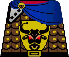
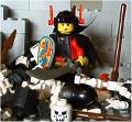
Lose the large shield logo and you've got a winner. I'm just not a fan of large logos on torsos -- armour designs are much more prefered.
Alan
edited PS: Just to clarify, based on later comments below, the clasp logo is fine, in fact maybe a bit bigger. It's only the big torso logo that doesn't work for me. Otherwise, it's a great piece of work -- keep at it!
Alan
edited PS: Just to clarify, based on later comments below, the clasp logo is fine, in fact maybe a bit bigger. It's only the big torso logo that doesn't work for me. Otherwise, it's a great piece of work -- keep at it!
Last edited by footsteps on Sat Jun 26, 2004 7:54 pm, edited 1 time in total.
I'm a human BEING, not a human doing!
The two most important days of your life are the day you are born
and the day you discover why. (Donald Sensing)
One plus one equals three... for large values of one. (Bruce Fournier)
The two most important days of your life are the day you are born
and the day you discover why. (Donald Sensing)
One plus one equals three... for large values of one. (Bruce Fournier)
- jamitjames
- Gentleman
- Posts: 774
- Joined: Fri May 14, 2004 12:13 pm
- Location: The Great North White, Canada
- Contact:
Better then my one, maybe you should change the color of the robe. I would like to see more from you, I want to make a bull army.
[url=http://radio.laml.org/]LAMLradio: LEGO Talk Podcast[/url]
- Formendacil
- Knight Templar
- Posts: 4162
- Joined: Wed May 05, 2004 7:22 pm
- Location: Ashland, MA
- Contact:
Yes, Brian, don't stop! Stickers are always good! (But then, who asked a crazed sticker fiend in the first place?)
Personally, I think it looks good, and that there is no reason to remove the Bull emblem. At least not both of them. I'm kind of thinking that you might want to lose the one on the broach, because it looks.... I dunno, kind of repetitive.
- wlister
- Sheriff
- Posts: 1562
- Joined: Tue Sep 16, 2003 1:40 pm
- Location: There be no castles here.
- Contact:
I like the emblem on the cape clasp, but coupled with the large emblem it is repetitive. I'd keep the clasp emblem and convert the large emblem into more plate. Or you could leave it, I like it, and you should keep it up. Practice and experience will only improve your skills.
Will
Will
After a long absence, I have returned. I can't wait to start building again.
- Dragon Master
- Merchant
- Posts: 1345
- Joined: Tue Sep 30, 2003 8:30 pm
- Location: USA
Your wasting you time
Just kidding, but really try making some original ones, not just adding details to Anthony's. Also get rid of the tiny bulls cloak clip, no printer could make that clear.
You'll get better,
DM
Just kidding, but really try making some original ones, not just adding details to Anthony's. Also get rid of the tiny bulls cloak clip, no printer could make that clear.
You'll get better,
DM
"I have looked for you. Now you have come to me. And I thank you." -Pope John Paul II
- Lord_Of_The_LEGO
- Earl of Wells
- Posts: 2954
- Joined: Thu Oct 23, 2003 6:20 pm
- Location: Eureka, CA
- Contact:
I like it Brian!
I agree that the large Bull logo isn't that great, but I like the button clasp. I also think the cape would look better in black insted of blue.
Hope to see more stickers from you soon!
I agree that the large Bull logo isn't that great, but I like the button clasp. I also think the cape would look better in black insted of blue.
Hope to see more stickers from you soon!
In the process of converting to [url=http://www.flickr.com/photos/nathanwells/]Flickr[/url].