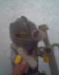
My first try at a Shield sticker
http://www.brickshelf.com/cgi-bin/gallery.cgi?i=916613
I did it on MS PAINT so it's not that good.Tell me what you think about it.
Custom Lion sticker
-
forester3291

- Merchant
- Posts: 1397
- Joined: Wed Apr 07, 2004 8:18 pm
Custom Lion sticker
Space rocks.
-
Formendacil

- Knight Templar

- Posts: 4162
- Joined: Wed May 05, 2004 7:22 pm
- Location: Ashland, MA
- Contact:
-
forester3291
- Merchant
- Posts: 1397
- Joined: Wed Apr 07, 2004 8:18 pm
Formendacil wrote:It doesn't look too bad. I would just suggest fiddling with the colours a little to make them a little less bright. More muted, if you know what I mean.
Just one question though: why another Lion shield? Aren't there enough official ones for you?
I was trying out some designs
Space rocks.
I think it would be better if you change the colors to some lighter.
[url=http://www.brickshelf.com/gallery/7sword7/]Shelved bricks(???)[/url]
You know you're a good person when you see megablocks and have to do things you would rather not.
You know you're a good person when you see megablocks and have to do things you would rather not.
-
forester3291
- Merchant
- Posts: 1397
- Joined: Wed Apr 07, 2004 8:18 pm

Ah, that's much better to see. Good job so far. You need a bit more detail around the head and claws, but apart from that you've got the shape well done (hmmm, I think my grammar's way off). Keep updating us. Thanks for sharing.forester3291 wrote:Here's yet another try http://www.brickshelf.com/cgi-bin/gallery.cgi?i=916723
Alan
I'm a human BEING, not a human doing!
The two most important days of your life are the day you are born
and the day you discover why. (Donald Sensing)
One plus one equals three... for large values of one. (Bruce Fournier)
The two most important days of your life are the day you are born
and the day you discover why. (Donald Sensing)
One plus one equals three... for large values of one. (Bruce Fournier)
-
Robin Hood

- Knight Templar
- Posts: 2070
- Joined: Thu May 13, 2004 2:35 am
- Location: An empty room.....somewhere.
- Contact: