Reviews of new KK sets

Discussion of official LEGO Castle Theme sets and products
Post Reply
User avatar
Lord_Of_The_LEGO
Earl of Wells
Posts: 2954
Joined: Thu Oct 23, 2003 6:20 pm
Location: Eureka, CA
Contact:

Reviews of new KK sets

Post by Lord_Of_The_LEGO »

Now that we have some clear pictures of the sets (thanks Jake! :D), I can write a review of them all:

8770-8774: These sets are not worthy of a review :evil: :evil:

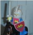
8777: I'm basing this review on this picture. This is probally my favorite set of the line, if it will be under $6. It's a decent army builder, and the purple is not as bad as barbie blue. Horses ae always welcome in small set and the barding looks cool too. Both figs appear to have new helmets and the black fig has black euro armor(!). There also appears to be a gold chrome great sword and a new roman shield.

8/10 -- I'll mostly likely buy multiple copies of this set.


8778: I'm basing this review on this picture. I really like this set, it appears of have some cool trap feature such as the bridge with spears and the boulder soccer ( :lol: ). Pieces look good (Brown BURP!) and the figs are great! I think the red knight is the best looking of jellybeans. The bad guy seems to have a new helmet, similar in design to Darth Vader's helm. The red knight also is wielding a new sword which might be in some light blue color.

7/10 -- I'll buy one at full price and more if on discount.


8779: This has got to be the worst set of the line. It doesn't even look like a good parts pack :( ! The only thing that caught my attention was the new horse face mask (what are those called), the rest of the set is empty and boring.

2/10 -- I'd buy it only in deep discount (75% off or more)


8780: Ugl, ugly, ugly! There are some parts in new colors here, but even that doesn't stop it from making this set really bad. As said before this set looks like a obsticle course, draw bridge, large snake, spinning axes... I noticed some decent parts, but some bad parts too, like the use of the Jack Stoned base plates. This set is an okay parts pack, that's all.


3/10 -- I'd buy it only in deep discount (75% off or more)


8781: You know, this set isn't half bad. Infact, it looks more like a castle than King Leo's! This castle once again if built on a CRAPP, but it pulls it off better than some previous castles. The bad guy to good guy is once again lope-sided, and four of those figs are the jellybeans! :? This castle does remind me of Harry Parter sets as in being very breezy, but again it looks better than the first KK's castle.


7/10 -- I'd only buy it at discount because my cash is low right now!
In the process of converting to [url=http://www.flickr.com/photos/nathanwells/]Flickr[/url].
User avatar
David Girard
Journeyman
Posts: 427
Joined: Tue Sep 23, 2003 4:54 pm
Location: Canada, Québec, Québec
Contact:

Post by David Girard »

Look at this:

http://www.classic-castle.com/sets/imag ... k/8777.jpg

The knights in the new 8777 picture is not the same.

Look the old http://www.minifig.co.uk/temp/legoKnights2004.jpg

They don't have the same color. Plus it doesn't use the same horse barding ! And there is no more catapult ! The armor are not ther too. What is tis picture ?

Maybe Lego listen to us when we said it was to much colorful. But for the barding, the new was good. For the catapult, I don't mind, it wasn't nice.
User avatar
architect
Baron von Ellermann
Posts: 3708
Joined: Mon Sep 08, 2003 5:10 pm
Location: Saint Louis, MO USA
Contact:

Post by architect »

They don't have the same color. Plus it doesn't use the same horse barding ! And there is no more catapult ! The armor are not ther too. What is tis picture ?
Please check the "official 2004 pictures thread". The pictures of 8777 and 8778 are probably prototype photographs, not the final designs.

Ben E.
Sets Admin
User avatar
David Girard
Journeyman
Posts: 427
Joined: Tue Sep 23, 2003 4:54 pm
Location: Canada, Québec, Québec
Contact:

Post by David Girard »

Many differences too in 8778 set !
http://www.classic-castle.com/sets/imag ... k/8778.jpg

I don't understand. Is 8777 and 8778 pictures Jake provided us are only prototype ?

They use old armor. And 8778 use a HP shield ! :shock:

What ? Is 8777 and 8778 picture are joke ?
User avatar
architect
Baron von Ellermann
Posts: 3708
Joined: Mon Sep 08, 2003 5:10 pm
Location: Saint Louis, MO USA
Contact:

Post by architect »

David,

It is most likely a mistake that we recieved old images of 8777 and 8778. The UK catalogue scan images are accurate. So the 8777 and 8778 photos that we have are cool because we can see early versions of the design. If I get final design photos, I will replace the prototype images.

Ben E.
User avatar
SirCumferance
Laborer
Posts: 111
Joined: Sun Feb 01, 2004 6:23 pm
Location: Home

Post by SirCumferance »

I think that the brightly coloured armor and weapons just looks kind of stupid. Does anybody know around what month these sets are coming out?
I am the queen of France!

... Maker of Castle Crusade

Mail me! kullvox03222@yahoo.com
User avatar
David Girard
Journeyman
Posts: 427
Joined: Tue Sep 23, 2003 4:54 pm
Location: Canada, Québec, Québec
Contact:

Post by David Girard »

I'm going to theorise...

What I think is the problem of the sets since some years, is the fact that they use too much color for creating.

I explain... look at the 8779. http://www.minifig.co.uk/temp/legoKnights2004.jpg
Look at each small building each side of the knights. The one on the right for example. How much color ? White, Light Gray, Blue, Tan, Black. 6 color. I think it look strange with all this colors. I think it could have been to replace the tan piece by black. The use of tan is not useful anyway in this set.

Look at 8781.
What make the castle not so bad and have a nice look is the good choice of color, and not to much. Mostly Light Gray and Blue. Some touch of other color also which is a bit strange, but there is not too much in this one. Again there is tan pieces, which is not useful.

What Jake called dull castle (1984-1993), wasn't like it. The color scheme were very well study, too have the best look possible.

Look at 6074 for example.
The castle is Light Gray, Black and small touch of yellow + blue flag. Very simple, but It's one of the best castle and best looking castle they made.

Look at 6081
The castle is Light Gray, Black, with blue and red flag. Again really simple, but really nice.

Look at 6046
For the structure: Light Gray, Drak Gray, Black, Red, Brown. Too much color. Not a nice one. The use of the red color doesn't appeal me.

An exception: 6067
Why is this one so nice, even if he have so much color ? It's because it's well distribute, and place logically.
If you separate things you understand.
The Wall:
2 colors. Light Gray and Black. Nice.
The Inn:
Black, Red, with touch of yellow and blue. Nice.
All is logically place.

6060 is another example. Many colors, but logically placed. We understand tournament have to be colorful.

What could we learn from that theory ? When you use many color, they have to be place logically and on specifics place. Not everywhere, like 6046 or 8779 or 8780, for example.

I know there is many example of...
1-...simple color scheme things which are nice
2-...too much color things which are not nice

Things have to stay simple to be good, and when you use much color, it has to be place logically. The eye doesn't love when there is too much color. :wink:
User avatar
Troy T. Moore
Gentleman
Posts: 710
Joined: Thu Sep 18, 2003 10:58 am
Location: Saskatchewan, Canada

Post by Troy T. Moore »

The only thing that caught my attention was the new horse face mask (what are those called)
It is properly called a shaffron (also chaffron, chanfron, shaffrein). :)
Troy T. Moore
Post Reply