First MOC.

Discussion of personal LEGO Castle creations
Post Reply
User avatar
Robin Hood
Knight Templar
Knight Templar
Posts: 2070
Joined: Thu May 13, 2004 2:35 am
Location: An empty room.....somewhere.
Contact:

First MOC.

Post by Robin Hood »

Well here it is.
http://www.brickshelf.com/cgi-bin/gallery.cgi?f=95178
Gelmoth oldest of all dragns. Some of you may remeber me saying a couple months back that I was starting a draogn, well here it is. It is the biggest lego thing I have ever built. terrible I know. I think that its not bad. I know I could do better but I am happy with the way it is right now. (not to mention the fact that it won first place in our fairs lego division, as the red ribbion in some of the pictures testifiy).

Please let me know what you think. :wink:
I build, therefore I am.

Brave words coming from a guy called grapenuts.
User avatar
footsteps
Tastes good with ketchup
Posts: 1680
Joined: Sat Oct 11, 2003 12:03 am
Location: Canada

Re: First MOC.

Post by footsteps »

I like the shape. The tail looks great, the head (and teeth!!!!), and especially the claws - very deadly looking.

Where you lose me is the colouring. I know, it's a personal preference thing, and I recognize that you're going for a mottled skin look (kudos to you for thinking of that). That's my only quibble.

The wings look a bit weak, but as Anthony has commented for his dragons, coming up with a wing design that isn't so heavy that it drags on the ground is a real toughy. I think you've done well with a very difficult design aspect. I've often wondered if large wings could be made by using a bunch of those plastic ewok-glider wing thingies as 'feathers' attached to a lighter skeletal frame. I don't have any so I can't test my theory.

So, how many heroes would fit inside that gaping maw?

Alan

PS and congrats on the award - you certainly earned it!!!!
I'm a human BEING, not a human doing!
The two most important days of your life are the day you are born
and the day you discover why. (Donald Sensing)
One plus one equals three... for large values of one. (Bruce Fournier)
User avatar
The Josh
Apprentice
Posts: 158
Joined: Fri Jun 18, 2004 10:02 pm
Location: Poughkeepsie, NY
Contact:

Post by The Josh »

I like it :D ! The coolest part is the large amount of pirate swords on the tail:

http://www.brickshelf.com/cgi-bin/gallery.cgi?i=874248

The only thing I would change would be the 2x2x3 slopes that are the spikes on the back of the dragon. I think they stick out a little too much. Besides the spikes, I think your dragon is very cool.
Robin Hood wrote:it won first place in our fairs lego division
Congrats on the win!

- The Josh
User avatar
doctorsparkles
Landlord
Posts: 995
Joined: Sat Feb 28, 2004 10:42 pm
Location: Medina, Ohio
Contact:

Post by doctorsparkles »

Not too shabby... though in my opinion he does look a tad bit emaciated. If I were to change anything, I'd either fatten him up a little bit or balance him out by shortening the legs so he doesn't look quite so skinny. But hey, if you're happy with the way he looks, more power to you.
"Always do what you want, and say what you feel, because those who mind don't matter, and those who matter don't mind." ~ Doctor Suess
Emperor James
Steward
Posts: 579
Joined: Mon Jul 12, 2004 3:55 am

Post by Emperor James »

I love this. It does look small and skinny when you are veiwing the whole folder, but when you enlarge a pic and see how big it really is, the proportions look appropriate. I do think you should make it fewer colors, but thats just me.
pwnage
User avatar
Robin Hood
Knight Templar
Knight Templar
Posts: 2070
Joined: Thu May 13, 2004 2:35 am
Location: An empty room.....somewhere.
Contact:

Re: First MOC.

Post by Robin Hood »

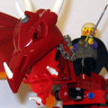
footsteps wrote:I like the shape. The tail looks great, the head (and teeth!!!!), and especially the claws - very deadly looking.

Where you lose me is the colouring. I know, it's a personal preference thing, and I recognize that you're going for a mottled skin look (kudos to you for thinking of that). That's my only quibble.

The wings look a bit weak, but as Anthony has commented for his dragons, coming up with a wing design that isn't so heavy that it drags on the ground is a real toughy. I think you've done well with a very difficult design aspect. I've often wondered if large wings could be made by using a bunch of those plastic ewok-glider wing thingies as 'feathers' attached to a lighter skeletal frame. I don't have any so I can't test my theory.

So, how many heroes would fit inside that gaping maw?

Alan

PS and congrats on the award - you certainly earned it!!!!
Thanks. I was origanlly going to make it just blue and green, but the amount of pieces was an issue.

I actually wasn't to pleased with the wings. I had hoped to make them look like they could actually hold it up if it were real without any magic. But the weight became a problem. I would like to take a lot of credit for the wining but there were only three other entrys in the fair. Besides our town isn't to big so there aren't many big lego fans. Thanks again for your comments.
I like it ! The coolest part is the large amount of pirate swords on the tail:

http://www.brickshelf.com/cgi-bin/gallery.cgi?i=874248

The only thing I would change would be the 2x2x3 slopes that are the spikes on the back of the dragon. I think they stick out a little too much. Besides the spikes, I think your dragon is very cool.

Robin Hood wrote:
it won first place in our fairs lego division


Congrats on the win!
Yah, I wasn't to sure on what to do for spikes, and these seemed the best so I did it.
Not too shabby... though in my opinion he does look a tad bit emaciated. If I were to change anything, I'd either fatten him up a little bit or balance him out by shortening the legs so he doesn't look quite so skinny. But hey, if you're happy with the way he looks, more power to you.
Yah, that was my biggest problem. I couldn't fatten him up any more or the legs wouldn't hold him. Though next time I make one it will be less shinny looking.
I love this. It does look small and skinny when you are veiwing the whole folder, but when you enlarge a pic and see how big it really is, the proportions look appropriate. I do think you should make it fewer colors, but thats just me.
I agree, but as I said before the amount of pieces had a limit and I reached it. I had never intended to have black or tan, but well....I need more lego.


Thanks for all your comments and please keep em coming. :wink:
I build, therefore I am.

Brave words coming from a guy called grapenuts.
User avatar
Duke_Dave
Reeve
Posts: 482
Joined: Thu Jul 01, 2004 6:39 pm
Location: KANSAS
Contact:

Post by Duke_Dave »

Very Nice!!! I really like it! I understand your color prob.(speaking a building collector) But still looks good.


Dave
User avatar
Robin Hood
Knight Templar
Knight Templar
Posts: 2070
Joined: Thu May 13, 2004 2:35 am
Location: An empty room.....somewhere.
Contact:

Post by Robin Hood »

Thanks. :wink:
I build, therefore I am.

Brave words coming from a guy called grapenuts.
User avatar
Glencaer
Marquis d'Krakhed
Posts: 659
Joined: Wed Sep 10, 2003 5:44 pm
Location: Tallahassee, FL

Post by Glencaer »

Robin,

Being a Dragon Builder myself, I can say that this is definately an excellent first step. Obviously your collection isn't large, but some different piece/color choices would probably have served you better. The use of color could use some refinement. Basically, I'm looking at the blue/green stripes on the leg - this doesn't look very natural/organic. Isolating colors is one way of handling it (Mladen-esque) - if the arms were entirely blue, and the body/tail entirely green, etc - It would have a more purposeful (it is meant to look that way) feel to it.

But seriously, for a smaller collection, this Dragon is amazing! In no time flat, you'll be pumping out Dragons even better than Formeathan and Horatio, I'm sure of it!!

Thanks for sharing!

-Lenny
===
"The sound of laughter is like
the vaulted dome of
a temple of happiness. "
~-Milan Kundera-~
User avatar
SavaTheAggie
Lord Sava of Aggie
Posts: 2419
Joined: Tue Sep 09, 2003 6:36 am
Location: Houston
Contact:

Post by SavaTheAggie »

There's not much that I could say that hasn't been said already. As Lenny said, this is a very excellent first step. I'm particularly drawn to the dragon's head, and while it's a tad blocky, it does seem to have a large amount of personality.

I like how you followed through with your black spike design from nose to tail tip. It's sometimes hard to do, but you pulled it off well. The tapering of the tail is a little sudden, I think I'd change the third segment of the tail from 6 studs wide down to 4.

I really like it, he looks mean and angry, I'd hate to be be a minifig in his path.

I look forward to seeing future MOCs from you.

--Anthony
[url=http://www.ikros.net][img]http://www.ikros.net/links/ikrosbuttonsmall.jpg[/img][/url]

Give a man a fire and he'll be warm for a day.
Set a man on fire and he'll be warm for the rest of his life.
User avatar
Robin Hood
Knight Templar
Knight Templar
Posts: 2070
Joined: Thu May 13, 2004 2:35 am
Location: An empty room.....somewhere.
Contact:

Post by Robin Hood »

Glencaer wrote:Robin,

Being a Dragon Builder myself, I can say that this is definately an excellent first step. Obviously your collection isn't large, but some different piece/color choices would probably have served you better. The use of color could use some refinement. Basically, I'm looking at the blue/green stripes on the leg - this doesn't look very natural/organic. Isolating colors is one way of handling it (Mladen-esque) - if the arms were entirely blue, and the body/tail entirely green, etc - It would have a more purposeful (it is meant to look that way) feel to it.

But seriously, for a smaller collection, this Dragon is amazing! In no time flat, you'll be pumping out Dragons even better than Formeathan and Horatio, I'm sure of it!!

Thanks for sharing!

-Lenny
Thanks.Yah, the colouring was a bit of a problem. I also lack the mental ability to get things coloured right. I am ok but my brother has more a mind for colour scheme, I am just a builder. Thanks for you comments.
There's not much that I could say that hasn't been said already. As Lenny said, this is a very excellent first step. I'm particularly drawn to the dragon's head, and while it's a tad blocky, it does seem to have a large amount of personality.

I like how you followed through with your black spike design from nose to tail tip. It's sometimes hard to do, but you pulled it off well. The tapering of the tail is a little sudden, I think I'd change the third segment of the tail from 6 studs wide down to 4.

I really like it, he looks mean and angry, I'd hate to be be a minifig in his path.

I look forward to seeing future MOCs from you.

--Anthony
Yah I wasn't sure if I liked the tail or not, I sertainly thought that the end could have used a bit more improvement, but this is a prototype.

The head is my all time favorite part. I was in the begining really worried on how it would turn out, but I ws very pleased on how it did. I have to say thanks to you, because your dragons had a huge effect on how I built mine. The head had a bit of modifing after I saw yours. I noticed that my dragon lacked cheeks. Thanks for your comments. :wink:
I build, therefore I am.

Brave words coming from a guy called grapenuts.
Post Reply