Hi all,
As a judge, I never make comments on entries while the contest is ongoing so as to avoid any appearance of favoritism. However, I really enjoy discussing MOCs, and am always itching to give feedback. So in the past I have several times made 'contest thoughts' threads: CCC II, CCC II vig category, CCC III, CCC IV, LEGO Castle Contest, CCC V, CCC VIII where I pointed out cool things and discussed some favorites. There has been some discussion on whether or not it was good to have feedback threads - here and here. One issue for me has been that the style of feedback thread I've done in the past takes a ton of time. A few years back Tony introduced an alternative - rather than highlighting the best MOCs, he let people know where their MOCs could have been improved, what he facetiously called the 'why did my entry suck?' thread, but more seriously a constructive criticism thread: CCCV, CCC VI. In these threads he offered constructive critiques to those who requested it. That's what I propose to do this year. A few ground rules:
1. I will only offer feedback to those who ask for it. Post your request in this thread.
2. You can only ask for feedback for one entry every two weeks. This is to prevent me from getting overwhelmed when Mark asks for feedback on his six thousand entries.
3. In your request, be sure to give a link to your entry. This will help save time of me having to do several clicks to find the entry for each one.
4. If you ask for a critique, you have to be prepared that that critique might be negative. I want to try to highlight how a MOC could be improved, rather than just praise the good things.
5. Just a note, if you have a MOC that did very well (e.g. any of the honorable mentions), it's probably not that there's anything particularly wrong with it. Among the top scoring entries in a category it becomes a game of inches. Often my favorite is not necessarily Josh's or Ben's, or vice versa, and the winner is declared out of the balance of all the judges. So it might just be that the winning one did a little better in one judge's eyes versus another.
That said, let the thread begin. Ask away!
Edit - Hey guys, Josh is also going to be joining in with his feedback as well. Double your pleasure, double your fun, with double fresh, double good, double critique gum!
Bruce
CCC X MOC critiques thread
-
Bruce N H

- Precentor of the Scriptorium
- Posts: 6314
- Joined: Mon Sep 15, 2003 9:11 pm
- Location: Middle Zealand
- Contact:
CCC X MOC critiques thread
[url=http://comicbricks.blogspot.com/]ComicBricks[/url] [url=http://godbricks.blogspot.com/]GodBricks[/url] [url=http://microbricks.blogspot.com/]MicroBricks[/url] [url=http://minilandbricks.blogspot.com/]MinilandBricks[/url] [url=http://scibricks.blogspot.com/]SciBricks[/url] [url=http://vignettebricks.blogspot.com/]VignetteBricks[/url] [url=http://www.classic-castle.com/bricktales/]Brick Tales[/url]

Re: CCC X MOC critiques thread
Hi Bruce,
I have enjoyed your critique in past CCC contests of each of your top entries. In my case, I really don't have much to complain about and am very humbled and greatful for the recognition of my entries this year. I can proabably almost guess what the biggest issue is, but my query would be towards my Castle entry. I spend probably half of my building time on that one project and I originally had planned angular walls, but had to deviate due to time constraints. You can definetly see the difference in quality from the keep, to the outer walls. My guess is this is what hurt the build, but I would love any comments you might have as that is proabably the 3rd full actual castle build I have done and have a lot of growing yet to do.
Here is the link to my entry and thank you for taking the time to do this for us. http://www.flickr.com/photos/fraslund/s ... 290069953/
David
[url]http://www.flickr.com/photos/fraslund/[/url]
-
soccerkid6

- Admin

- Posts: 2176
- Joined: Fri Jun 03, 2011 6:41 pm
- Location: Nordheim Keep
- Contact:
Re: CCC X MOC critiques thread
Thanks for doing this Bruce!
I would love to hear how my entry for the Forest Life category http://www.flickr.com/photos/66620538@N ... 375617958/ could have been improved
I would love to hear how my entry for the Forest Life category http://www.flickr.com/photos/66620538@N ... 375617958/ could have been improved
John 14:6, Jesus answered, "I am the way the truth and the life. No one comes to the Father except through me."
Brickbuilt: http://www.brickbuilt.org/
Flickr: https://www.flickr.com/photos/isaacsnyder/
Brickbuilt: http://www.brickbuilt.org/
Flickr: https://www.flickr.com/photos/isaacsnyder/
-
Bruce N H
- Precentor of the Scriptorium
- Posts: 6314
- Joined: Mon Sep 15, 2003 9:11 pm
- Location: Middle Zealand
- Contact:
Re: CCC X MOC critiques thread
David,
Rochester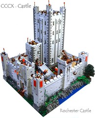
To start out with, this was an incredibly rich category this year, with a great number of very high quality MOCs. Your castle was really good and could probably have won in other years or different contests. That said, as you thought, the squared off walls was an issue for this one. In judging I try to take each MOC on it's own, but now I've gone back and looked at several photos of the real Rochester and the satellite view on Google maps, and as you know the walls extend a larger area of more of a squashed parallelogram shape. In bringing them down to a 64x64 square they look too neat and squared off - something that would be unlikely for a castle built as a defensive work along a geographic feature such as a river - and also it makes the interior feel cramped. A larger enclosed area would allow for additional action inside. I also would have liked to see a little more outside the walls. Say a 16-stud distance out from the walls on the gate and river side. That way with a little more green and blue you could get a better color contrast to offset the gray, and you could maybe add a boat on the river to load and unload using that crane, also a little piece of road and you could bring that horse and rider outside the gate a bit. The keep itself has a great shape, but I think the proportions seems off, particularly when compared to the real thing. It's a little taller and narrower, which makes it a little more like a skyscraper than a keep, visually. Also, I thought the quoins at the corners were a little heavy-handed. Making them out of 2x4 and 2x2 tiles is too much, imo. I much prefer the more subtle ones along the middle portions made of 1x2 and 1x1 tiles. Again, if you look at the real thing, there is only a very thin line of lighter stones along the corners.
Bruce
[url=http://comicbricks.blogspot.com/]ComicBricks[/url] [url=http://godbricks.blogspot.com/]GodBricks[/url] [url=http://microbricks.blogspot.com/]MicroBricks[/url] [url=http://minilandbricks.blogspot.com/]MinilandBricks[/url] [url=http://scibricks.blogspot.com/]SciBricks[/url] [url=http://vignettebricks.blogspot.com/]VignetteBricks[/url] [url=http://www.classic-castle.com/bricktales/]Brick Tales[/url]
-
Bruce N H
- Precentor of the Scriptorium
- Posts: 6314
- Joined: Mon Sep 15, 2003 9:11 pm
- Location: Middle Zealand
- Contact:
Re: CCC X MOC critiques thread
Soccerkid,
Forest life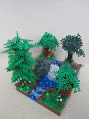
Again, a nice MOC, but maybe it doesn't have as natural a look as some of the other entries in this category. The trees are nice, though the one with palm leaves is my least favorite of the bunch. Also it seems a little out of place since the other three trees are the same style. Perhaps that one should have been on the upper portion, since as you travel up a real mountain in elevation the tree varieties change. Also since that's the tallest it would have given some greater height variation to the overall MOC. As a general suggestion, when you have a MOC with upper and lower tiers, and you put the taller items on the lower tier and the shorter items on the upper tier, it soft of flattens out the overall heights across the MOC and negates the effect of having tiers in the first place. The trunks on the three smaller trees seem a little fat in proportion to the leaves, and personally I don't like the places where you went back and forth between bricks and cylinders in the trunks. The placement of the figs could have been improved. I like the fisherman, but you can't see him in any of the photos submitted for judging, just his fishing pole. That's more of a question of which photos you choose to include for judging. I'm not sure what the other two are doing. The one in the corner in particular just seems to be standing and staring at a tree. The waterfall and stream are great, though i think a few bits of trans blue would be nice in the middle of the all-trans-clear waterfall section. Normally I wouldn't comment at all on the underground, but you made it an issue by featuring the 'underground' shot as one of your three for judging. I like the cave with the treasure and the little holes, but the problem with the underground is that you see that everything else is just a one-plate skin on top of the gray rock. If you're going to show the cross-section of the underground, the stream should be a few plates deep, there should be a layer of brown soil underneath the grass, and that tree needs roots (which could be cool in that they could extend down and frame the treasure cave). Again, I normally wouldn't critique things below the surface of a MOC, but when you make a cross-section of the earth a third of your judged photos, it stands out.
Bruce
[url=http://comicbricks.blogspot.com/]ComicBricks[/url] [url=http://godbricks.blogspot.com/]GodBricks[/url] [url=http://microbricks.blogspot.com/]MicroBricks[/url] [url=http://minilandbricks.blogspot.com/]MinilandBricks[/url] [url=http://scibricks.blogspot.com/]SciBricks[/url] [url=http://vignettebricks.blogspot.com/]VignetteBricks[/url] [url=http://www.classic-castle.com/bricktales/]Brick Tales[/url]
-
JoshWedin

- Chevalier de Chèvre
- Posts: 4995
- Joined: Sun Nov 09, 2003 2:35 pm
- Location: Pondering what you are pondering
- Contact:
Re: CCC X MOC critiques thread
Bruce said he didn't mind if I chimed in as well, so here it goes.
I mostly agree with Bruce on this one but my suggestions for improvement are more drastic. What you can see of your landscaping there is very good. It shouldn't be hidden under those trees. I felt the trees were the weakest part of this build and they cover up the strongest part. I would have dropped the evergreen tree altogether and maybe the dark green one as well. If you had one tree on the upper section and one on the lower, then the beautiful rockwork would be more visible. I also would have mixed the green and dark green leaves together. The color difference would less distracting that way. The underground cave was a nice touch but I agree with Bruce that it didn't go far enough. I think I would have axed the cave and kept the focus on the front. If you are going to have a cave right under a tree on the edge, we should have been able to see some roots or a layer of topsoil or something like that. Like Bruce, I would have complety ignored the under-structure except that it became part of the build because of the cave and the small voids in the rock. Lastly the category was Forest Life and I could barely see the figs. I nearly missed the fisherman altogether. A lower camera angle might have helped as well and let us see under those trees.
Build On!
Josh
As Bruce said this category was full of extremely high quality builds so you were up against some stiff competition. What knocked it down for me was the over-sized detailing on the corners. Smaller would have been better in this case. Also the shorter tower that serves as the entrance to the main keep has the corner detailing on the front but not the back. The main keep has it on all the corners so this threw it off for me. That shorter tower just didn't seem finished. Also, as you pointed out, the outer curtain wall just doesn't seem to be the same quality as the keep. I did like the hints of landscaping on the edges but the levels seem a bit off. It is hard to tell in the pics but the water seems to be the same level as the ground at the front gate. I would have liked to see an obviously higher ground level in front.Fraslund wrote:my query would be towards my Castle entry.
soccerkid6 wrote:I would love to hear how my entry for the Forest Life category could have been improved
I mostly agree with Bruce on this one but my suggestions for improvement are more drastic. What you can see of your landscaping there is very good. It shouldn't be hidden under those trees. I felt the trees were the weakest part of this build and they cover up the strongest part. I would have dropped the evergreen tree altogether and maybe the dark green one as well. If you had one tree on the upper section and one on the lower, then the beautiful rockwork would be more visible. I also would have mixed the green and dark green leaves together. The color difference would less distracting that way. The underground cave was a nice touch but I agree with Bruce that it didn't go far enough. I think I would have axed the cave and kept the focus on the front. If you are going to have a cave right under a tree on the edge, we should have been able to see some roots or a layer of topsoil or something like that. Like Bruce, I would have complety ignored the under-structure except that it became part of the build because of the cave and the small voids in the rock. Lastly the category was Forest Life and I could barely see the figs. I nearly missed the fisherman altogether. A lower camera angle might have helped as well and let us see under those trees.
Build On!
Josh
AFOL and his money are easily parted.
[url=http://www.flickr.com/photos/ak_brickster/8 ... hotostream][img]http://farm9.staticflickr.com/8252/85336074 ... 2a10_t.jpg[/img][/url] [url=http://www.Brothers-Brick.com]The Brothers Brick[/url]
[url=http://www.flickr.com/photos/ak_brickster/8 ... hotostream][img]http://farm9.staticflickr.com/8252/85336074 ... 2a10_t.jpg[/img][/url] [url=http://www.Brothers-Brick.com]The Brothers Brick[/url]
Re: CCC X MOC critiques thread
This is great feedback and I agree with everthing said. I knew the build would suffer when I deviated from my original plan of angled walls and simply ran out of tiles to finish the rest of the walls in the same manner. The ideas also about the extra space along the outside was something I struggled with as well. I think what really killed me is I tried to go too big and had to tried to build my (square) way out of it. It became less Rochester and more generic.
Thank you both again for taking the time to review this. As I said, I still have a lot to learn and castles are especially something I really want to step my game up with. Each build is a learning experience and good feedback is invaluable.
edit* (Forgot to mention, the design was also heavily inspired by the movie Ironcald which drove the tile usage on the corners-)
[url]http://www.flickr.com/photos/fraslund/[/url]

Re: CCC X MOC critiques thread
I would appreciate feedback on my Forest Life entry:
http://www.flickr.com/photos/mrcp6d/set ... 092842028/
Thanks!
http://www.flickr.com/photos/mrcp6d/set ... 092842028/
Thanks!
-
JoshWedin
- Chevalier de Chèvre
- Posts: 4995
- Joined: Sun Nov 09, 2003 2:35 pm
- Location: Pondering what you are pondering
- Contact:
Re: CCC X MOC critiques thread
This was a good, solid entry. There isn't much wrong with it. As far as the actual build goes, my only real issue was the rock wall at the back. It is nice and random but then it looks cut off at the top. Some sort of irregular top to it would have been nice. I did like both of your trees and the landscaping in this small area is very good. A slightly higher camera angle would have nice, as your stream/pond gets hidden by the border (those borders are quite the fad right now, aren't they?).mrcp6d wrote:I would appreciate feedback on my Forest Life entry
What it is missing is that little "extra something" that is so hard to define. Other than eating frogs (I liked that bit, btw) there wasn't anything to make this stand out.
Hope this helps even though it's rather vague,
Josh
AFOL and his money are easily parted.
[url=http://www.flickr.com/photos/ak_brickster/8 ... hotostream][img]http://farm9.staticflickr.com/8252/85336074 ... 2a10_t.jpg[/img][/url] [url=http://www.Brothers-Brick.com]The Brothers Brick[/url]
[url=http://www.flickr.com/photos/ak_brickster/8 ... hotostream][img]http://farm9.staticflickr.com/8252/85336074 ... 2a10_t.jpg[/img][/url] [url=http://www.Brothers-Brick.com]The Brothers Brick[/url]

Re: CCC X MOC critiques thread
I'd be happy if you guys gave me some feedback on this build please.
http://www.flickr.com/photos/justin__m/8464910987/
http://www.flickr.com/photos/justin__m/8464910987/
[img]http://farm9.staticflickr.com/8120/86369329 ... 2cc9_m.jpg[/img]
[url=https://www.flickr.com/photos/112482494@N07/]Flickr[/url] [url=http://www.mocpages.com/home.php/79686]Mocpages[/url] [url=http://www.brickshelf.com/cgi-bin/gallery.cgi?m=Jbob]Brickshelf[/url]
Whatever you do, work at it with all your heart, as working for the Lord, not for men. Colossians 3:23
[url=https://www.flickr.com/photos/112482494@N07/]Flickr[/url] [url=http://www.mocpages.com/home.php/79686]Mocpages[/url] [url=http://www.brickshelf.com/cgi-bin/gallery.cgi?m=Jbob]Brickshelf[/url]
Whatever you do, work at it with all your heart, as working for the Lord, not for men. Colossians 3:23
-
JoshWedin
- Chevalier de Chèvre
- Posts: 4995
- Joined: Sun Nov 09, 2003 2:35 pm
- Location: Pondering what you are pondering
- Contact:
Re: CCC X MOC critiques thread
Sorry if I'm a bit harsh but this one, the second part of your Daring Escape entry, was confusing. The 2nd build was supposed to show the escape. You say that your character was imprisoned deep within the earth but you show him hiding by a guard tower. I had a hard imagining how the wooden guard tower was part of his underground prison.Justin M wrote:I'd be happy if you guys gave me some feedback on this build please
Also the tower construction was rather plain and uninteresting. I did like the rocks for the foundation but there wasn't anything really striking about this one. Nothing really draws the eye to it, except for the border (those were popular in this contest). The border did catch my attention but the frame shouldn't be the most interesting part of the artwork.
Josh
AFOL and his money are easily parted.
[url=http://www.flickr.com/photos/ak_brickster/8 ... hotostream][img]http://farm9.staticflickr.com/8252/85336074 ... 2a10_t.jpg[/img][/url] [url=http://www.Brothers-Brick.com]The Brothers Brick[/url]
[url=http://www.flickr.com/photos/ak_brickster/8 ... hotostream][img]http://farm9.staticflickr.com/8252/85336074 ... 2a10_t.jpg[/img][/url] [url=http://www.Brothers-Brick.com]The Brothers Brick[/url]
-
Lord Mercat
- Laborer
- Posts: 116
- Joined: Mon Dec 31, 2012 8:23 am
Re: CCC X MOC critiques thread
Wanted to see if I could get some feedback on this entry to the custom fantasy figure contest. This is actually the first customizing type contest I've ever entered (though I have wished to for quite a while) so I would like to see what I could improve on. I'm thinking the addition of the horse and lance probably hurt it as it didn't really add much. Also, looking back I thought the sword was a bit underwhelming. Anyway your opinion is appreciated! http://www.flickr.com/photos/33940525@N ... hotostream
-
Bruce N H
- Precentor of the Scriptorium
- Posts: 6314
- Joined: Mon Sep 15, 2003 9:11 pm
- Location: Middle Zealand
- Contact:
Re: CCC X MOC critiques thread
Mrcp6d,
Frog legs in the forest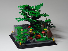
As Josh noted, this is a nice little build, but there's not much to make it stand out. I do like the main tree quite a bit. I'm not as thrilled about the two smaller trees. I think they obscure the nicer parts of the MOC and would have best been left off. The one with the tan trunk in particular didn't set well with me. I think as a tree it would have been better if the leaf elements were separated by one or two round tiles rather than a round brick. I was intrigued by the guy peeking at them around the tree, and would be interested to know what's about to happen next - is he an assassin about to kill them, a fugitive on the run, etc. I'm a little confused by the geography of the stream, which seems to just appear out of the rocks in the back and run off to the front corner. I agree that making the top of the rocks uneven would make it look more natural.
Justin M,
Oath of revenge, part 2 of 3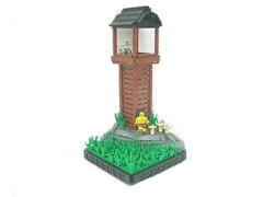
I have to say, this was the weakest of the three parts of your daring escape entry. I liked the other two scenes quite a bit, but this one left me scratching my head. Aside from the chain on his wrist, this looks more like one of the guards doing some leisurely sunbathing during his break time rather than a guy escaping from some underground prison. Maybe show him emerging from the hole he dug out of his cell, or overpowering a guard to break free, or running as the guy in the tower above shoots an arrow at him, etc. I did really like the rocks, and the technique you used in several of your MOCs layering the ground with small leaf elements and then flower stems works really well - I'll have to try that some time. One general complaint on your entries is that they were all sort of washed out in terms of the lighting. Maybe play with the settings on your camera, or adjust the brightness/contrast levels in Photoshop/Gimp.
Lord mercat,
Ragnel Tartaros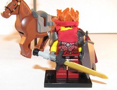
There were some nice ideas on both of your custom figs, but I think they worked out better on the Golden Paladin. The hair idea was quite good, and has a real anime feel to it. I think this goes better with the other fig, which has a more anime style overall, perhaps due to the larger golden pauldrons and the robe. The idea of attaching the scabbard with chain links was also nice. The main problem overall was execution. I'm not a customizer, so I can't give good advice on how to do this the right way, but I do notice when things aren't quite sharp in their execution. For instance there are some places where the cuts aren't clean, like in the pauldrons just where they meet the arms, or near the base of the sword blade, or that piece of red fabric on the back. As I said, I did think your other custom was better overall, and the execution on that one came across as being cleaner.
Bruce
[url=http://comicbricks.blogspot.com/]ComicBricks[/url] [url=http://godbricks.blogspot.com/]GodBricks[/url] [url=http://microbricks.blogspot.com/]MicroBricks[/url] [url=http://minilandbricks.blogspot.com/]MinilandBricks[/url] [url=http://scibricks.blogspot.com/]SciBricks[/url] [url=http://vignettebricks.blogspot.com/]VignetteBricks[/url] [url=http://www.classic-castle.com/bricktales/]Brick Tales[/url]
-
Tastymuffins
- Geoffrey of Monmouth
- Posts: 176
- Joined: Sat May 29, 2010 8:32 pm
- Location: New Orleans LA
- Contact:
Re: CCC X MOC critiques thread
I'd love to hear anything you have to say about my entry to the castle category. I was rather disappointed I didn't get into the honorable mentions. So I'm very curious to hear what you think of it! viewtopic.php?f=3&t=23000
My Legos at [url]http://www.mocpages.com/home.php/12849[/url]
[img]http://www.brickshelf.com/gallery/lord-of-o ... asant4.jpg[/img]
[img]http://www.brickshelf.com/gallery/lord-of-o ... asant4.jpg[/img]

Re: CCC X MOC critiques thread
Hey there guys, what a great contest it was.
would appreciate critism on my entry in MISC category please
http://www.flickr.com/photos/52526744@N ... 095582643/
would appreciate critism on my entry in MISC category please
http://www.flickr.com/photos/52526744@N ... 095582643/
[url=http://www.flickr.com/photos/52526744@N04/]flickR[/url]