Friskywhiskers,
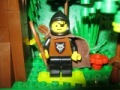
Escape from the Rogue Tower 


First up, your entry didn't really fit the category, which was described as a bandit hero (think Robin Hood) escaping, rather than just anyone escaping from anyone. This came up in
question 53 of the contest questions thread. That said, there were several entries that did this sort of thing, and I didn't put excessive weight on this aspect. The second scene, climbing down from the small tower, was by far the strongest of the three parts. That one I had no complaints about - I loved the round base and the landscaping, the birch tree, the shape of the tower, the door etc. The landscaping and tree on the first installment is also excellent, as is the action of the figs. The biggest complaint here is that, as described, this is an ambush where the bandits jumped out of the brush. Given this scene, it seems like the knight should have seen any bandits coming from a mile away. To be an ambush you would think he was going though a thicket, or a narrow pass in the mountains or some other location where he could be attacked unawares. That said, though, the real weak point was the third installment. In terms of the story, he was captured and escaped to find the result, which was, well, nothing really. That was very much a letdown after the first two chapters. Also, in terms of the build, it's supposed to be a busy pub, but it seems to have a lot of empty space. Every busy pub I've ever been in has been crowded, with patrons, servers, furniture, etc. I do really like the wall detailing with the mottling and the brick bricks. Not so sure I like those 1x3 brown slopes, though. The guy in the corner is presumably drunk? That might be a good detail if the bar were very crowded, but it looks odd here. Actually, him in the corner makes it look a little more like a dungeon.
Mencot,
Den of thieves 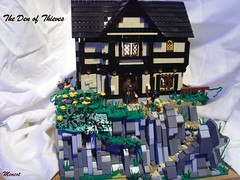
This one did feel unfinished. The fact that one side had to be hidden by a sheet, including one wall of the underground lair, hurt the look. You could see light peeking through in some places where bricks weren't fully pressed together (e.g. in the roof). Also, I understand that you probably didn't have the black 2x2 double concave slopes to fill in the place where the gable meets the rest of the roof, but you should come up with some better solution than just leaving holes, or else don't do the gable and just go with a simpler roofline. Also, I don't know how they get into the underground lair. Is there a trap door in the floor of the pub? Or is there a secret door out through the cliff face? You should show that.
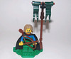
LettuceBrick,
Preparing wood 
I really liked the two-man saw, the stream, and the use of tan for places they were sawing. I thought the road should not have been all straight. On the two larger trees in back, I thought the canopy of leaves was too small for the length of the trunk. Also, I don't like the brown plates on top of the leaf elements. That doesn't look right. One other confusion for me - are the woodsmen floating the logs downstream, or pulling them with horses? It seems like they would do one or the other, depending on the terrain, but not both at the same location.
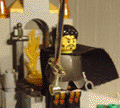
Rifiröfi,
Dwarves' brewery 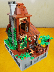
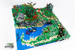
There are some things I really like about this MOC, particularly the different techniques used in the roof, and that giant pulley made of wagon wheels, also those tall narrow windows. Perhaps this speaks to my lack of knowledge about breweries, but the inside is a total mystery to me. That green object, for instance, looks interesting, but needs some more context. Also, I don't think the birds-eye view photo is helping you here as it turns out more frustrating than illuminating. One other note, with all that brown (building, wagon, tree), you probably should have gone with a different color for the ground so that the others would stand out more.
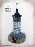
Legonardo,
Mage's Tower 
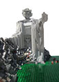
The round stone tower technique is really cool and was my favorite part about this MOC. I thought the wooden part at the top should have a larger diameter - as it was it looked like just a big tube. I appreciate the difficulties with making round tower roofs, but I thought this roof was too flat. Not sure about the inclusion of a musket on that lamp post at the bottom - in the end it just looks like a musket. I also thought all of the chains and axes around the window were distracting and should have been edited out.
Kumplekante,
The ground rules for this thread said that I'll only comment on one MOC per person every two weeks. So as to be fair to others who want feedback, I'll just go with your first one. If you want to ask about the other, post a request in this thread in a couple of weeks. Anyway:
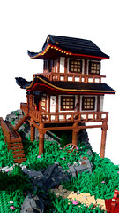
Burg Lyndwormsfald 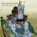
This is probably another of those MOCs that looks a lot better in person where you can look at it from all sides and see the details, than it does in a few photos online. The overall shape is really cool, and putting it in the middle of a waterfall is neat. I particularly like that wooden gallery that looks out over the waterfall. The main problem is that this is so busy - there's the complex shape, details like those flying buttresses, color details in the roofs, mottling in the walls, color variation in the river and the ground and the rocks, height variations etc. IMO, when building for the camera, the key is to contrast simple and complex. In terms of color, for instance, if you were to have a keep with walls in all one color, surround it with landscaping that is very complex in color scheme. Otoh, if the keep is very intricate in color scheme, basically put it against landscaping that is pretty much all the same shade of green, or gray, or blue, etc, or at most areas that were blocked into solid colors (green grass over here, dark gray cliff over there, blue water below, etc). The same with building style. If the keep is a simple square tower (nothing wrong with that, tons of real historic examples like this), then make the landscape around it intricate. If the castle is very intricate, lots of levels etc, make the land simpler. I'm not saying just put it on flat baseplates, but you want some contrast. When everything is complex, as in your MOC, the details overwhelm and hide each other.
That's a more general note. A couple of additional thoughts on yours. The shape comes across as almost ship-like, which may have been your intention. I might have played that idea up even more. You should have moved the light source for your second photo, as the shadow kinds of hides it. Your third photo, the one of the interior, really didn't do you any favors. I know you wanted to show that it had some interior, and highlight the light-up firepit, but it's so hard to see what's going on. Either find a better way to light it and a better camera angle so you can actually see the interior detail well, or skip this photo and give us another exterior shot, maybe from a different angle (fig's-eye-view at the gate, or looking up from the base of the waterfall might have been cool).


