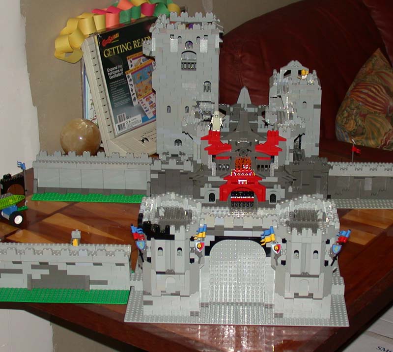
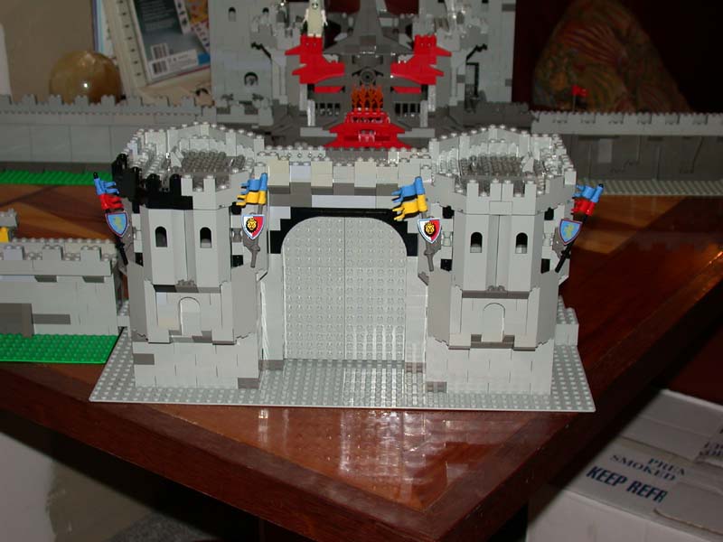
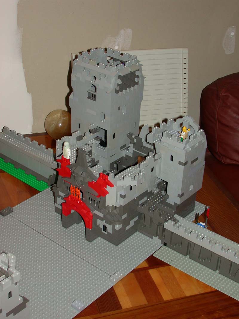
I have just finished the first draft of a build on my inner and outer gates for my large castle. I would appreciate some feedback. I am hoping to link both gatehouses to CCC standard walls to create a walled town and main keep. This is the start of my ideas.
Here are some deep links:
http://www.brickshelf.com/gallery/banne ... rgates.jpg
http://www.brickshelf.com/gallery/banne ... ergate.jpg
http://www.brickshelf.com/gallery/banne ... rgate2.jpg
Here is the Gallery(when public):
http://www.brickshelf.com/cgi-bin/gallery.cgi?f=119422
Cheers
SirBert
Inner and Outer Gates for castle project - feedback please
-
Dragonlord Esq.

- Reeve
- Posts: 499
- Joined: Wed Jan 19, 2005 7:41 am
- Location: TX
-
mcrankinchuk
- Villein
- Posts: 26
- Joined: Thu Feb 10, 2005 3:49 pm
- Location: Halifax, Nova Scotia
I'm not sure if you're suffering from the same problem I am (lack of bricks) but you sure know how to design. The only think I'd suggest is adding a bit more dark grey and bley into the walls to make it more random.
Looks somewhat cluttered but very cool at the same time. I like it!
As a suggestion from a newbie, don't take this as seriously as you'll take a suggestion from a veteran. The towers are great but the walls could use a bit more randomness. Maybe you'll want to split the colors up and give it a stony look. I'm not sure how to explain it.
Thanks for the feedback.
Erik - you may be really old if you wait for it to be finished ...
Dragon Lord - You suggest that it be more solid - do you mean smoother more traditional walls? what makes you feel it isn't solid? Also "too random" do you mean the design on the back gate or?
Sorry but getting some specifics will help me make it better.
McRankinchuk -
As a newbie I'll take suggestions from veterans and newbies alike ...
Thanks for the suggestion about the walls. I have been trying out designs to fit with CCC standard, with different pieces to stretch my collection. One is made with Burps and Lurps, one is made with Light Gray 1 x 6 x 5 Bricks, and one is made with traditional bricks.
I am still a real newbie on the building scene - started with Lego only about 7-8 months ago with some old trains from the 70's. Castle stuff came soon after looking at some MOC's on the web.
I do seem to have bought a lot of pieces, so, so far I haven't run out of pieces but really soon the greys will be gone - I have about a third more than what I've used already for these pieces.
My problem is that I don't like symmetry, or at least don't work well with it, so I get caught up in trying to start something that is different than what I've seen and end up trying to be symmetrical ....
Oh well I'll just have to keep building.
Thanks again for you comments - still open to more if others have 'em.
Cheers
SirBert
-
Dragonlord Esq.
- Reeve
- Posts: 499
- Joined: Wed Jan 19, 2005 7:41 am
- Location: TX
Specifics, huh? The central tower just looks too busy to me. All the decorations don't really work for me. The front two towers start out with a flat wall at the bottom, but towards the top you used two bumpy walls side by side. That looks mismatched to me. I just think it needs to be more streamlined.