Ruins of Mourning

Discussion of personal LEGO Castle creations
Post Reply
User avatar
plums_deify
Knight Templar
Knight Templar
Posts: 834
Joined: Thu Jan 15, 2004 7:04 am

Ruins of Mourning

Post by plums_deify »

When I first came to CC, one of the very first MOC's I ever posted was my Ruins of Mourning. I never took it down.

Every so often, I'd take it off the shelf, dust it, and put it back. But NWBC is coming, and I wanted to show it off...but I had one issue. It was meant to be viewed from one side only.

So, I took it off the shelf, dusted it, and took it apart. (gasp!)

I put it back together, with a few major changes. One, it's meant to be viewed from many angles. Two, a year has passed, so it's a tad bit more over grown. And three? I think my ability to take a decent picture has increased dramatically. ;)

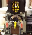
So, here it is. Ruins of Mourning, version 2.0.

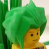
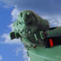
I opted to keep the figures in the front. The seem to add a sense of lonliness to the whole situation.

Here's a shot of the back where I built up a bit of the ruins. They're still falling apart.

A bird's eye view.

Gallery, when public.

And for reference, the original.

Thanks!
Knowledge is power. Power corrupts. Be Smart. Be evil.

Sister Brick @ [url=http://www.brothers-brick.com]The Brothers Brick[/url]!
User avatar
eNiGMa
Justiciar
Posts: 1842
Joined: Tue May 03, 2005 10:43 pm
Location: Taylorsville, Utah
Contact:

Post by eNiGMa »

Nice work! I actually remember seeing the original on brickshelf a long time ago (long before I even joined CC!). This is really nice, it has a better aesthetic to it IMO. I like the warrior statue the best.
Nathan Cunningham
[url=http://sly-pig.blogspot.com]Blog[/url] | [url=https://www.facebook.com/nathan.cunningham.9]Facebook[/url] | [url=http://sly-pig.blogspot.com/p/blog-page.html]MOCs[/url]
User avatar
Formendacil
Knight Templar
Knight Templar
Posts: 4162
Joined: Wed May 05, 2004 7:22 pm
Location: Ashland, MA
Contact:

Post by Formendacil »

I remember the original, and liking it.

And Mark II is nothing but improvements!

Kudos! :D
User avatar
The Yeti
Laborer
Posts: 122
Joined: Tue Feb 08, 2005 4:21 pm

Post by The Yeti »

Nice work! I actually remember seeing the original on brickshelf a long time ago (long before I even joined CC!). This is really nice, it has a better aesthetic to it IMO. I like the warrior statue the best.
Same here. It looks even better now, then it did then, and you have definitely captured the felling of loneliness in this.
Funny things DO happen--just never when you need them...
User avatar
wizardnoob28
Apprentice
Posts: 199
Joined: Thu Apr 21, 2005 12:00 pm

Post by wizardnoob28 »

Great job! I like the statues, and in the room is a skeleton of a soldier. It makes it feel like a destroyed town or something along those lines.
User avatar
Scnicker
Landlord
Posts: 978
Joined: Wed Oct 06, 2004 7:38 pm
Location: Istanbul - Turkey

Post by Scnicker »

I knew about the first one, but this one is really good. It really has the ruin feel to it with the plants, vines etc. that grew on the walls. Also the dead knight inside the ruins really adds up to the feeling. The only suggestion I might make is that the statue that wears the armor that is located at the front blocks the doorway a bit. It might be better if you move him to the left a bit.
Great Job Darkie,

-Yankı
Queen Goan
Freeman
Posts: 84
Joined: Tue Aug 30, 2005 12:38 am
Location: Vancouver, Canada

Post by Queen Goan »

Really nicely done. The door askew, the plants overgrowing it, all adds to a lonely, mournful feeling. Very lovely.

I agree with Scnicker, that one statue could do with being moved slightly to the left as it blocks the door a bit too much.
User avatar
Kanduu
Laborer
Posts: 143
Joined: Sun Aug 21, 2005 12:15 am
Location: Northern Oklahoma
Contact:

Post by Kanduu »

I like both. The idea of overgrown stuff is fun, and run-down stuff is always enjoyable (Lego and real life). Too bad I can't see it in person. Nice job, make another ;).
"Go Pokes!" :)
User avatar
plums_deify
Knight Templar
Knight Templar
Posts: 834
Joined: Thu Jan 15, 2004 7:04 am

Post by plums_deify »

Thank you all much. What you see is about the extent of my old grey bricks. When I gather enough in new grey, I'll probably do something similar.

It will be at NWBC, so if any of you are going, you can stop by and see it.

Scnicker--Statue adjusted. Thanks. :)
Knowledge is power. Power corrupts. Be Smart. Be evil.

Sister Brick @ [url=http://www.brothers-brick.com]The Brothers Brick[/url]!
User avatar
E of Alshire
Merchant
Posts: 1289
Joined: Sun Aug 28, 2005 1:10 am
Location: Tulsa, OK
Contact:

Post by E of Alshire »

Very good!

I think it could be improved only with a crumbling tower. I like towers. But it's your MOC, so if you don't like towers, then you don't have to put one in... :D

I do like how it's all overgrown and crumbly. You've captured the 'hasn't been disturbed' feeling of an ancient ruin.
LEGOFREAK wrote:I like it.
Its nice, and flowery. there is a sense of tranquility, and death about the place. [
What he said. In the forum of your previous MOC. :D
User avatar
Cyclonis
Bailiff
Posts: 300
Joined: Thu Jan 27, 2005 6:08 am
Location: Cyclopia
Contact:

Post by Cyclonis »

Great! I love landscapes and ruins and natural stuff like that. It's very 'plant-y', which is what i love. Nice statues.
User avatar
Graynar
Gentleman
Posts: 763
Joined: Tue Jul 26, 2005 10:23 pm
Contact:

Post by Graynar »

Looks great!

I like the overgrown plants and foliage too. Makes it look very abandoned. The statues are a nice tough to.

Graynar
Post Reply