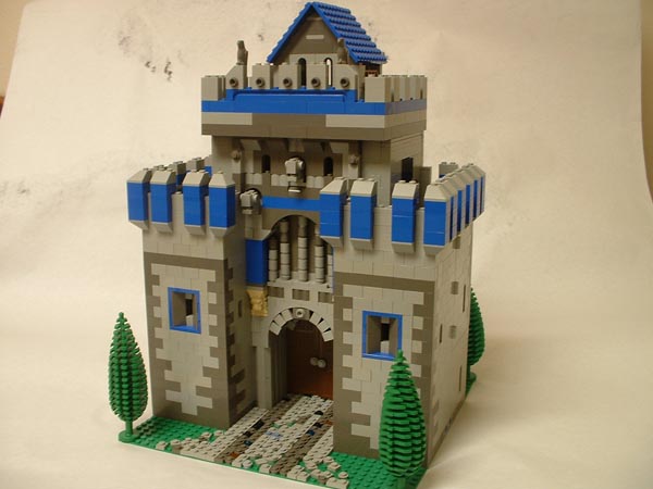
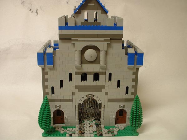
Hello all! Here's my new version of my gatehouse. Since I first posted this MOC I went away with alot of good criticism and bettered my gatehouse. I made the sides swing out, and put a "cobblestone" walk in. I also added alot more dark grey, especially on the corners, after receiving a few bricklink orders.
As always thanks for looking and any criticism is most welcome!
Edit: Since brickshelf is taking thier sweet time in moding this folder I will include a couple of teaser deeplinks.
http://www.brickshelf.com/gallery/wunzt ... ouse_a.jpg
http://www.brickshelf.com/gallery/wunzt ... ouse_g.jpg
Thanks all!
Gatehouse update
-
wunztwice

- Knight Bannerett
- Posts: 2656
- Joined: Tue Nov 29, 2005 5:33 pm
- Location: Eastern Oregon
- Contact:
Gatehouse update
in His grip, Chris
Feed my hobby? [url=http://www.bricklink.com/store.asp?p=wunztwice]My Bricklink[/url]
[url=http://www.flickr.com/photos/wunztwice]My Flickr![/url]
[url=http://www.brickshelf.com/gallery/wunztwice/]My Brickshelf
<><
Feed my hobby? [url=http://www.bricklink.com/store.asp?p=wunztwice]My Bricklink[/url]
[url=http://www.flickr.com/photos/wunztwice]My Flickr![/url]
[url=http://www.brickshelf.com/gallery/wunztwice/]My Brickshelf
<><
That's a really cool gatehouse wunztwice. It kind of looks like a Byzantine structure to me.


Jonathan
YesRomas wrote:One thing though, and pardon me if this has been adressed, but aren't the arrow slits backwards?
Jonathan
[url=http://www.bricklink.com/store.asp?p=HenrytheV]My Bricklink Store[/url]
-
wunztwice
- Knight Bannerett
- Posts: 2656
- Joined: Tue Nov 29, 2005 5:33 pm
- Location: Eastern Oregon
- Contact:
OK, ok. I admit I did build them backwards, and I built it that way with the knowledge of what I was doing. I built the arrow slits like that so that you could see them from the outside. I figured that they could function like that in real life fairly well, so there's my reasoning.
Now, other than the slits being backwards what do folks think. (also, to get it out of the way now, the blue is supposed to hlep break up the big grey wall syndrome, before anyone asks. I realise it's not exactly historical, but it's Lego.
Thanks!
Now, other than the slits being backwards what do folks think. (also, to get it out of the way now, the blue is supposed to hlep break up the big grey wall syndrome, before anyone asks. I realise it's not exactly historical, but it's Lego.
Thanks!
in His grip, Chris
Feed my hobby? [url=http://www.bricklink.com/store.asp?p=wunztwice]My Bricklink[/url]
[url=http://www.flickr.com/photos/wunztwice]My Flickr![/url]
[url=http://www.brickshelf.com/gallery/wunztwice/]My Brickshelf
<><
Feed my hobby? [url=http://www.bricklink.com/store.asp?p=wunztwice]My Bricklink[/url]
[url=http://www.flickr.com/photos/wunztwice]My Flickr![/url]
[url=http://www.brickshelf.com/gallery/wunztwice/]My Brickshelf
<><
-
smcginnis

- Justiciar
- Posts: 1868
- Joined: Sun Feb 26, 2006 9:00 pm
- Location: Santa Rosa, California
- Contact:
I like it. It would look good in a layout, except for the slanted roof. I like the wallfronts, and the columns above the gateway, plus the battlements and the gargoyles are cool. Just one thing (besides the backwords arrow slits  ), the dark gray in the path is too clear-cut, I think it is supposed to be cart tracks, but it could still use some mixing up.
~smcginnis
~smcginnis
Learning French.
Say it "ESS-MICK-GIN-ISS", with a hard "G", as in "get".
I'm a Pumpkin.
[url=http://www.freerice.com/]Free Rice[/url]
Say it "ESS-MICK-GIN-ISS", with a hard "G", as in "get".
I'm a Pumpkin.
[url=http://www.freerice.com/]Free Rice[/url]
-
E of Alshire
- Merchant
- Posts: 1289
- Joined: Sun Aug 28, 2005 1:10 am
- Location: Tulsa, OK
- Contact:
Much Improved!
I love those wrong-way windows - Let's face it, castle fans, they just look better this way - and that arched entrance is great!
Incorporating Bright color to a castle is just something I'm not good at, but you've executed it perfectly.
EDIT: That tan lion head looks really out of place - they make those in Dark Grey as well
Grand Job!
[url=http://www.brickshelf.com/cgi-bin/gallery.cgi?m=EofAlshire][img]http://www.brickshelf.com/gallery/EofAlshir ... ll_sig.jpg[/img][/url]

I like it. It is true, the window slits opposite look better..although during a siege it's like a blackhole for arrows.
I find blue a good color for castle(not a whole castle) and you blended it well here. The cobble stone pathway is done well and the molded doors on the back fit perfect.
Good job.
EDIT: The only part of the blue i'd change, is the very top where it loops around. Maybe try spacing it like the mid section.
[url=http://www.brickshelf.com/cgi-bin/gallery.cgi?m=Cyin]Brickshelf Gallery[/url]
-
The dark tide
- Gentleman
- Posts: 734
- Joined: Tue Feb 28, 2006 10:10 pm
- Location: I don't know where I am. WHERE AM I!
....................................
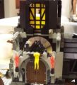
very impressive.How did you get the pieces right above the door to do that round look?
-
Bruce N H

- Precentor of the Scriptorium
- Posts: 6311
- Joined: Mon Sep 15, 2003 9:11 pm
- Location: Middle Zealand
- Contact:
Hey,
Very cool. I like all of the detail work to break up the BGW, and also the way you have it open up for interior access. Probably my favorite detail is that you remembered to have the windows ascend along with the staircase.
Bruce
Very cool. I like all of the detail work to break up the BGW, and also the way you have it open up for interior access. Probably my favorite detail is that you remembered to have the windows ascend along with the staircase.
Bruce
[url=http://comicbricks.blogspot.com/]ComicBricks[/url] [url=http://godbricks.blogspot.com/]GodBricks[/url] [url=http://microbricks.blogspot.com/]MicroBricks[/url] [url=http://minilandbricks.blogspot.com/]MinilandBricks[/url] [url=http://scibricks.blogspot.com/]SciBricks[/url] [url=http://vignettebricks.blogspot.com/]VignetteBricks[/url] [url=http://www.classic-castle.com/bricktales/]Brick Tales[/url]
Yes they do!I love those wrong-way windows - Let's face it, castle fans, they just look better this way -
And it gives the archer inside a better view.
I really like this gatehouse. It looks like a mixture of roman and medieval architecture.
Really unique!
[url=http://www.majhost.com/cgi-bin/gallery.cgi?m=RabbitSpook]My Majhost Gallery[/url]
[url=http://www.brickshelf.com/cgi-bin/gallery.cgi?m=RabbitSpook]My Brickshelf Gallery[/url]
[url=http://www.brickshelf.com/cgi-bin/gallery.cgi?m=RabbitSpook]My Brickshelf Gallery[/url]
-
wunztwice
- Knight Bannerett
- Posts: 2656
- Joined: Tue Nov 29, 2005 5:33 pm
- Location: Eastern Oregon
- Contact:
Re: ....................................
Thanks everyone!
I'm glad you all like this version. It took a while to figure out how to divide the hinged parts versus the roof pieces that lift off.
DO you mean as part of the arch? Those are just stuck up to the underside of the arch piece, it's a cool technique I figured out when I was young. I also see some others using it.The dark tide wrote:very impressive.How did you get the pieces right above the door to do that round look?
Yup I know, thanks though. I just havn't been able to get ahold of any. Sometime I may just break down and find some on bricklink.E of Elshire wrote:That tan lion head looks really out of place - they make those in Dark Grey as well
I'm glad you all like this version. It took a while to figure out how to divide the hinged parts versus the roof pieces that lift off.
in His grip, Chris
Feed my hobby? [url=http://www.bricklink.com/store.asp?p=wunztwice]My Bricklink[/url]
[url=http://www.flickr.com/photos/wunztwice]My Flickr![/url]
[url=http://www.brickshelf.com/gallery/wunztwice/]My Brickshelf
<><
Feed my hobby? [url=http://www.bricklink.com/store.asp?p=wunztwice]My Bricklink[/url]
[url=http://www.flickr.com/photos/wunztwice]My Flickr![/url]
[url=http://www.brickshelf.com/gallery/wunztwice/]My Brickshelf
<><
-
The dark tide
- Gentleman
- Posts: 734
- Joined: Tue Feb 28, 2006 10:10 pm
- Location: I don't know where I am. WHERE AM I!
....................................
AAAAh, I see know.Thanks for answering the question.
-
Fry_slayer

- Steward
- Posts: 539
- Joined: Sun Nov 21, 2004 11:52 am
- Location: was in Legoland
Your creation as a whole -- rock solid! 
Not to mention those expensive trees... Duh wish i can lay my claws.. erm hand on those.
Now would this belongs to Morcian or Royal Knights II ?
Not to mention those expensive trees... Duh wish i can lay my claws.. erm hand on those.
Now would this belongs to Morcian or Royal Knights II ?
[url=http://www.brickshelf.com/cgi-bin/gallery.cgi?m=Fryslayer]Brickshelf[/url] | [url=http://brickgamers.blogspot.com/]BrickGamers[/url]
-
Stone Goblin

- Bailiff
- Posts: 313
- Joined: Mon Oct 03, 2005 10:29 pm
- Location: In the Dark Forest
Sweet moc. 
Love the color scheme you used. Buildings are so much cooler when they can open up for easy accessability like your moc.
Keep up the good work.
Love the color scheme you used. Buildings are so much cooler when they can open up for easy accessability like your moc.
Keep up the good work.
My MOCpages:[url]http://www.mocpages.com/home.php/2746[/url]
Our store(Peppermint Pig and I)
LibertyBRICK:[url]http://www.bricklink.com/store.asp?p=Stone_Goblin[/url]
Our store(Peppermint Pig and I)
LibertyBRICK:[url]http://www.bricklink.com/store.asp?p=Stone_Goblin[/url]