Okay, so this is old, but I need an opinion (or even two):
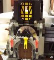
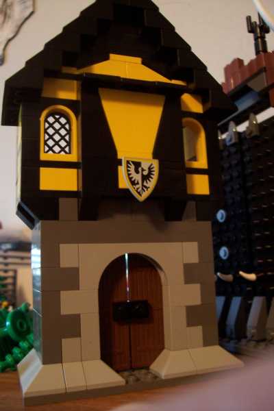
http://www.brickshelf.com/gallery/EofAl ... _tudor.jpg
http://www.brickshelf.com/gallery/EofAl ... _tudor.jpg
http://www.brickshelf.com/gallery/EofAl ... _tudor.jpg
No interior; apply within.
Thanks
Ethan
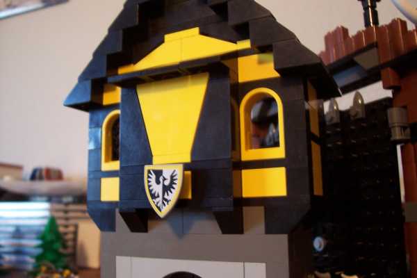
Tudor House
-
E of Alshire
- Merchant
- Posts: 1289
- Joined: Sun Aug 28, 2005 1:10 am
- Location: Tulsa, OK
- Contact:
Tudor House
Last edited by E of Alshire on Thu Apr 13, 2006 2:26 am, edited 1 time in total.
[url=http://www.brickshelf.com/cgi-bin/gallery.cgi?m=EofAlshire][img]http://www.brickshelf.com/gallery/EofAlshir ... ll_sig.jpg[/img][/url]
-
wunztwice
- Knight Bannerett
- Posts: 2656
- Joined: Tue Nov 29, 2005 5:33 pm
- Location: Eastern Oregon
- Contact:
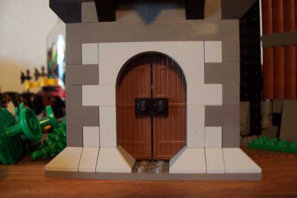
Well, its nice. I especially like the lower, stone, portion. Its hard to go wrong with alternating corner-stones; and the slopes on the bottom look good.
However the upper portion does need some work. I think if you didn't have that middle portion sticking out, but rather flush with the rest it would look better. I like the angles in that section, but not how it sticks out.
Overall a good design, and I can see it turning into a sweat MOC, especially with an interior... hehe
in His grip, Chris
Feed my hobby? [url=http://www.bricklink.com/store.asp?p=wunztwice]My Bricklink[/url]
[url=http://www.flickr.com/photos/wunztwice]My Flickr![/url]
[url=http://www.brickshelf.com/gallery/wunztwice/]My Brickshelf
<><
Feed my hobby? [url=http://www.bricklink.com/store.asp?p=wunztwice]My Bricklink[/url]
[url=http://www.flickr.com/photos/wunztwice]My Flickr![/url]
[url=http://www.brickshelf.com/gallery/wunztwice/]My Brickshelf
<><
-
Blueandwhite
- CC Mascot Maker
- Posts: 1418
- Joined: Wed Oct 13, 2004 12:12 pm
- Location: Bolton, Ontario
I disagree.wunztwice wrote:However the upper portion does need some work. I think if you didn't have that middle portion sticking out, but rather flush with the rest it would look better. I like the angles in that section, but not how it sticks out.
We see so many tudor houses, all of which look more or less the same, that it is nice to see something deviate from the norm. I actually like the upper portion because it sticks out. It gets incredibly dull to look at hundreds of tudor-style houses which all look the same. I'm glad to see that you've taken the time to mix it up a bit.
A nice effort.
Later.
Holy Hand Grenade of Antioch Batman!!
[url=http://www.brickshelf.com/cgi-bin/gallery.c ... ueandwhite]My Brickshelf Gallery[/url]
[url=http://www.flickr.com/photos/httpwwwflickrc ... eandwhite/]My Flickr[/url]
[url=http://www.brickshelf.com/cgi-bin/gallery.c ... ueandwhite]My Brickshelf Gallery[/url]
[url=http://www.flickr.com/photos/httpwwwflickrc ... eandwhite/]My Flickr[/url]

Have to agree with Blueandwhite. The top section is very sexy, I like it a lot. In not a fan of the bottom slopes personally. Tudor houses deliberately had the smallest ground level footprint possible as it was how tax was worked out. Very nice model otherwise.
James Stacey
------
www.minifig.co.uk
I'm a citizen of Legoland travellin' Incommunicado
------
www.minifig.co.uk
I'm a citizen of Legoland travellin' Incommunicado
-
J_Chartowich

- Laborer
- Posts: 143
- Joined: Fri Feb 10, 2006 3:38 pm
- Location: Colorado, USA
- Contact: