2 MOC for Svitavy

Discussion of personal LEGO Castle creations
Post Reply
User avatar
BohuslavIII
Villein
Posts: 35
Joined: Thu Jun 22, 2006 11:43 am
Location: Bohemia Regnum

2 MOC for Svitavy

Post by BohuslavIII »

For exposition at Svitavy, where my two medieval ships are placed, I made a coulisse of a city harbor. I appreciate all comments. My Czechoslovak colleagues don’t like usage of so many walls with pattern, what do you think?


Image

unfinished exposition
Last edited by BohuslavIII on Wed Feb 07, 2007 8:25 pm, edited 1 time in total.
[url=http://www.brickshelf.com/cgi-bin/gallery.cgi?m=BohuslavIII]my Gallery[/url]
Please excuse my English, is a product of the compiler. I speak only czech language.
User avatar
BohuslavIII
Villein
Posts: 35
Joined: Thu Jun 22, 2006 11:43 am
Location: Bohemia Regnum

Post by BohuslavIII »

At Svitavy exposition there will be shown not only MOCs but also original sets. I want place to one show-case some Vikings, but the whole fortress 7019 was too big. I took only the front gate and surrounding palisade and made some landscaping.
Sorry for the photo quality. What do you think?

Image
[url=http://www.brickshelf.com/cgi-bin/gallery.cgi?m=BohuslavIII]my Gallery[/url]
Please excuse my English, is a product of the compiler. I speak only czech language.
User avatar
Athos
Councilor of the Realm
Posts: 4262
Joined: Tue Jan 13, 2004 4:33 am
Location: Nevada
Contact:

Post by Athos »

First MOC:
My Czechoslovak colleagues don’t like usage of so many walls with pattern, what do you think?
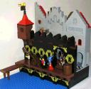
I concur... I'm also not quite clear on what the purpose of the black wall is. Particularly with the grey walls behind it.

I do like the dock, especially the small portion that is jutting out, using SNOT techniques.

Second MOC:

The landscaping on the hill for the fortress doesn't really do it for me. Can't really explain why. It just doesn't look right.

I really like the watchtower though and the sloped ramp up to the dock.

Steve

P.S. I'd split this into two threads, so we can discuss each MOC separately. :D
[url=http://www.johnny-thunder.blogspot.com/]Travel with Johnny Thunder![/url]
User avatar
Maedhros
Knight Templar
Knight Templar
Posts: 1885
Joined: Mon Jul 18, 2005 8:22 pm
Location: The dark forests of Sweden
Contact:

Re: 2 MOC for Svitavy

Post by Maedhros »

BohuslavIII wrote:My Czechoslovak colleagues don’t like usage of so many walls with pattern, what do you think?
Actually my first thought was "Sweet, I got to get myself some more of those wallpieces ;) I think that´s one of the first times ever I´ve seen those used in a MOC, and I´ve always liked them very much...

The grey wall behind looks good but I don´t really think they work with each other. Also the SNOT on the pier is quite clever, good use of those beautiful patterned plates.
"Hinc satis elucet maiorem habere uim ad discenda ista liberam curiositatem quam meticulosam necessitatem.”
- Augustinus Hipponensis
User avatar
Prince Imdol
Master
Posts: 1762
Joined: Fri Oct 20, 2006 1:11 am
Location: Massachusetts

Post by Prince Imdol »

These are really good mocs, well done.
User avatar
Norro
Councilor
Posts: 1197
Joined: Mon Jan 26, 2004 8:45 am
Location: Ireland
Contact:

Post by Norro »

Wow, nice work! I've never seen so many of those DM wall pieces in one place and that really makes your model unique. I also like the cramped walkway between the two walls. The viking tower is also great!

God Bless,

Nathan
User avatar
Spongey
Merchant
Posts: 1377
Joined: Sun Aug 13, 2006 4:39 pm
Location: Canada

Post by Spongey »

I agree that too many printed pieces can ruin a MOC. However, I think that you are still within the limits of a good number of these printed pieces, and therefore, I think that both of your MOCs are very good.
User avatar
Traveler
Reeve
Posts: 491
Joined: Sat Jul 29, 2006 5:42 pm

Post by Traveler »

I'm not a fan of that particular printed piece, mainly because I find the color a bit garish for castle creations, but it's really a personal preference. If you like them, by all means continue to use them!
User avatar
Bruce N H
Precentor of the Scriptorium
Posts: 6311
Joined: Mon Sep 15, 2003 9:11 pm
Location: Middle Zealand
Contact:

Post by Bruce N H »

Hey,

The walled harbor is really nice. That's actually one of the first times I've liked that printed piece. The matching arches under the dock go well with it. The three different rooflines on the buildings behind the wall are nice as well.

On the viking scene I would pretty much repeat what Steve said above.

Bruce
[url=http://comicbricks.blogspot.com/]ComicBricks[/url] [url=http://godbricks.blogspot.com/]GodBricks[/url] [url=http://microbricks.blogspot.com/]MicroBricks[/url] [url=http://minilandbricks.blogspot.com/]MinilandBricks[/url] [url=http://scibricks.blogspot.com/]SciBricks[/url] [url=http://vignettebricks.blogspot.com/]VignetteBricks[/url] [url=http://www.classic-castle.com/bricktales/]Brick Tales[/url]
User avatar
jens
Lord
Posts: 238
Joined: Sat Apr 02, 2005 9:36 pm
Location: Germany

Post by jens »

The first MOC is nice, but I think there are too much printed bricks in the same direction used. It's to homogeneously distribute for me. But this is only my opinion.

The second MOC I like much more. It looks really like one of these showcases, where the sets are displayed and surrounded by a few builded accessories.

The landscaping here looks - in my eyes - good. I don't like the use of slopes for landscaping, neither at rocks, nor at corrugations. But there are not very mich used, it works for me.
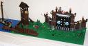
Steve wrote: The landscaping on the hill for the fortress doesn't really do it for me. Can't really explain why. It just doesn't look right.
Bruce N H wrote: On the viking scene I would pretty much repeat what Steve said above.
So it would be interessting for me to hear why you don't like this landscaping?

regards,
jens
User avatar
E of Alshire
Merchant
Posts: 1289
Joined: Sun Aug 28, 2005 1:10 am
Location: Tulsa, OK
Contact:

Post by E of Alshire »

My Czechoslovak colleagues don’t like usage of so many walls with pattern, what do you think?
I like these- I think this is one of the few excuses for using many wall peices, when there's a design on it.
User avatar
Sibley
Foot Soldier
Posts: 243
Joined: Mon Jul 18, 2005 8:48 pm
Contact:

Re: 2 MOC for Svitavy

Post by Sibley »

BohuslavIII wrote:My Czechoslovak colleagues don’t like usage of so many walls with pattern, what do you think?
I like the effect, especially augmented by the newer viking tiles.
~Dan Sibley
[url=http://www.brickshelf.com/cgi-bin/gallery.cgi?m=DSibley]Brickshelf[/url] | [url=http://www.mocpages.com/home.php/1225]MOCPages[/url] | [url=http://www.flickr.com/photos/dsibley/]Flickr[/url]
User avatar
wunztwice
Knight Bannerett
Posts: 2656
Joined: Tue Nov 29, 2005 5:33 pm
Location: Eastern Oregon
Contact:

Post by wunztwice »

I just realized I had not replied to this yet!

I actually like the use of the decorated parts. I've always like them and never could get them to look right in a MOC. You've broken that "hold" by using them seqentially throughout the MOC. It's almost overbearing, but not.

I especially like the use of the decorated arches, and the brown tile parts (those are beautiful aren't they?)
in His grip, Chris

Feed my hobby? [url=http://www.bricklink.com/store.asp?p=wunztwice]My Bricklink[/url]

[url=http://www.flickr.com/photos/wunztwice]My Flickr![/url]
[url=http://www.brickshelf.com/gallery/wunztwice/]My Brickshelf![/url](not updated...)
<><
User avatar
kelderic
Knight Bannerett
Posts: 2583
Joined: Mon May 01, 2006 8:45 pm
Location: Indiana, USA
Contact:

Post by kelderic »

I would have to disabgree with your colleagues, because I think that the golden dragons look great in that pattern. The bottom arches really complement the top pieces. Also, the wooden out cropping really seems well placed and natural.

Kelderic
Battling with college to try and prevent the dark age.
Post Reply