Page 1 of 2
Brick-At-Arms
Posted: Fri May 19, 2006 11:50 am
by Peppermint Pig
After doing some google searching, I settled on Brick-At-Arms for the title of the Lego gaming system I am designing. Not to put the cart before the horse, but I always get hung up on such details, like the TITLE. I see no harm in posting this before I publish more of the actual system. Never know when such details will be completed, you know?

My first goal is to write up Castle content, and I am allowing for an expansion into other themes later. So it will be Brick-At-Arms: Castle, or Brick-At-Arms: Space. If I complete the system work, I guarantee there will be some great illustrations and gaming template sheets to accompany. I'm about on par with rayhawk in terms of digital illustration, though I'll need some practice with lego figure drawing, especially in that distorted style...
A very brief summary of the system so far: Faction oriented hierarchial army system with multiple play options: Freeform, Campaign, and Journeyman venues are flexible to the player without compromising the core of the system, allowing players of diverse experience and available time to find a solution. Allows for plenty of customization. System does not require/depend upon continuuity for unit record keeping across battles, nor does it require points-based unit purchasing for battles, but allows for either. Gameplay can be turn-based or round-based, utilizing action points and initiative statistics. Current Status: Statistics system is 99% complete. Army hierarchy & dynamics about 75% complete. Content and specialized rules are 4% formulated.
I'd very much like to discuss issues with tabletop lego gaming in general so that I can avoid any pitfalls found in the alternative systems. I appreciate game design imput if you have any, and feel free to ask questions about this system! It helps, alot!

Oh, also, any logo ideas??
Re: Brick-At-Arms
Posted: Fri May 19, 2006 7:27 pm
by eNiGMa
Peppermint Pig wrote:with multiple play options: Freeform, Campaign, and Journeyman venues are flexible to the player without compromising the core of the system
Sweeeet.

This game sounds like a blast. Though I have no ideas to offer, I would like to say that I can't wait to see the finished product so I can give it a try.
Posted: Fri May 19, 2006 7:45 pm
by Lord Nev
It's a little Greek to me but it sound like fun!

Re: Brick-At-Arms
Posted: Fri May 19, 2006 8:57 pm
by E of Alshire
Peppermint Pig wrote:though I'll need some practice with lego figure drawing, especially in that distorted style...
I beleive you mean "stylized." Sounds much more professional.
Anyway, sounds good! I'd like to see a competitor to Brickwars; if not just for new ideas.
Posted: Fri May 19, 2006 11:43 pm
by ragnarok
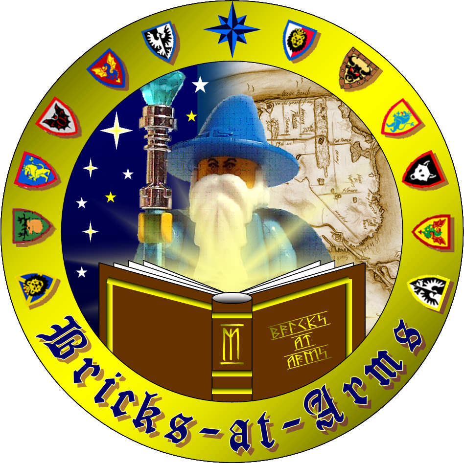
I've tried to master something as a logo for you. Here is a deep link:
http://www.brickshelf.com/gallery/ragna ... aalogo.png
I didn't exactly follow the name but more like the general idea of your project.
P.S. If
Peppermint Pig doesn't find it useful but anyone else does, feel free to contact me to change the name or something else and it's yours.
For the sake of helping a fellow user I used a picture of
lordofthelego's
Majisto from his Brickshelf gallery since my bricks are currently some 200 miles away and I did not have a proper picture. Please, if there is a problem PM me and I will remove the image.
Posted: Fri May 19, 2006 11:46 pm
by eNiGMa
Wow, great logo, ragnarok! It looks very professional.
Posted: Sat May 20, 2006 3:00 am
by Peppermint Pig
I beleive you mean "stylized." Sounds much more professional.
Yeah, stylized.
That's a cool logo mockup. One issue I have is making the logo universal to all of Lego's themes, but having a custom logo for each theme with a common design layout would work. Thank you very much ragnarok. The wheels in my mind are churning.
Stone Goblin just approached and took a look at the logo. He likes it and thinks it fits with the magic and factions of castle, but agrees with me on making something more universal.
SG is doing some sketches with me, and I'll post some concepts soon
Posted: Sat May 20, 2006 6:25 pm
by Fry_slayer
Since you asked for a logo might as well try one which follow the rules of a logo, cant get enough of the skulls. For some reason this idea just pop up after i saw ur post....
must.... put into.... realisation...

Skull and weapons, how much more universal can you get at war?
Posted: Sun May 21, 2006 8:13 am
by Peppermint Pig
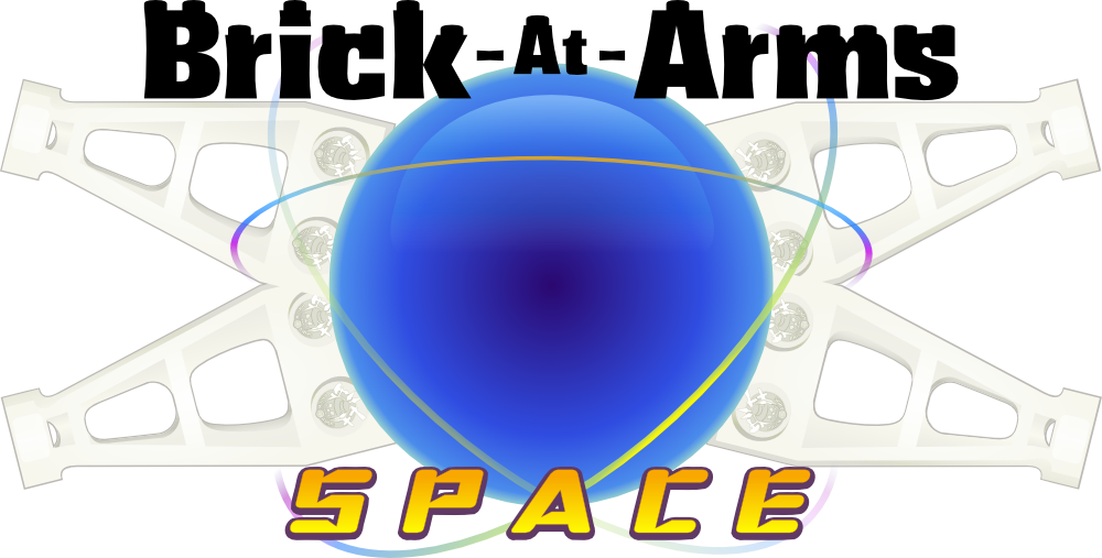
The talent at this forum never ceases to amaze me. I really like that logo Fry_slayer! In fact, I re-vectorized it and applied it to a WIP vector piece I'm doing for BAA Space. Take a look!
http://www.brickshelf.com/gallery/Pep/A ... ip_001.png
It took me some time to build the space wing, but I think it really adds to whole composition... might need to move the wings closer in, but that could cover up the logo you did...
I'm not totally decided on the main logo yet since it's not conveying the exact feeling I want.. leaning towards a sans font with some weight to it, with a hint of the plain lego typeface used on packaging. Not sure if I will continue to add studs on top of the letters. Let me know if that's good or bad. I'll be adding some painter illustrations of space figs in the center later... this is after all my first work in progress export, so more to come
Posted: Tue May 23, 2006 10:22 am
by Fry_slayer
An expansion set of rules for space from the core system, now that gets me itchy again. There comes a point in life when few things matter anymore, oddly enough trying logo ideas which excites me for other people seems to be one of them.
A decent try you have there
but you are off track in terms of basic rules in creating a logo: You must a have focus. Either you make the wards bigger than the graphics or vice versa or it will fall flat. Try either making the graphic elements or the wardings the main focus and the other as support element, you might be surprised of the end result.
Another issue is the small details like the studs you are putting on the wards, while it is a nice touch always consider the minimum size you will be displaying them. Just imagine for a second how would it look if it were to be scaled down small and put on the upper left side of the web page or on a namecard for starter.
I should stop now as anymore blunder from me and this post might end up in publishing
So heres my take, again
Posted: Tue May 23, 2006 11:01 am
by ragnarok
A lot of originality and classy work on the forum!
That looks like a nice development of the general idea that you presented two posts above - there is a clear link between the overall topic and the chapters/themes included. However if I were you I would go for someway incorporating the "SPACE" tag into the logo itself rather than leaving it aside. Another idea would be using some customized font like dots, cosmic or mey be even calc, and see how it fits.
http://www.brickshelf.com/gallery/Pep/A ... ip_001.png
I like the orb in its simplicity and yet perfection but I must agree with
Fry_slayer about the wardings and the focus of the logo.
Posted: Fri Jun 09, 2006 2:03 am
by Peppermint Pig
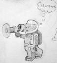
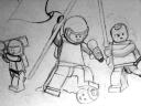
Sorry for the delay here. That's a great looking logo Fry. I wish I could show you my updated logo... My computer has been giving me a hard time and I may need to reinstall the system since I can't get my vector tools working. On the bright side, I have some sketches to share..
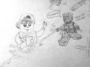
These first few are rough sketches of space figs that I want to put together for a painter scene.
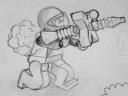
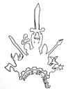
Stone Goblin's pen sketch of a logo idea.
This last one is a bit of fun: Timmy the time traveler is being eradicated for his temporal tampering.
Posted: Fri Jun 09, 2006 3:07 pm
by amadeus
I just bought 6 pounds of vintage space sets, so I'm ready to go with Brick-at-Arms space.
Posted: Fri Jun 09, 2006 6:05 pm
by TwoTonic Knight
I take it this is to be skirmish level gaming. Really, what comes to mind is how will it differ from Rayhawk's system? I'd suggest cleaner and simpler, but reading your description it doesn't seem that's the way you are going.
Posted: Fri Jun 09, 2006 11:02 pm
by E of Alshire
Peppermint Pig wrote:This last one is a bit of fun: Timmy the time traveler is being eradicated for his temporal tampering.
The sketches look great, but as TwoTonic said, how will this differ from Rayhawk's work? Also, unless this is simply an abbreviation of BrikWars, I'd try to avoid iconic BrikWars minifigs, such as Timmy and Jaw-Jaw.