Page 1 of 1
Goblin
Posted: Sun May 04, 2008 6:47 pm
by Lamanda2
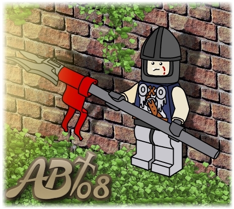
Just a little piece of artwork I made of one of my LEGO Goblins:
 -Deeplink-
-Flickr Link-
-Deeplink-
-Flickr Link-
I actually drew the Goblin itself a while ago, but made the background for him yesterday on The Gimp when playing around with it for a bit.
The shadowing probably isn't accurate to where the light is coming from, but I think it turned out alright otherwise.
C & C Welcome!
~Amanda
Posted: Sun May 04, 2008 7:18 pm
by Quickblade22
Great work Amanda! I'm really liking your new signature at the bottom of your artwork.
Posted: Sun May 04, 2008 10:33 pm
by LORD DOOM
Yay! Gobbies!
What a beautiful rendering Amanda.

As you may or may not know, I am your biggest goblin fan. I almost prefer your custom painted heads to that of the official LEGO© trolls. I do think they look better in green and more like goblinses but you're the artist so who am I to talk. And the background is wicked awesome, (Even though you cheated.

)
And as Eric says, your signature is excellent although it's size does distract a bit from the image, however that's a good thing if you really want your work to be recognized.
Again, great illustration. You have many talents! Yay!

Posted: Mon May 05, 2008 4:06 am
by Lamanda2
"As you may or may not know, I am your biggest goblin fan. I almost prefer your custom painted heads to that of the official LEGO© trolls."
I don't think I could pick a better fan myself! Thanks for the kind words, DOOM.
"..I do think they look better in green and more like goblinses but you're the artist so who am I to talk."
I defintetely prefer them in green as well, but I always like a little variation in my minifigs. What would probably be best is for me to give the tan gobbies a whole different name. Since when I think Goblins, green is the color that pops in my head.
"And the background is wicked awesome, (Even though you cheated. )"
Heheh. Thanks!
 "I'm really liking your new signature at the bottom of your artwork."
Thanks. I got bored with my old plain one, so I thought I'd mix it up some.
"And as Eric says, your signature is excellent although it's size does distract a bit from the image, however that's a good thing if you really want your work to be recognized."
I agree the size of the sig in this image was pretty big, probably should have down-sized it a notch, but it filled up that corner nicely (It just yelled, "Blah" in my face before
).
If anyone would like to see it with a smaller sig which blends in better,
here ya' go! Looks nice I think!
Thanks again!
~Amanda
Posted: Tue May 06, 2008 4:05 am
by kelderic
Very nice, Amanda! The proportions look good on the fig, and the background looks realistic. Only one criticism, actually, and nothing really important. From the way the shadows are falling, the light is in front of the fig, so the left side of his helmet should be lighter, not darker. Besides that, (and the fact that it's a fleshie, nooooo!!!!!! hehe, j/k), it looks great!
Kelderic
Posted: Tue May 06, 2008 4:00 pm
by Lamanda2
"From the way the shadows are falling, the light is in front of the fig, so the left side of his helmet should be lighter, not darker."
Heheh. You're right!
Since I had drawn the fig itself on it's own a while back, I forgot to switch that for this image!
"(and the fact that it's a fleshie, nooooo!!!!!! hehe, j/k), it looks great!"
Hey! He's not fleshie- He is tan!!
~Amanda