Preparing Flickr banner images
Posted: Tue Jul 30, 2013 7:50 pm
Hey all,
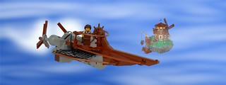
In this thread Sergeant Chipmunk posted an amazing MOC. BTW, the great presentation deserves a post in its own right in the publishing forum, but I'll let him do that if he wishes. I want to focus on Flickr banner photos.

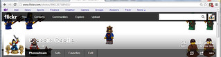
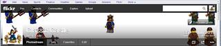
SC decided to make this his Flickr banner image, and I agree that this is a great idea. Unfortunately, due to the shape of the Flickr banner, difficulties with editing it, and most importantly all of the text that gets plastered across it, it comes out looking like this:

Still very cool, but it loses a lot of the impact of the full photo. How can we fix this? And more to the point, how can you do the same for your banner photos? Okay, here's what I did. All of this is in Gimp, though you can use Photoshop or other programs. See this tutorial on downloading and using Gimp if you need to understand about using layers in Gimp.
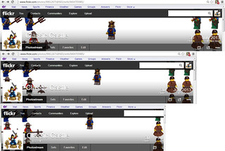
Okay, first I took a screencap of his banner and pasted it into Gimp (above). I made this the top layer, with a white layer underneath. I was sure to add a transparency mask to the top layer, and I cut out all of the "image space", to give something like this (the white space is all a cutout from the top layer). I'll call this the "frame".

Then, since his image is a silhouette against a gray background, I made this quick mock-up background. This isn't really necessary, it will just help to see how the final image will turn out. In this image the "frame" is hidden.

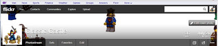
Here's what it looks with the "frame" turned visible.

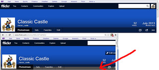
Okay, next I took Sgt Chipmunk's original image, and pasted it into this Gimp file, in a layer over the mock-up background, but below the "frame" layer. I used the 'scale layer' option and moved the original image around to best highlight it, coming up with the following:

Turning off the "frame" layer, we can see the image that would give rise to this banner. I suppose it would be possible to just go with this roughly edited version, and I'm sure more careful Photoshoppery (I know, Gimpery to be more accurate in my case) you could come up with a good image. OTOH, If Sgt Chipmunk wanted to do this, he could just rebuild the MOC and re-take the photo. In this particular case this would be pretty easy, since it would just be adding black to extend the ground on either side of the action, and re-take the photo, zooming out appropriately.

However, let's say we're not quite satisfied. This just clumps the action in the middle, and wastes sections of the "frame". What if we rebuilt the MOC specifically to fit the "frame"? If you go back and look at the "frame" you'll see that it's irregularly shaped - narrower at the edges, and fatter in the middle-right portion.
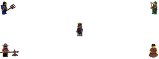
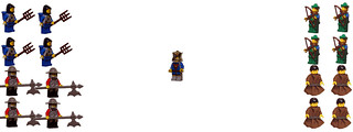
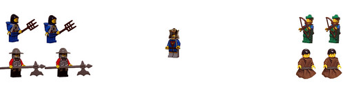
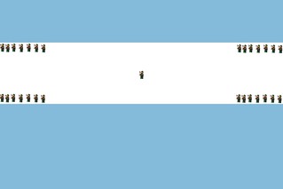
So, here's what I did. In Gimp I took Sgt. Chipmunk's original image and broke it into three pieces - the two figs on the left, moon in the middle, and the fig and the tree on the right. I made these into three separate layers, and moved each of them relative to the "frame" and background to come up with the following:

Here's what it looks like if the "frame" is removed. Now, if Sgt Chipmunk wanted to, he could rebuild the MOC to look like this and re-take the photo. Again, in this particular case, the fact that it is all silhouette makes rebuilding reasonable, as all this would do is take sections of the original apart and add in a big black wall of bricks, with some plates in the middle to give some sloping between the sections. BTW, if something like the image below were used, the result with the "frame" included automatically by Flickr would look better than the image directly above this paragraph, because I've got gray behind the text, but in Flickr the text would be sitting against that black part of this image.

Now, I show this not to suggest that Sgt Chipmunk needs to change his banner. I'm only picking on him because his image is so cool, and also the silhouette nature makes it a little easier to do all of this manipulation. Rather I want to suggest that people think about their banner images. If you think about the different elements you want in your image, you can play around with them in Gimp or Photoshop to see how you can optimize your image, and then go build accordingly. Think about putting the key parts of your image in the unobstructed part of the banner space, and conversely put relatively neutral parts of your image behind your name and other text.
I should note that there are certainly other options for banner images. A single MOC against a white or otherwise plain background can work well, particularly if the MOC stretches horizontally rather than vertically. Some sort of fairly random pattern, such as a pile of bricks, can also be very effective. Whatever you choose, though, the technique I suggested above of clipping out a "frame" and using that as a top layer in Gimp or Photoshop will help you crop and size your image to get the best overall result given the odd shape of the banner space and the placement of the text.
Anyway, I hope this helps. Sgt. Chipmunk, thanks for being the example here.
Bruce
In this thread Sergeant Chipmunk posted an amazing MOC. BTW, the great presentation deserves a post in its own right in the publishing forum, but I'll let him do that if he wishes. I want to focus on Flickr banner photos.
SC decided to make this his Flickr banner image, and I agree that this is a great idea. Unfortunately, due to the shape of the Flickr banner, difficulties with editing it, and most importantly all of the text that gets plastered across it, it comes out looking like this:
Still very cool, but it loses a lot of the impact of the full photo. How can we fix this? And more to the point, how can you do the same for your banner photos? Okay, here's what I did. All of this is in Gimp, though you can use Photoshop or other programs. See this tutorial on downloading and using Gimp if you need to understand about using layers in Gimp.
Okay, first I took a screencap of his banner and pasted it into Gimp (above). I made this the top layer, with a white layer underneath. I was sure to add a transparency mask to the top layer, and I cut out all of the "image space", to give something like this (the white space is all a cutout from the top layer). I'll call this the "frame".
Then, since his image is a silhouette against a gray background, I made this quick mock-up background. This isn't really necessary, it will just help to see how the final image will turn out. In this image the "frame" is hidden.
Here's what it looks with the "frame" turned visible.
Okay, next I took Sgt Chipmunk's original image, and pasted it into this Gimp file, in a layer over the mock-up background, but below the "frame" layer. I used the 'scale layer' option and moved the original image around to best highlight it, coming up with the following:
Turning off the "frame" layer, we can see the image that would give rise to this banner. I suppose it would be possible to just go with this roughly edited version, and I'm sure more careful Photoshoppery (I know, Gimpery to be more accurate in my case) you could come up with a good image. OTOH, If Sgt Chipmunk wanted to do this, he could just rebuild the MOC and re-take the photo. In this particular case this would be pretty easy, since it would just be adding black to extend the ground on either side of the action, and re-take the photo, zooming out appropriately.
However, let's say we're not quite satisfied. This just clumps the action in the middle, and wastes sections of the "frame". What if we rebuilt the MOC specifically to fit the "frame"? If you go back and look at the "frame" you'll see that it's irregularly shaped - narrower at the edges, and fatter in the middle-right portion.
So, here's what I did. In Gimp I took Sgt. Chipmunk's original image and broke it into three pieces - the two figs on the left, moon in the middle, and the fig and the tree on the right. I made these into three separate layers, and moved each of them relative to the "frame" and background to come up with the following:
Here's what it looks like if the "frame" is removed. Now, if Sgt Chipmunk wanted to, he could rebuild the MOC to look like this and re-take the photo. Again, in this particular case, the fact that it is all silhouette makes rebuilding reasonable, as all this would do is take sections of the original apart and add in a big black wall of bricks, with some plates in the middle to give some sloping between the sections. BTW, if something like the image below were used, the result with the "frame" included automatically by Flickr would look better than the image directly above this paragraph, because I've got gray behind the text, but in Flickr the text would be sitting against that black part of this image.
Now, I show this not to suggest that Sgt Chipmunk needs to change his banner. I'm only picking on him because his image is so cool, and also the silhouette nature makes it a little easier to do all of this manipulation. Rather I want to suggest that people think about their banner images. If you think about the different elements you want in your image, you can play around with them in Gimp or Photoshop to see how you can optimize your image, and then go build accordingly. Think about putting the key parts of your image in the unobstructed part of the banner space, and conversely put relatively neutral parts of your image behind your name and other text.
I should note that there are certainly other options for banner images. A single MOC against a white or otherwise plain background can work well, particularly if the MOC stretches horizontally rather than vertically. Some sort of fairly random pattern, such as a pile of bricks, can also be very effective. Whatever you choose, though, the technique I suggested above of clipping out a "frame" and using that as a top layer in Gimp or Photoshop will help you crop and size your image to get the best overall result given the odd shape of the banner space and the placement of the text.
Anyway, I hope this helps. Sgt. Chipmunk, thanks for being the example here.
Bruce