Harry Potter drawng

Discussion of photography, editing and publishing techniques
Post Reply
User avatar
Graynar
Gentleman
Posts: 763
Joined: Tue Jul 26, 2005 10:23 pm
Contact:

Harry Potter drawng

Post by Graynar »

Hey guys,

I drew this scene today;

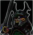
I present our flesh tone friend-Harry Potter, facing his pale faced enemy-Lord Voldmort! Engaged in a deadly duel, Lord Voldmort prepares a sinister attack!

Image

Enjoy!

Please tell me what you think. ;)

Graynar
User avatar
Cyclonis
Bailiff
Posts: 300
Joined: Thu Jan 27, 2005 6:08 am
Location: Cyclopia
Contact:

Post by Cyclonis »

Thats magnificent! Inspiration has strucked me! How old are you?
User avatar
Recluce
Landlord
Posts: 975
Joined: Fri Aug 19, 2005 4:36 pm
Location: Santa Rosa, CA

Post by Recluce »

Ok, only a few gripes..... the right hand of Voldemort is somewhat wrong... like, where is the arm? And if the arm is behind him, then the angle of the hand is different than what you drew. Also a similar thing for Harry, his left arms and hand look weird... I think the hand is too small, and the arms too long. Harry's hair looks a bit odd, too, maybe too oblong? Make it rounder? Otherwise, I'd say its another excellent little picture.

What medium are you using? Paper, inks, and color pencils?
User avatar
Graynar
Gentleman
Posts: 763
Joined: Tue Jul 26, 2005 10:23 pm
Contact:

Post by Graynar »

Cyclonis wrote:
How old are you?
15

Recluce wrote:
the right hand of Voldemort is somewhat wrong... like, where is the arm? And if the arm is behind him, then the angle of the hand is different than what you drew.
Hehe, my bad, I'm used to drawing people, not LEGO men. They are proportioned differently, but the arm is behind the hand. The pose in the arm is a little un-LEGO like.
Also a similar thing for Harry, his left arms and hand look weird... I think the hand is too small, and the arms too long
A mistake to fix in future drawing.
What medium are you using? Paper, inks, and color pencils?
Normal computer paper, a differed asortment of pencil crayons, and mechanical pencils.

My bad, I hope this picture wasn't a complete flop. I'm glad you liked it Cyclonis.

Thanks,

Graynar
User avatar
Recluce
Landlord
Posts: 975
Joined: Fri Aug 19, 2005 4:36 pm
Location: Santa Rosa, CA

Post by Recluce »

No, not a flop at all. That was just constructive criticism. I still really like the drawing, it truly captures the essence of the graveyard set!
User avatar
eNiGMa
Justiciar
Posts: 1842
Joined: Tue May 03, 2005 10:43 pm
Location: Taylorsville, Utah
Contact:

Post by eNiGMa »

This is my favorite so far! I love the background the best; the building (Due to a brain fart, I forget the name at the moment), the moon, and all the Death Eaters. Keep up the good work!
Nathan Cunningham
[url=http://sly-pig.blogspot.com]Blog[/url] | [url=https://www.facebook.com/nathan.cunningham.9]Facebook[/url] | [url=http://sly-pig.blogspot.com/p/blog-page.html]MOCs[/url]
User avatar
Cyclonis
Bailiff
Posts: 300
Joined: Thu Jan 27, 2005 6:08 am
Location: Cyclopia
Contact:

Post by Cyclonis »

eNiGMa wrote:...the building (Due to a brain fart, I forget the name at the moment)...
The moselium? ;)
Yeah I love that one the best aswell, but I'm more castle than HP.
-Cyclonis
Post Reply