This is the next installment of the now weekly theme review. I will be alternating with Prince Imdol, who will do Black Falcons next week.
I know that KKII can be a touchy topic on this site. However, I believe that, if we all keep our emotions in check, we can try and convey our likes and dislikes without disrespecting others' opinions. Please, try and take this opportunity to make a calm, informative theme review. Let's not get this thread locked!
KKII was released in 2004, and ended in 2006. Sets included Vladek's Dark Fortress and Battle of the Pass. Please feel free to review figs, sets, and the general aura of the theme. (Be nice!)
Theme Review: Knights Kingdom II
-
Prince Imdol
- Master
- Posts: 1762
- Joined: Fri Oct 20, 2006 1:11 am
- Location: Massachusetts

Gonna break it down into the 3 generations:
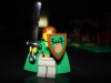
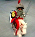
KK2.1: New shields, new visors, new swords. I really don't have a problem with the vibrant colors, and the printed armors aren't that bad. Some of the sets were less-than-average, though. And not enough small sets for kids to dump allowance money on. The smallest set was like $8 and priced at least twice what it was worth. I think 8778 and 8780 were the two best sets of the line.
KK2.2: Triangle shields are back, and now the armors are a little less useful with each knights animal emblem decal. 8875 was far too fragile, but other than that, I really enjoyed these sets.
KK2.3: Now these sets are pretty nice. I love the armors with the rivets and other decals on them. A very nice touch. The addition of a mace as a weapon was a nice touch, and they didn't even have to mold new pieces. I love 8813, 10 figs (each with armor) for $40? Can't go wrong there.
Action Figure knights: No. Just... no.
Peeron contributions: 577 (Viking Chess), 7009, 7654, 7655, 7695, 7771, 8813, 8821, and 8822.
[url=http://www.brickshelf.com/cgi-bin/gallery.cgi?m=MaccyG]My Brickshelf Gallery[/url]
[url=http://www.brickshelf.com/cgi-bin/gallery.cgi?m=MaccyG]My Brickshelf Gallery[/url]
-
zac_schmitt
- Freeman
- Posts: 78
- Joined: Fri Jun 30, 2006 4:56 am
well, we're just asking for trouble with this one, aren't we? 
kk2 never bothered me at all. the colors didn't bother me one whit, the set design was okay, the figs looked good to me...so i never could have really complained too much if i'd wanted to. on top of that there were several sets i really genuinely enjoy playing with.
all in all, coulda gotten better for the money, but it wasn't a waste of my time. if we were assigning letters grades to this sort of thing, factions like crusaders, black falcons and the recently reviewed black knights would get high b's and a's, whereas kk2 gets solid c+'s and b-'s. overall, a c+ seems fair enough.
79% of Classic Castle hates KK2. If you're one of the 20% that loves it, paste this into your sig. Started by Danju.
-
Danju the Clever

- Artisan
- Posts: 272
- Joined: Sun Apr 23, 2006 12:47 pm
- Location: Why do you need to know this, anyway?
The reason I hated it was the storyline. I miss the days where kids could make up their own adventures, and not have to rely on a comic to see how to play with the set. The universe is losing its creativity due to electronics (Not blaming them, though - Might and Magic really sparked my imagination as a kid) and I wish Lego would not feed that.
Though the new line hopefully has no story...
Though the new line hopefully has no story...
[img]http://tickers.TickerFactory.com/ezt/d/4;10 ... /event.png[/img]
-
Troy T. Moore
- Gentleman
- Posts: 710
- Joined: Thu Sep 18, 2003 10:58 am
- Location: Saskatchewan, Canada
I think the structure of the buildings while allowing for easy building is perhaps the worst part of the theme. I will admit though, I do use the BUTP quite regularly in my own creations, partly because they save a lot of time.
The knights themselves are highly controversial because of the colours. I think individually with the exception of baby-blue they're all fantastic, as red can go with royal knights and green to the forest men etc, but the fact there's an absolute spectrum of colours all defending the same castle is maybe a bad design, as is the lack of generic hero sentries. The Scorpion Knights are better though, and Vladek is a great kingdom "darklord".
Besides the Castles, the other downfall I felt was the catapults. A lot were completely absurd in their design and function, but again, perhaps with the castles themselves, they would be a lot of fun if you were younger.
artificial snow
-[url=http://www.richard-am.net/]richard-am.net[/url] [url=http://www.richard-am.net/tagged/lego]/lego[/url]-
[img]http://www.brickshelf.com/gallery/lord-of-o ... tizen4.jpg[/img] [img]http://farm4.staticflickr.com/3834/95487351 ... 3d8e_t.jpg[/img]
-[url=http://www.richard-am.net/]richard-am.net[/url] [url=http://www.richard-am.net/tagged/lego]/lego[/url]-
[img]http://www.brickshelf.com/gallery/lord-of-o ... tizen4.jpg[/img] [img]http://farm4.staticflickr.com/3834/95487351 ... 3d8e_t.jpg[/img]
(though) im not a big fan of KKII at all, i did buy a couple of sets - the KK chess set which is nice in itself, but also a cool army builder, and 8877 vladek's castle. i must say VDF is better than its recent predecessors, including 8781, 6098 and maybe even 6097. the shadow knights are pretty cool, especially their helmet. I actually like the faces of the KKII jellybeans, but that's really all i can say about KKII. everything else, except maybe the vladek's barding, is really lego castle at its lowest point.
~~ Supernova ~~
Good trades with: Chrislad77, kelderic, Strider, Unknown Knight and ZIGGY!
Good trades with: Chrislad77, kelderic, Strider, Unknown Knight and ZIGGY!
-
Blueandwhite
- CC Mascot Maker
- Posts: 1418
- Joined: Wed Oct 13, 2004 12:12 pm
- Location: Bolton, Ontario
Well, where to begin  ?
?
Lets start by stating the obvious: I do NOT like KKII.
For me, this theme was about the worst castle line LEGO has ever produced. The sets were little more than glorified playsets. Gimmicks were given priority at the expense of sound design. Wheeled horses and an Indiana Jones styled "citidel" were the order of the day. Most offensive of course was the fact that these playsets lacked the basic assortment of bricks needed for even basic MOCing.
I won't hold the colour change against the KKII sets, however it made the sets pretty worthless as parts packs for those of us who still collect in old grey. Personally, I feel the colours looked decent enough, but the set designs were so sub-standard that it hardly matters.
If you can get past the fact that the sets were designed as playsets, and that building and MOCing has obviously taken a back seat, then there is still the matter of the minifigs themselves. Personally, I just don't like the Jellybean Knights. I don't like their heavily stylized space helmets or their vibrant, yet monochromatic colour schemes. I'm not fond of their power swords or their strange heraldry. For me, these guys remind me of that 80s cartoon dud: Visionaries.
I appologize if you like this line, but I think it is absolutely horrible.
Holy Hand Grenade of Antioch Batman!!
[url=http://www.brickshelf.com/cgi-bin/gallery.c ... ueandwhite]My Brickshelf Gallery[/url]
[url=http://www.flickr.com/photos/httpwwwflickrc ... eandwhite/]My Flickr[/url]
[url=http://www.brickshelf.com/cgi-bin/gallery.c ... ueandwhite]My Brickshelf Gallery[/url]
[url=http://www.flickr.com/photos/httpwwwflickrc ... eandwhite/]My Flickr[/url]
-
Prince Imdol
- Master
- Posts: 1762
- Joined: Fri Oct 20, 2006 1:11 am
- Location: Massachusetts
-
kelderic
- Knight Bannerett
- Posts: 2583
- Joined: Mon May 01, 2006 8:45 pm
- Location: Indiana, USA
- Contact:
Likes:
I did like some of the new pieces. For instance, a few of the prefab wall pieces were useful. Also, the black euro armor, and all the euro armor from KKK2.3 was very nice.
Dislikes:
I hated the storyline. I think is violates the whole essance of lego, which is the openness of it. It is suppose to inspire creativity, and imagination, but with such a binding storyline, it defeats the purpose.
Edit
ANother thing I forgot, is that I really like the rectangular shields. They are perfect for Roman shields, and they are the one thing that I really like from KKII.
Kelderic
Last edited by kelderic on Sun Feb 04, 2007 5:55 pm, edited 2 times in total.
Battling with college to try and prevent the dark age.
My god, how could I forget the worst aspect of these sets!
I do not want to be told how to play with my Lego, thankyouverymuch.
I do not want to be told how to play with my Lego, thankyouverymuch.
Peeron contributions: 577 (Viking Chess), 7009, 7654, 7655, 7695, 7771, 8813, 8821, and 8822.
[url=http://www.brickshelf.com/cgi-bin/gallery.cgi?m=MaccyG]My Brickshelf Gallery[/url]
[url=http://www.brickshelf.com/cgi-bin/gallery.cgi?m=MaccyG]My Brickshelf Gallery[/url]

Well, I wasn't bothered so so much about the colors (Most of them anyway). This line introduced new shields, helmets, visors and some other cool stuff. What does bother me is the lack of generic good-guy figs and that each set is based off a storyline.
KK2.2 was a great addition with some very cool shields, and slightly smaller sets then the previous line. Furthermore these sets were less restricted to the storyline and could be used anywhere.
KK2.3, in my opinion has little conection to the previous two lines. It is a very cool extension, including new armors, maces,and a really cool, fig jammed 40 dollar set! The one thing that bothers me, this line had not a single small set!
~Ziggy
I've been let back on, zip-adee-doo-dah!
I totally felt the same way. Even while I was working my brains out trying to do the storyline comics within deadline, I was making exactly that objection about it to anyone who would listen. Imagine the irony, a lifelong fan fighting as hard as he could to argue his Lego job out of existence. (I still did the best job I could, of course, despite my personal opinions.)kelderic wrote:Dislikes:
I hated the storyline. I think is violates the whole essance of lego, which is the openness of it. It is suppose to inspire creativity, and imagination, but with such a binding storyline, it defeats the purpose.
Of course I was a lot more AFOL-activist belligerent back then, what with the color change still fresh in everyone's memory and Galidor figures still wasting away on the clearance racks. In hindsight, I think that once you start down the action-figure path, you kind of need a storyline - nobody complains about Bionicle being storyline dependent, I don't think - the only change was that we were trying to tie the locked-down action figure storyline to a series of playsets as well, which was a little harder to swallow.
I wonder if KK2's real value was as an experiment, to give the marketers and designers more data going forward on the usefulness of strongly-defined characters and storylines in what was traditionally an open-ended toy. I think they get a little better at it in each passing year; the treatment of Exo-Force is a decent example, and probably in a genre much better suited to that kind of thing.

I'll take a stab at KK2.
At first glance I was none to pleased. I walked into a toy store and picked up boxes of KK 2.1 and just shook my head.
But as time went on the more I looked at them the more I liked them. Especially Vladek and his soldiers. I really enjoyed the green knights from KK 2.1 as well. The patterns on the armor are very keen!
So here is my breakdown of the line.
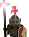
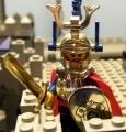
KK 2.1: The only one I did not purchase was 8779 The Grand Tournament. I did not like the roller horses at all. However I did purchase multiple sets of 8777 Vladek Encounter. I love Vladek faction and I needed more horses. The main castle was nothing to spectacular. I liked the rectangular shields, but the 'space visors' from the helmets annoyed me except as I said above, the green Rascus armor was a good touch.
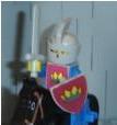
KK 2.2: 8877 Vladek's Dark Fortress, 8876 Scorpion Prison Cave, and G678 KK Chess Set were my favorites of this line. I liked the return to the triangle shields, and I really, really really like Vladek's Dark Fortress. Very good stuff! I still cannot seem to make up my mind if I like the animal sigils on the knight's armor except for Vladek. The monkey sigil especially annoys me.
KK 2.3: I think this is a return to the older designs of TLC. 8813 Battle at the Pass is probably the best set beacuse of the large amount of the figures. The one downside I think is that if you want to give the soldiers armor to another figure you are left with a blank torso. That unto itself is not a problem if you do not mind printing out new stickers for the blank torsos.
Overall
The Positives about this line.
I liked the nifty sculpted pieces such as the Vladek Helm from Vladek's Dark Fortress and the dragon mouths from Mistlands Tower.
I really like the different faces, but since I have a lot of classic lego heads I was able to mix everything around with little problem.
The different styles of shields were a great touch. I like the purple wolf and the blue eagle.
The use of a very strong "bad guy" faction was a great touch. Vladek and his Legions of Mean Dudes are great.
The Negatives about this line.
The Monkey sigil? Come on! I can see a knight using wolf, an eagle, and even a bear as his sign. But a monkey? that is just plain silly.
The colors are just a little too vibrant from me. I actually mixed my Jelly Bean Knight figure pieces around. For example I have the Red Bear Knight (yeah I barely remember the hero's names) red colors mixed with tan. It looks pretty spiffy. And I also ordered some old school visors off brick link and won some off EBay to cut out the space visors. The look better know. Mixing and matching the colors just works better for me.
The prices. There were no small sets that were around $5 to $7. I was disappointed with that as well.
The swords. I am just not a big fan of the swords that were designed for the series. They look too cartonnish.
Overall I give the series a C+. I think it is interesting that LEGO went power ranger with the knights and some of the pieces put out were definitely cool. I think that they were shooting for a larger audience to sell these sets to as well. Crazy Rainbow Knights need to retire.
At first glance I was none to pleased. I walked into a toy store and picked up boxes of KK 2.1 and just shook my head.
But as time went on the more I looked at them the more I liked them. Especially Vladek and his soldiers. I really enjoyed the green knights from KK 2.1 as well. The patterns on the armor are very keen!
So here is my breakdown of the line.
KK 2.1: The only one I did not purchase was 8779 The Grand Tournament. I did not like the roller horses at all. However I did purchase multiple sets of 8777 Vladek Encounter. I love Vladek faction and I needed more horses. The main castle was nothing to spectacular. I liked the rectangular shields, but the 'space visors' from the helmets annoyed me except as I said above, the green Rascus armor was a good touch.
KK 2.2: 8877 Vladek's Dark Fortress, 8876 Scorpion Prison Cave, and G678 KK Chess Set were my favorites of this line. I liked the return to the triangle shields, and I really, really really like Vladek's Dark Fortress. Very good stuff! I still cannot seem to make up my mind if I like the animal sigils on the knight's armor except for Vladek. The monkey sigil especially annoys me.
KK 2.3: I think this is a return to the older designs of TLC. 8813 Battle at the Pass is probably the best set beacuse of the large amount of the figures. The one downside I think is that if you want to give the soldiers armor to another figure you are left with a blank torso. That unto itself is not a problem if you do not mind printing out new stickers for the blank torsos.
Overall
The Positives about this line.
I liked the nifty sculpted pieces such as the Vladek Helm from Vladek's Dark Fortress and the dragon mouths from Mistlands Tower.
I really like the different faces, but since I have a lot of classic lego heads I was able to mix everything around with little problem.
The different styles of shields were a great touch. I like the purple wolf and the blue eagle.
The use of a very strong "bad guy" faction was a great touch. Vladek and his Legions of Mean Dudes are great.
The Negatives about this line.
The Monkey sigil? Come on! I can see a knight using wolf, an eagle, and even a bear as his sign. But a monkey? that is just plain silly.
The colors are just a little too vibrant from me. I actually mixed my Jelly Bean Knight figure pieces around. For example I have the Red Bear Knight (yeah I barely remember the hero's names) red colors mixed with tan. It looks pretty spiffy. And I also ordered some old school visors off brick link and won some off EBay to cut out the space visors. The look better know. Mixing and matching the colors just works better for me.
The prices. There were no small sets that were around $5 to $7. I was disappointed with that as well.
The swords. I am just not a big fan of the swords that were designed for the series. They look too cartonnish.
Overall I give the series a C+. I think it is interesting that LEGO went power ranger with the knights and some of the pieces put out were definitely cool. I think that they were shooting for a larger audience to sell these sets to as well. Crazy Rainbow Knights need to retire.
Herb Coats
"Chimichanga!"
"Chimichanga!"