Hi all,
In the past couple of CCC's I haven't done any sort of feedback thread, and I kind of missed doing it. For those who are newer to CC, a brief explanation. As a judge, I feel that I can't comment on CCC entries when they are posted to the forums for fear of giving any perception of bias. In this thread I will take the opportunity to comment on a few of them. For each category I will give my three favorites, and then comment on a few of the others in no particular order. If I don't comment on a particular entry, it is no indication of whether I liked or disliked it (other than the fact that it is not one of my three favorites) - it just means that I didn't have anything relevant to add to the conversation about that MOC. Also note that these are my thoughts, and not reflective of anything from the other judges. There are five of us judging, and the category winners come from the combination of all of our scores, so my own personal favorite may or may not be the category winner. Anyway, on to the MOCs ...
Bruce
Bruce's contest thoughts - CCCVIII
-
Bruce N H

- Precentor of the Scriptorium
- Posts: 6311
- Joined: Mon Sep 15, 2003 9:11 pm
- Location: Middle Zealand
- Contact:
Bruce's contest thoughts - CCCVIII
[url=http://comicbricks.blogspot.com/]ComicBricks[/url] [url=http://godbricks.blogspot.com/]GodBricks[/url] [url=http://microbricks.blogspot.com/]MicroBricks[/url] [url=http://minilandbricks.blogspot.com/]MinilandBricks[/url] [url=http://scibricks.blogspot.com/]SciBricks[/url] [url=http://vignettebricks.blogspot.com/]VignetteBricks[/url] [url=http://www.classic-castle.com/bricktales/]Brick Tales[/url]
-
Bruce N H
- Precentor of the Scriptorium
- Posts: 6311
- Joined: Mon Sep 15, 2003 9:11 pm
- Location: Middle Zealand
- Contact:
Re: Bruce's contest thoughts - CCCVIII
Castle evolution
My top three:
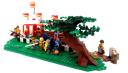
1. Turambar's road - I thought this was really fun to turn the category on its head and actually do the devolution. I like the attention to detail, with the remains of the tree from the earlier era there in the second era, while new trees are growing up, with also the milepost breaking down (though it seems to have been restored in the modern era). The photo op in modern times with just a tiny patch of Roman road is a funny idea.
2. KumpelKante's gate - Here the transformation from the Green Dragons to the Red Lions occupancy is really nice, building on the earlier era in a natural way. The rockscaping is really well done here.
3. DJColwell's cathedral - Very nice how in the first scene we see them laying out the initial marks to build the addition seen in the second. Great roofing effect in the first scene, and the snow on the roof in the second is also well done. In the WWII era the broken window is really well done. Very sad that even the tomb doesn't survive the ravages of war in the third scene.
Others, in no particular order:
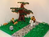
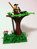 EK's tree - Clever idea here that as the boy grows older, and then decays, so does the tree. Kind of makes me think of the book The Giving Tree.
 Januson's crossroads - The clever thing here is how the idea of horns is reinforced in each era, with the cow showing up each time, but also the bison headdress, the name of the inn, and the name of the road (perhaps the soldiers in the second photo should be the KK1 Bull Knights instead). I actually think the cobblestones in the second scene are a little too busy color-wise, and obscure the rest of the scene a bit, though it is nice that the same cobblestones are re-used in the gift-shop sidewalk in the third scene.
 ACPin's rock - I'm not convinced that the rock looks natural - it looks a little more like a constructed amphitheater. However, it is a clever parts usage to turn that ramp element into the center of this scene.
My top three:
1.
Turambar's road - I thought this was really fun to turn the category on its head and actually do the devolution. I like the attention to detail, with the remains of the tree from the earlier era there in the second era, while new trees are growing up, with also the milepost breaking down (though it seems to have been restored in the modern era). The photo op in modern times with just a tiny patch of Roman road is a funny idea.2.
KumpelKante's gate - Here the transformation from the Green Dragons to the Red Lions occupancy is really nice, building on the earlier era in a natural way. The rockscaping is really well done here.3.
DJColwell's cathedral - Very nice how in the first scene we see them laying out the initial marks to build the addition seen in the second. Great roofing effect in the first scene, and the snow on the roof in the second is also well done. In the WWII era the broken window is really well done. Very sad that even the tomb doesn't survive the ravages of war in the third scene.Others, in no particular order:
EK's tree - Clever idea here that as the boy grows older, and then decays, so does the tree. Kind of makes me think of the book The Giving Tree. Januson's crossroads - The clever thing here is how the idea of horns is reinforced in each era, with the cow showing up each time, but also the bison headdress, the name of the inn, and the name of the road (perhaps the soldiers in the second photo should be the KK1 Bull Knights instead). I actually think the cobblestones in the second scene are a little too busy color-wise, and obscure the rest of the scene a bit, though it is nice that the same cobblestones are re-used in the gift-shop sidewalk in the third scene. ACPin's rock - I'm not convinced that the rock looks natural - it looks a little more like a constructed amphitheater. However, it is a clever parts usage to turn that ramp element into the center of this scene.[url=http://comicbricks.blogspot.com/]ComicBricks[/url] [url=http://godbricks.blogspot.com/]GodBricks[/url] [url=http://microbricks.blogspot.com/]MicroBricks[/url] [url=http://minilandbricks.blogspot.com/]MinilandBricks[/url] [url=http://scibricks.blogspot.com/]SciBricks[/url] [url=http://vignettebricks.blogspot.com/]VignetteBricks[/url] [url=http://www.classic-castle.com/bricktales/]Brick Tales[/url]
Re: Bruce's contest thoughts - CCCVIII
very good idea
Your comments were very relevant.
I am looking forward to seeing your other favorites
Icare
Your comments were very relevant.
I am looking forward to seeing your other favorites
Icare
-
Bruce N H
- Precentor of the Scriptorium
- Posts: 6311
- Joined: Mon Sep 15, 2003 9:11 pm
- Location: Middle Zealand
- Contact:
Re: Bruce's contest thoughts - CCCVIII
Fairy Tale
This was our most popular category, and brought out many of the most fun MOCs:
My top three:
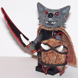
1.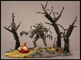 Legohaulic's Little Red Riding Hood - This is pretty much the perfect entry. That wolf is amazing - I particularly like the way the face is shaped using fig arms to make the curve above the eyes, with just the touch of red, also the layers of battle droid arms to make the shape of the back. Very imposing posing as well. Lil Red is great, skipping along, and the hood idea is perfect (though I am less happy with her basket). Creepy trees, dead brush, and the overall shape of the base are great, and remind me of the aesthetic of Legohaulic's winning Tower of Torment from two CCC's ago.
2. Busboy489's Enchanted Rose Room - The idea here is just so clever - a little scavenger hunt of Disney movies (trust me, since I've got a little girl, we've seen all of the Disney princess movies over and over). But what makes it great are the little construction details. The spinning wheel in particular is a wonderful design. As is the micro castle to give a sense of distance.
3. SlyOwl's Christmas Carol - Classic Sly goodness. Very clever to illustrate different scenes as you rotate the MOC. Great build details include the roof shingles, the candlestick by Scrooge's bed, the busts in Christmas past (I would have liked to see the dance at old Fezziwig's, though I understand it would have been impossible to fit in), the Fabuland body with fig arms and head for Christmas Present, Tim's crutch, the snow on the churchyard gate, and the brick face on Scrooge's home.
Others, in no particular order:
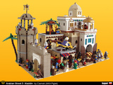 Piglet's Arabian Street I've got 'A Whole New World' running through my head now (remember, I have small children, so watching Disney is a pretty regular thing at our house). As I recall, Piglet did a great Arabian scene for a previous CCC. Here elements from the Prince of Persia line and lots of dark tan really enhance the previous building style. My favorite bits are probably the green and blue accents on the right-hand building and the octagonal tower by the gate. The muted color palette of the buildings makes a great backdrop for the colorful action of the people. Jafar is very well done here.
 Januson's Cinderella - The great thing here is how the carriage actually looks like a pumpkin. Also the way the horse is dug into the ground to look like it's a mouse growing up, and the use of the linked-flame technique for the magic.
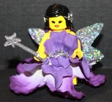
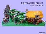 Icare's Snow White The figs in this are really great. I do wish there were some way to connect the action of Snow White taking the apple with the dwarves' mining at the other side of the MOC.
 NewRight's Arthur That angled tree is great, also the fig posing, Sir Ector's tunic, the tournament setup (though isn't the tree way too close to the lists). It's hard to see the pavilion in the back due to the high contrast of the photos. Also, Merlin is hidden in the photos submitted for the contest - I didn't see him until I looked at the larger photo gallery just now, and then I realized you can just see the tips of his hat and his want peeking out from behind the tree.
 DarkTemplar's Humpty Dumpty - The scene is hilarious, with the shattered Humpty, complete with yolk. I love the brick wall and the micro castle in the distance with the path leading up to it. The micro gate and trees are really clever. Perplexed knight holding bits of shell and 'do not cross' barriers are really funny.
 DJColwell's Jack and the Beanstalk - I really like the mosaic sky and the layers of hills in the backdrop. The legs of the giant coming down out of the cloud look like giant minifig legs, which is nice. An easy detail to miss is the great goose that Jack is carrying. The only negative for me is the flat landscaping in the foreground, and maybe the busy-ness of the beanstalk's color scheme.
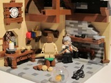 Turumbar's Pinnochio - This is a beautiful scene. The color palette hits just the right note. Great details like the little chips of wood on the floor, the fish bowl, the pipe on the mantle, the paint jars. My only complaint is the height of the roof seems off - all that empty space above takes away from the intimate small scene below.
 Legohaulic's Robin Hood - Of course the round shape for this is striking, as is the cobblestone effect (are all those loose? this thing would be pretty much impossible to transport to a con or other public showing). Lots of great details as well, like the duck and chicken, the simple but very effective stocks, the bundles of wheat or branches, etc. Posing of the figs is outstanding. I really think that along with another scene this could have been a contender to win the 'Rob the Rich' category, but since Tyler already won this category with his other entry, that's kind of moot.
 Skalldyr's Sleeping Beauty - All of the elements are here, with the wall with the break in it, the overgrown hedge, the spinning wheel, and of course the protagonists. It would have been tempting to go too overboard with the vegetation, but those three-leaf plant pieces work perfectly here.
 Monsterbrick's Sleeping Beauty's castle - Matt is really known for his innovative parts use, and the shield here is notable. Interesting tree shape using the leaf pieces still on the sprues, though the result seems out of scale with the castle. I do think this micro castle would be even better if it were the backdrop to a pair of figs (Beauty and her Prince) in the foreground to give some forced perspective, as with the Humpty Dumpty and the Rose Room above.
 Eilonwy's Princess and the Pea - Here Katie brings her signature mosaic style to a complete scene. The rose pattern in the windows is particularly striking, as are the spiraling flowerpots along the hallway. The 2x2 turntable bases in the wall are very subtle but give a nice texture, and I also really like the little 1-stud-wide openings on either side of the main archway. My only complaint is that the scene seems a little cold. I think this may be because of the size of the room - a smaller scene would be a little more cozy and intimate. Also, it's perhaps unavoidable that the mattresses look more like slabs of concrete than soft feather beds, which kind of hurts the whole story line.
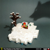 Crises' wolf - The shadow here is such a cool effect. I wonder what he used to cast it?
This was our most popular category, and brought out many of the most fun MOCs:
My top three:
1.
Legohaulic's Little Red Riding Hood - This is pretty much the perfect entry. That wolf is amazing - I particularly like the way the face is shaped using fig arms to make the curve above the eyes, with just the touch of red, also the layers of battle droid arms to make the shape of the back. Very imposing posing as well. Lil Red is great, skipping along, and the hood idea is perfect (though I am less happy with her basket). Creepy trees, dead brush, and the overall shape of the base are great, and remind me of the aesthetic of Legohaulic's winning Tower of Torment from two CCC's ago.2.
Busboy489's Enchanted Rose Room - The idea here is just so clever - a little scavenger hunt of Disney movies (trust me, since I've got a little girl, we've seen all of the Disney princess movies over and over). But what makes it great are the little construction details. The spinning wheel in particular is a wonderful design. As is the micro castle to give a sense of distance.3.
SlyOwl's Christmas Carol - Classic Sly goodness. Very clever to illustrate different scenes as you rotate the MOC. Great build details include the roof shingles, the candlestick by Scrooge's bed, the busts in Christmas past (I would have liked to see the dance at old Fezziwig's, though I understand it would have been impossible to fit in), the Fabuland body with fig arms and head for Christmas Present, Tim's crutch, the snow on the churchyard gate, and the brick face on Scrooge's home.Others, in no particular order:
Piglet's Arabian Street I've got 'A Whole New World' running through my head now (remember, I have small children, so watching Disney is a pretty regular thing at our house). As I recall, Piglet did a great Arabian scene for a previous CCC. Here elements from the Prince of Persia line and lots of dark tan really enhance the previous building style. My favorite bits are probably the green and blue accents on the right-hand building and the octagonal tower by the gate. The muted color palette of the buildings makes a great backdrop for the colorful action of the people. Jafar is very well done here. Januson's Cinderella - The great thing here is how the carriage actually looks like a pumpkin. Also the way the horse is dug into the ground to look like it's a mouse growing up, and the use of the linked-flame technique for the magic. Icare's Snow White The figs in this are really great. I do wish there were some way to connect the action of Snow White taking the apple with the dwarves' mining at the other side of the MOC. NewRight's Arthur That angled tree is great, also the fig posing, Sir Ector's tunic, the tournament setup (though isn't the tree way too close to the lists). It's hard to see the pavilion in the back due to the high contrast of the photos. Also, Merlin is hidden in the photos submitted for the contest - I didn't see him until I looked at the larger photo gallery just now, and then I realized you can just see the tips of his hat and his want peeking out from behind the tree. DarkTemplar's Humpty Dumpty - The scene is hilarious, with the shattered Humpty, complete with yolk. I love the brick wall and the micro castle in the distance with the path leading up to it. The micro gate and trees are really clever. Perplexed knight holding bits of shell and 'do not cross' barriers are really funny. DJColwell's Jack and the Beanstalk - I really like the mosaic sky and the layers of hills in the backdrop. The legs of the giant coming down out of the cloud look like giant minifig legs, which is nice. An easy detail to miss is the great goose that Jack is carrying. The only negative for me is the flat landscaping in the foreground, and maybe the busy-ness of the beanstalk's color scheme.Turumbar's Pinnochio - This is a beautiful scene. The color palette hits just the right note. Great details like the little chips of wood on the floor, the fish bowl, the pipe on the mantle, the paint jars. My only complaint is the height of the roof seems off - all that empty space above takes away from the intimate small scene below. Legohaulic's Robin Hood - Of course the round shape for this is striking, as is the cobblestone effect (are all those loose? this thing would be pretty much impossible to transport to a con or other public showing). Lots of great details as well, like the duck and chicken, the simple but very effective stocks, the bundles of wheat or branches, etc. Posing of the figs is outstanding. I really think that along with another scene this could have been a contender to win the 'Rob the Rich' category, but since Tyler already won this category with his other entry, that's kind of moot. Skalldyr's Sleeping Beauty - All of the elements are here, with the wall with the break in it, the overgrown hedge, the spinning wheel, and of course the protagonists. It would have been tempting to go too overboard with the vegetation, but those three-leaf plant pieces work perfectly here. Monsterbrick's Sleeping Beauty's castle - Matt is really known for his innovative parts use, and the shield here is notable. Interesting tree shape using the leaf pieces still on the sprues, though the result seems out of scale with the castle. I do think this micro castle would be even better if it were the backdrop to a pair of figs (Beauty and her Prince) in the foreground to give some forced perspective, as with the Humpty Dumpty and the Rose Room above. Eilonwy's Princess and the Pea - Here Katie brings her signature mosaic style to a complete scene. The rose pattern in the windows is particularly striking, as are the spiraling flowerpots along the hallway. The 2x2 turntable bases in the wall are very subtle but give a nice texture, and I also really like the little 1-stud-wide openings on either side of the main archway. My only complaint is that the scene seems a little cold. I think this may be because of the size of the room - a smaller scene would be a little more cozy and intimate. Also, it's perhaps unavoidable that the mattresses look more like slabs of concrete than soft feather beds, which kind of hurts the whole story line. Crises' wolf - The shadow here is such a cool effect. I wonder what he used to cast it?
[url=http://comicbricks.blogspot.com/]ComicBricks[/url] [url=http://godbricks.blogspot.com/]GodBricks[/url] [url=http://microbricks.blogspot.com/]MicroBricks[/url] [url=http://minilandbricks.blogspot.com/]MinilandBricks[/url] [url=http://scibricks.blogspot.com/]SciBricks[/url] [url=http://vignettebricks.blogspot.com/]VignetteBricks[/url] [url=http://www.classic-castle.com/bricktales/]Brick Tales[/url]

Re: Bruce's contest thoughts - CCCVIII
Thanks for sharing your thoughts on these entries. I think you verbalized my dissatisfaction with my entry better than I could have done. The whole thing left me feeling cold and hard, and now I see you using these words, and I think they are quite accurate. It's funny how the building process works. It takes a long time to come up with an idea and build something, and then at the end (at least for me), there's a large amount of luck involved with whether it actually "works" or not. I suppose that with experience one can better "see" ahead to how things are going to look when they're finished. (I'd develop this idea more, but I have not the time.)
-
Bruce N H
- Precentor of the Scriptorium
- Posts: 6311
- Joined: Mon Sep 15, 2003 9:11 pm
- Location: Middle Zealand
- Contact:
Re: Bruce's contest thoughts - CCCVIII
Fantasy custom fig
My top three:
1.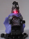 Quickblade's Lord Soth - I go back and forth on the use of clay for the cape. Around the neck, in particular, it drapes really well, but in the back it feels too thick and heavy. I'm a sucker for those light-up eyes, though. They give such a great effect that it pushes this one over the top for me.
2. Bluesecrets' Violette Etoile - The dress design here is really pretty. It looks like she's wearing a flower - actually, I suspect that it's made using petals from a silk flower. The hair band is also a perfect accessory.
3. Brickule's General Fangguard - The paint job here is quite nice, and the custom sword has a great design. What makes this one for me, though, is the custom shield.
Others, in no particular order:
 Icare's Ettin - Great solution for making the two-headed monster. I do wish the decal were a waterslide one rather than a simple paper one.
 Boses' Knightmare - This is, IMO, the best of the various man/beast brick built entries. The size of the horse body doesn't overshadow the torso, which is always a difficulty with these centaur-like MOCs, and the legs are really the correct shape. Great parts choice all through this one. Oh, and giving him four arms is great.
 ACPin's Scorpion King - My other favorite from the brick-built man/beast entries. The blades as legs give a really creepy look, the transition from bricks to torso is completely smooth, and the scorpion arms is a wonderul idea.
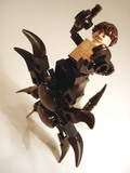
 Crises' treasure keeper - Crises just goes to show that you can make a great fig out of all official elements. Good mixing of parts from all over here. Very interesting weapon here.
My top three:
1.
Quickblade's Lord Soth - I go back and forth on the use of clay for the cape. Around the neck, in particular, it drapes really well, but in the back it feels too thick and heavy. I'm a sucker for those light-up eyes, though. They give such a great effect that it pushes this one over the top for me.2.
Bluesecrets' Violette Etoile - The dress design here is really pretty. It looks like she's wearing a flower - actually, I suspect that it's made using petals from a silk flower. The hair band is also a perfect accessory.3.
Brickule's General Fangguard - The paint job here is quite nice, and the custom sword has a great design. What makes this one for me, though, is the custom shield.Others, in no particular order:
Icare's Ettin - Great solution for making the two-headed monster. I do wish the decal were a waterslide one rather than a simple paper one. Boses' Knightmare - This is, IMO, the best of the various man/beast brick built entries. The size of the horse body doesn't overshadow the torso, which is always a difficulty with these centaur-like MOCs, and the legs are really the correct shape. Great parts choice all through this one. Oh, and giving him four arms is great. ACPin's Scorpion King - My other favorite from the brick-built man/beast entries. The blades as legs give a really creepy look, the transition from bricks to torso is completely smooth, and the scorpion arms is a wonderul idea. Crises' treasure keeper - Crises just goes to show that you can make a great fig out of all official elements. Good mixing of parts from all over here. Very interesting weapon here.[url=http://comicbricks.blogspot.com/]ComicBricks[/url] [url=http://godbricks.blogspot.com/]GodBricks[/url] [url=http://microbricks.blogspot.com/]MicroBricks[/url] [url=http://minilandbricks.blogspot.com/]MinilandBricks[/url] [url=http://scibricks.blogspot.com/]SciBricks[/url] [url=http://vignettebricks.blogspot.com/]VignetteBricks[/url] [url=http://www.classic-castle.com/bricktales/]Brick Tales[/url]
Re: Bruce's contest thoughts - CCCVIII
These reviews are all very well thought out and informative, makes me look back at some MOCs I passed over before. I hope one of mine gets reviewed 
Back to the front!
-
Bruce N H
- Precentor of the Scriptorium
- Posts: 6311
- Joined: Mon Sep 15, 2003 9:11 pm
- Location: Middle Zealand
- Contact:
Re: Bruce's contest thoughts - CCCVIII
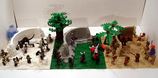
Medieval Maintenance
My own top three
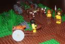
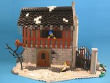
1. Derfel Cadarn - Ye Old Forge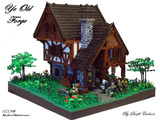 - This is the first of Derfel's MOCs I'm commenting on, so let's just start out with a general observation that his technique for making stone walls using tons of 1x1 round plates is quite striking and gives a visual connection between all of his MOCs. I may be wrong, but I think it is with this CCC that he also started varying up the texture by including some SNOT'd tiles as well. Perhaps the only negative I can say about his technique is that it could become overpowering if overdone, but here in this forge there is a great balance between that and the timber-framed portions. Very nice roofline on this - I'm a sucker for interesting rooflines, btw. Way too often this is a forgotten feature of MOCs and people top off their buildings with two big rectangles coming together at an angle. Also some great life details in this scene, like the tools leaned up against the wall, the trough near the forge, the placement of the figs and foliage etc.
2. Hardegon - Reconstruction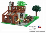 - In contrast with Derfel's above, this MOC is very clean and simple, but also very beautiful. Great details like the ends of posts sticking out and the guy mixing concrete. The simple tile road inset into the ground works well against the studs for the grass (note to new builders - the real rookie mistake would be to put the cobblestones on top of the surrounding ground, rather than even with it as done here). Good figs posing, particularly the guys unloading the ox-cart.
3. DJColwell - Caravel in Dry Dock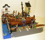 - I really love how the boat is constructed to try to get a caravel shape rather than simply using boat hull pieces. The guy running the pump is a great detail. Lots of great fig posing, and details like the guy with his lunch in his toolbox, or the rowboat in danger of capsizing. My only complaint is probably the color scheme. It doesn't really work to try to do the mottling by having all dark gray and then a few huge (from a fig's viewpoint) patches of light gray. Also the two buildings in the background would be a good opportunity to add some splashes of color to a MOC that is largely gray and brown, but here she went with tan and white.
Others, in no particular order:
Mcdenbestin's shipyard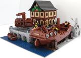 - It's hard not to compare and contrast this with DJColwell's similar MOC. For instance, this one loses out by relying on prefab boat hulls. This one actually has the better color scheme, IMO. While it also could use some splashes of color (though the green on the building is nice), it has a better consistency of coloration. The fig activity seems a little lacking, IMO - a shipyard should be a busier place, I'd think. That crane is a great feature - I wish it were in use, say unloading timbers for the ship or something, rather than sitting idle.
Cera cera's Crondor Bridge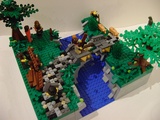 - Some nice landscaping here, with the shape and depth of the river relative to the surrounding land (though some sloping in the surrounding land would be nice). I also like the nobleman and the foreman discussing plans off to the side. I'm bothered by the construction - you simply wouldn't build a half-arch like that hanging out in space and then later add some timbers over the top. Pretty much the whole point of an arch is that by coming together in the middle, the forces balance out, pressing the weight of the bridge above down and to the sides. In reality this thing would crumble into the river below.
Tastymuffins' keeping out the cold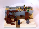 - Okay, I'm not overly thrilled with the big squared off sections in white for the snow - it's just too regular to look natural. My neighbor's driveway looks like that, but he's got a snowblower. When I scoop my drive the edges are much more ragged. The great thing here, though is the piece of historical realism about how these walls were actually constructed. This is total win for me on the aspect of teaching us something about real medieval life. A couple of suggested improvements - in the wall's interior, showing some places where the rubble/mortar wall filling isn't completely covered with straw would be nice. Also, a bunch of tan antennas or lightsaber blades would work well for hay. It looks from Bricklink that it would be pricey to get these in any quantity, but there's a three-long technic axle readily available in quantity in dark tan that would work well here for piles of hay. Or if you're willing to go to yellow, the stick-shift lever would be the best piece size-wise to be hay.
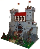
Peter's Wolfpack Tower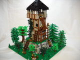 - I just wanted to highlight the two guys on the middle level of the scaffold. The guy on the left is great, trying to balance that tall stack of stones that are about to topple over. I'm a little concerned about the physics of the guy on the right - the way he's lifting that chain suggests that he's much more likely to fall over the edge than to actually pull up the barrel, assuming it weighs anything at all. Also, it seems odd that the roof is relatively intact given the state of the stone walls. The trees here are outstanding, with several different designs. I particularly like the one on the left corner using a bunch of that three-leaf foliage element.
Lomero's street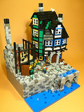 - The color scheme here is outstanding, with the gray sections contrasting the blue, green and white section. The shapes of the two buildings on the right are also really interesting, and very Lomero. Those cylindrical parts used for the timber framing work very well, and the angles help in making the interesting shapes mentioned before. Great details like the bird on the roof and the water splashing over the paddle wheel (though the wheel itself seems to have no connection to anything). I really like the technique for the cobblestones, but I would suggest that since it is so interesting in terms of shapes and textures, it might have been best to have it be all one color (with the brown and green touches thrown in). Especially since the sea wall and the stone wall of the building under construction use the same light gray/dark gray mix.
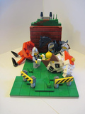
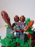
Shmails' CHIMP Squad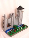 - This winning entry was certainly one of the most fun entries in all of the contest. It works perfectly here to have the monochromatic blocks of color broken up by figs and texture. The guys about to throw an orc body on the wagon have a real Monty Python 'bring out your dead' feel to me.
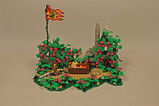
Crises' pig problem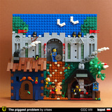 - The compression of the deep three-dimensional scene onto a narrow footprint is really interesting here. It almost makes this into a relief sculpture. Also the mosaic backdrop. The one thing that would improve the effect here, IMO, would be to have the road get more narrow as it approaches the gate, to create the illusion of it receding into the distance. The design of the castle wall is great, with little details like those turntable bases and the binoculars (?) suggesting the bottom edge of a raised portcullis.
Liwnik's windmill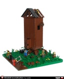 - The guy in the bottom left of the main scene has a nice little solution for a saw. The windmill itself has interesting construction. It's not immediately clear to me how (or if) the tiled-over studs-out walls are attached to the studs-up floor, roof and framework.
My own top three
1. Derfel Cadarn - Ye Old Forge
- This is the first of Derfel's MOCs I'm commenting on, so let's just start out with a general observation that his technique for making stone walls using tons of 1x1 round plates is quite striking and gives a visual connection between all of his MOCs. I may be wrong, but I think it is with this CCC that he also started varying up the texture by including some SNOT'd tiles as well. Perhaps the only negative I can say about his technique is that it could become overpowering if overdone, but here in this forge there is a great balance between that and the timber-framed portions. Very nice roofline on this - I'm a sucker for interesting rooflines, btw. Way too often this is a forgotten feature of MOCs and people top off their buildings with two big rectangles coming together at an angle. Also some great life details in this scene, like the tools leaned up against the wall, the trough near the forge, the placement of the figs and foliage etc.2. Hardegon - Reconstruction
- In contrast with Derfel's above, this MOC is very clean and simple, but also very beautiful. Great details like the ends of posts sticking out and the guy mixing concrete. The simple tile road inset into the ground works well against the studs for the grass (note to new builders - the real rookie mistake would be to put the cobblestones on top of the surrounding ground, rather than even with it as done here). Good figs posing, particularly the guys unloading the ox-cart.3. DJColwell - Caravel in Dry Dock
- I really love how the boat is constructed to try to get a caravel shape rather than simply using boat hull pieces. The guy running the pump is a great detail. Lots of great fig posing, and details like the guy with his lunch in his toolbox, or the rowboat in danger of capsizing. My only complaint is probably the color scheme. It doesn't really work to try to do the mottling by having all dark gray and then a few huge (from a fig's viewpoint) patches of light gray. Also the two buildings in the background would be a good opportunity to add some splashes of color to a MOC that is largely gray and brown, but here she went with tan and white.Others, in no particular order:
Mcdenbestin's shipyard
- It's hard not to compare and contrast this with DJColwell's similar MOC. For instance, this one loses out by relying on prefab boat hulls. This one actually has the better color scheme, IMO. While it also could use some splashes of color (though the green on the building is nice), it has a better consistency of coloration. The fig activity seems a little lacking, IMO - a shipyard should be a busier place, I'd think. That crane is a great feature - I wish it were in use, say unloading timbers for the ship or something, rather than sitting idle.Cera cera's Crondor Bridge
- Some nice landscaping here, with the shape and depth of the river relative to the surrounding land (though some sloping in the surrounding land would be nice). I also like the nobleman and the foreman discussing plans off to the side. I'm bothered by the construction - you simply wouldn't build a half-arch like that hanging out in space and then later add some timbers over the top. Pretty much the whole point of an arch is that by coming together in the middle, the forces balance out, pressing the weight of the bridge above down and to the sides. In reality this thing would crumble into the river below.Tastymuffins' keeping out the cold
- Okay, I'm not overly thrilled with the big squared off sections in white for the snow - it's just too regular to look natural. My neighbor's driveway looks like that, but he's got a snowblower. When I scoop my drive the edges are much more ragged. The great thing here, though is the piece of historical realism about how these walls were actually constructed. This is total win for me on the aspect of teaching us something about real medieval life. A couple of suggested improvements - in the wall's interior, showing some places where the rubble/mortar wall filling isn't completely covered with straw would be nice. Also, a bunch of tan antennas or lightsaber blades would work well for hay. It looks from Bricklink that it would be pricey to get these in any quantity, but there's a three-long technic axle readily available in quantity in dark tan that would work well here for piles of hay. Or if you're willing to go to yellow, the stick-shift lever would be the best piece size-wise to be hay.Peter's Wolfpack Tower
- I just wanted to highlight the two guys on the middle level of the scaffold. The guy on the left is great, trying to balance that tall stack of stones that are about to topple over. I'm a little concerned about the physics of the guy on the right - the way he's lifting that chain suggests that he's much more likely to fall over the edge than to actually pull up the barrel, assuming it weighs anything at all. Also, it seems odd that the roof is relatively intact given the state of the stone walls. The trees here are outstanding, with several different designs. I particularly like the one on the left corner using a bunch of that three-leaf foliage element.Lomero's street
- The color scheme here is outstanding, with the gray sections contrasting the blue, green and white section. The shapes of the two buildings on the right are also really interesting, and very Lomero. Those cylindrical parts used for the timber framing work very well, and the angles help in making the interesting shapes mentioned before. Great details like the bird on the roof and the water splashing over the paddle wheel (though the wheel itself seems to have no connection to anything). I really like the technique for the cobblestones, but I would suggest that since it is so interesting in terms of shapes and textures, it might have been best to have it be all one color (with the brown and green touches thrown in). Especially since the sea wall and the stone wall of the building under construction use the same light gray/dark gray mix.Shmails' CHIMP Squad
- This winning entry was certainly one of the most fun entries in all of the contest. It works perfectly here to have the monochromatic blocks of color broken up by figs and texture. The guys about to throw an orc body on the wagon have a real Monty Python 'bring out your dead' feel to me.Crises' pig problem
- The compression of the deep three-dimensional scene onto a narrow footprint is really interesting here. It almost makes this into a relief sculpture. Also the mosaic backdrop. The one thing that would improve the effect here, IMO, would be to have the road get more narrow as it approaches the gate, to create the illusion of it receding into the distance. The design of the castle wall is great, with little details like those turntable bases and the binoculars (?) suggesting the bottom edge of a raised portcullis. Liwnik's windmill
- The guy in the bottom left of the main scene has a nice little solution for a saw. The windmill itself has interesting construction. It's not immediately clear to me how (or if) the tiled-over studs-out walls are attached to the studs-up floor, roof and framework.[url=http://comicbricks.blogspot.com/]ComicBricks[/url] [url=http://godbricks.blogspot.com/]GodBricks[/url] [url=http://microbricks.blogspot.com/]MicroBricks[/url] [url=http://minilandbricks.blogspot.com/]MinilandBricks[/url] [url=http://scibricks.blogspot.com/]SciBricks[/url] [url=http://vignettebricks.blogspot.com/]VignetteBricks[/url] [url=http://www.classic-castle.com/bricktales/]Brick Tales[/url]
-
Blego7

- Master Builder

- Posts: 944
- Joined: Fri Mar 12, 2010 2:40 pm
- Location: Pennsylvania, USA
- Contact:
Re: Bruce's contest thoughts - CCCVIII
Wow. I don't envy your job with this one Bruce! However I really appreciate the thought, especially for people like me who really need the criticism. It gives an incentive to join next year. Fantastic collaboration and reviews.
[url=http://www.mocpages.com/home.php/29890]MOCpage[/url]-[url=http://www.brickshelf.com/cgi-bin/gallery.cgi?m=blego7]Brickshelf[/url]-[url=http://www.flickr.com/photos/baericks/]Flickr[/url]
[img]http://farm7.staticflickr.com/6070/60792295 ... 322c_t.jpg[/img][img]http://farm7.staticflickr.com/6228/63001936 ... 5f22_t.jpg[/img][img]http://farm7.staticflickr.com/6151/61385805 ... eafa_t.jpg[/img]
[img]http://farm7.staticflickr.com/6070/60792295 ... 322c_t.jpg[/img][img]http://farm7.staticflickr.com/6228/63001936 ... 5f22_t.jpg[/img][img]http://farm7.staticflickr.com/6151/61385805 ... eafa_t.jpg[/img]
-
Bruce N H
- Precentor of the Scriptorium
- Posts: 6311
- Joined: Mon Sep 15, 2003 9:11 pm
- Location: Middle Zealand
- Contact:
Re: Bruce's contest thoughts - CCCVIII
Realistic castle figure
My top three:
1. kris kelvin - Dietrich von Altenburg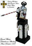 - Impeccable paint job (or are some of those waterslide decals - either way it looks great). Nice customized lance. BTW, one of the shields on the podium is upside-down.
2. DarkTemplar - Templar Baron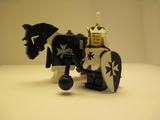 - Very nice black and white design, carried through every element of this (the black painting on the crown is very effective). Also a great purist flail design.
3. thrash - Teutonic Knight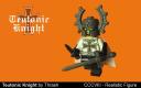 - Very cool to design the elements and then use a 3-d printer. The helm is reminiscent of the bat lord helms. I do think you could have done away with the vambraces - they don't really enhance the fig, imo, and introducing a Brickforge element is a little less self-customized.
Others, in no particular order
Mswlik's Cyrano - Nice design on the torso decal. It's unfortunate that you made him have a big nose, but then chose a photo angle that obscures this. There's a reason we have three photos per entry - make use of them.
icare's D'artagnan - I like that the torso is decorated, even though it is largely covered. The scabbard looks interesting - I'd like to see a better shot of that.
Marco Polo's Emperor Barbarossa and Eleanor of Aquitaine - I always like when people incorporate real history into their creations, rather than just "Here's a king" or whatever. The emperor in particular is a good match to the actual painting.
Balamorgineas' falconer - This one is hurt by unfocused photography, but I really like the brick-built falcon.
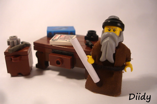
Diidy's Leonardo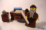 - A pretty good likeness of Da Vinci using all official elements. Nice design on the furniture behind him as well - also a good collection of odds and ends sitting on top of the desk.
Bluesecrets' nun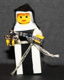 - I appreciate the detail on the rosary here.
Pecovam's Templar - Something about the texture here is nice - It's not all sleek and shiny, so it's more like a knight that's been a veteran of many wars. Nice paint job on the helm and sword, particularly.
My top three:
1. kris kelvin - Dietrich von Altenburg
- Impeccable paint job (or are some of those waterslide decals - either way it looks great). Nice customized lance. BTW, one of the shields on the podium is upside-down.2. DarkTemplar - Templar Baron
- Very nice black and white design, carried through every element of this (the black painting on the crown is very effective). Also a great purist flail design.3. thrash - Teutonic Knight
- Very cool to design the elements and then use a 3-d printer. The helm is reminiscent of the bat lord helms. I do think you could have done away with the vambraces - they don't really enhance the fig, imo, and introducing a Brickforge element is a little less self-customized.Others, in no particular order
Mswlik's Cyrano
- Nice design on the torso decal. It's unfortunate that you made him have a big nose, but then chose a photo angle that obscures this. There's a reason we have three photos per entry - make use of them.icare's D'artagnan
- I like that the torso is decorated, even though it is largely covered. The scabbard looks interesting - I'd like to see a better shot of that.Marco Polo's Emperor Barbarossa and Eleanor of Aquitaine
- I always like when people incorporate real history into their creations, rather than just "Here's a king" or whatever. The emperor in particular is a good match to the actual painting.Balamorgineas' falconer
- This one is hurt by unfocused photography, but I really like the brick-built falcon.Diidy's Leonardo
 - A pretty good likeness of Da Vinci using all official elements. Nice design on the furniture behind him as well - also a good collection of odds and ends sitting on top of the desk.
Bluesecrets' nun
- I appreciate the detail on the rosary here. Pecovam's Templar
- Something about the texture here is nice - It's not all sleek and shiny, so it's more like a knight that's been a veteran of many wars. Nice paint job on the helm and sword, particularly.[url=http://comicbricks.blogspot.com/]ComicBricks[/url] [url=http://godbricks.blogspot.com/]GodBricks[/url] [url=http://microbricks.blogspot.com/]MicroBricks[/url] [url=http://minilandbricks.blogspot.com/]MinilandBricks[/url] [url=http://scibricks.blogspot.com/]SciBricks[/url] [url=http://vignettebricks.blogspot.com/]VignetteBricks[/url] [url=http://www.classic-castle.com/bricktales/]Brick Tales[/url]
-
Bruce N H
- Precentor of the Scriptorium
- Posts: 6311
- Joined: Mon Sep 15, 2003 9:11 pm
- Location: Middle Zealand
- Contact:
Re: Bruce's contest thoughts - CCCVIII
Miscellaneous:
My own top three:
1. davee123 - Viking Village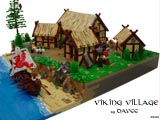 - Of course the obvious highlight here is the design of the thatched roofs, which everyone already noted. Lots of other great details of civilian life, which is so often overlooked in MOCs that tend to focus on Vikings looting and pillaging. I love the rack with fish hanging to dry, and the use of dementor capes as stretched skins. Fig legs as those roof posts are great, as is the color variation where the waves are hitting the shore. If I were forced to complain about something it would be that the ground is too flat once you get to the higher ground back from the shore.
2. TooMuchCaffeine - Lakeside Kidnap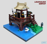 - This thing is just the definition of NPU. All studless doesn't generally feel right for me for natural settings, but here it works well. I really like the clean blocks of color. The medium blue highlights in the water are great. The carrot tops, the curved roof, and the slopes along the water's edge are perfect. The highlights, though are the way the heron's legs are done and the splash of blood on the assassinated guard.
3. Derfel Cadarn - Bron-Y-Aur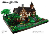 - There's hardly anything to be said here, as this is just simply beautiful. The landscaping and foliage is perfect. The details of the timber sections are great, like those 1x1 tiles rotate 45 degrees and the detail under the eaves of the front gable. The overall shape is great. I just noticed this - is that Darth Vader lurking in the background? LOL. Great shape to the low wall along the front - it makes a nice natural curve to fit the landscaping.
Others, in no particular order:
Peter's church - Extra bonus here for picking a real historical church as inspiration, and the complex shapes are achieved perfectly. I particularly like the solution for the rounded roofline. My only complaint is that I'd like to see some figs and surrounding land to give this more life as a scene.
Pijani's Ched Nasad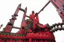 - Really interesting shapes and sweeping heights. The photo I showed is my favorite, giving a fig's eye perspective and a better sense of awe. I do wish this were populated to bring it to life. Also, I'm not a fan of the red/black color scheme aesthetically, but I understand the choice.
LokosuperfluoLEGOman's flying machine - Great inspiration for a MOC and well-achieved. After the last two comments, I'm sure you can guess my critique - I'd like to see a fig riding on this, maybe about to launch it from the top of a tower or something.
Tobiasz's medieval market - A very impressive scene. I really like the shape on the church and the buildings, particularly the angled one on the far left. I'm a little perplexed by the vast expanse of dark gray ground. If that's stone, why have a cobblestone road? Also, I think this scene was hurt by the photography. One good photo from above to show the whole scene, and then two photos from the figs' perspective showing some action with the backdrop of the church and buildings. Maybe make the whole thing into some sort of story, like, for instance, put in the hunchback of Notre Dame, Esmerelda, and some guards (I know, the church doesn't really look like Notre Dame, but it would work as a scene).
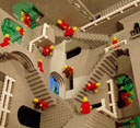
NewRight's Relativity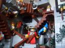 - I'm not sure how to class this in with other entries, as it's just such a unique creation. More castle art than castle MOC. Really well done and reminiscent of the classic Andrew Lipson Daniel Shieu MOC.
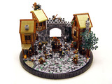
Jediknight219's Wizard's Castle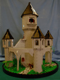 - Perhaps the most beautiful MOC of the whole contest. All of those round shapes work so well together, and on a round base as well. I'd love to see exactly how the central tower is achieved. My complaint - again, it's ultimately lifeless without some sort of population.
My own top three:
1. davee123 - Viking Village
- Of course the obvious highlight here is the design of the thatched roofs, which everyone already noted. Lots of other great details of civilian life, which is so often overlooked in MOCs that tend to focus on Vikings looting and pillaging. I love the rack with fish hanging to dry, and the use of dementor capes as stretched skins. Fig legs as those roof posts are great, as is the color variation where the waves are hitting the shore. If I were forced to complain about something it would be that the ground is too flat once you get to the higher ground back from the shore.2. TooMuchCaffeine - Lakeside Kidnap
- This thing is just the definition of NPU. All studless doesn't generally feel right for me for natural settings, but here it works well. I really like the clean blocks of color. The medium blue highlights in the water are great. The carrot tops, the curved roof, and the slopes along the water's edge are perfect. The highlights, though are the way the heron's legs are done and the splash of blood on the assassinated guard. 3. Derfel Cadarn - Bron-Y-Aur
- There's hardly anything to be said here, as this is just simply beautiful. The landscaping and foliage is perfect. The details of the timber sections are great, like those 1x1 tiles rotate 45 degrees and the detail under the eaves of the front gable. The overall shape is great. I just noticed this - is that Darth Vader lurking in the background? LOL. Great shape to the low wall along the front - it makes a nice natural curve to fit the landscaping.Others, in no particular order:
Peter's church
- Extra bonus here for picking a real historical church as inspiration, and the complex shapes are achieved perfectly. I particularly like the solution for the rounded roofline. My only complaint is that I'd like to see some figs and surrounding land to give this more life as a scene.Pijani's Ched Nasad
- Really interesting shapes and sweeping heights. The photo I showed is my favorite, giving a fig's eye perspective and a better sense of awe. I do wish this were populated to bring it to life. Also, I'm not a fan of the red/black color scheme aesthetically, but I understand the choice.LokosuperfluoLEGOman's flying machine
 - Great inspiration for a MOC and well-achieved. After the last two comments, I'm sure you can guess my critique - I'd like to see a fig riding on this, maybe about to launch it from the top of a tower or something.
Tobiasz's medieval market
- A very impressive scene. I really like the shape on the church and the buildings, particularly the angled one on the far left. I'm a little perplexed by the vast expanse of dark gray ground. If that's stone, why have a cobblestone road? Also, I think this scene was hurt by the photography. One good photo from above to show the whole scene, and then two photos from the figs' perspective showing some action with the backdrop of the church and buildings. Maybe make the whole thing into some sort of story, like, for instance, put in the hunchback of Notre Dame, Esmerelda, and some guards (I know, the church doesn't really look like Notre Dame, but it would work as a scene).NewRight's Relativity
- I'm not sure how to class this in with other entries, as it's just such a unique creation. More castle art than castle MOC. Really well done and reminiscent of the classic Andrew Lipson Daniel Shieu MOC.Jediknight219's Wizard's Castle
- Perhaps the most beautiful MOC of the whole contest. All of those round shapes work so well together, and on a round base as well. I'd love to see exactly how the central tower is achieved. My complaint - again, it's ultimately lifeless without some sort of population.[url=http://comicbricks.blogspot.com/]ComicBricks[/url] [url=http://godbricks.blogspot.com/]GodBricks[/url] [url=http://microbricks.blogspot.com/]MicroBricks[/url] [url=http://minilandbricks.blogspot.com/]MinilandBricks[/url] [url=http://scibricks.blogspot.com/]SciBricks[/url] [url=http://vignettebricks.blogspot.com/]VignetteBricks[/url] [url=http://www.classic-castle.com/bricktales/]Brick Tales[/url]
-
Frank_Lloyd_Knight
- Steward
- Posts: 516
- Joined: Sat Mar 06, 2010 4:53 am
- Location: Corpus Christi
Re: Bruce's contest thoughts - CCCVIII
Bruce,
This review is great. During the contest entry period, the flood of posts was overwhelming, and I really didn't keep up with everything. It's nice to have a tour of the highlights in a single thread with some thoughtful perspective bringing everything together.
FLK
P.S.
This review is great. During the contest entry period, the flood of posts was overwhelming, and I really didn't keep up with everything. It's nice to have a tour of the highlights in a single thread with some thoughtful perspective bringing everything together.
FLK
P.S.
I'm probably the only person not familiar with this, but I'm curious about this moc you mentioned. Is there a site with any photos of it still up?...reminiscent of the classic Andrew Lipson Daniel Shieu MOC.
-
Bruce N H
- Precentor of the Scriptorium
- Posts: 6311
- Joined: Mon Sep 15, 2003 9:11 pm
- Location: Middle Zealand
- Contact:
Re: Bruce's contest thoughts - CCCVIII
Hey,
Here's Andrew's site. Several cool Escher MOCs, also other sculptures etc.
Bruce
Frank_Lloyd_Knight wrote:I'm curious about this moc you mentioned. Is there a site with any photos of it still up?
Here's Andrew's site. Several cool Escher MOCs, also other sculptures etc.
Bruce
[url=http://comicbricks.blogspot.com/]ComicBricks[/url] [url=http://godbricks.blogspot.com/]GodBricks[/url] [url=http://microbricks.blogspot.com/]MicroBricks[/url] [url=http://minilandbricks.blogspot.com/]MinilandBricks[/url] [url=http://scibricks.blogspot.com/]SciBricks[/url] [url=http://vignettebricks.blogspot.com/]VignetteBricks[/url] [url=http://www.classic-castle.com/bricktales/]Brick Tales[/url]
-
Bruce N H
- Precentor of the Scriptorium
- Posts: 6311
- Joined: Mon Sep 15, 2003 9:11 pm
- Location: Middle Zealand
- Contact:
Re: Bruce's contest thoughts - CCCVIII
Rob the rich ...
My top three:
1. Derfel Cadarn -Rich Man's Mill & Drink And Be Merry -


In the robbery scene, that water wheel is outstanding - best solution I've ever seen for that. I also really like that the water is dark green rather than the standard blue. Also cool how a few of those three-leaf cylinder pieces are built directly into the stone walls. One subtle detail is in the rock wall in front of the door of the mill - he's topped it here with alternating 1x2 tiles and then 1x1 tiles raised one plate and rotated 45 degrees - that works very well. In the second scene I really like the detail achieved with tooth plates to look like pennants. The stained glass is also really nice.
2. Karrde - Aid the Poor -
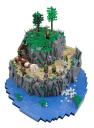
In the robbery scene I really like the non-square footprint. The rockscaping is really well done to give a lot of different shapes. Great height, and very cool that there is different action involving all three levels of the scene. One suggestion would be to take another photo from the water level looking up to take advantage of the elevation of the MOC - photographing from above tends to flatten out the scene more. In the second scene, another non-square base, also it's nice that the border between the green areas and the tan areas seems natural. The irregular fence in the back is good. Best detail, though is the texture achieved in the roofs by slightly angling the plates with respect to each other.
3. axel76 -Robbery of the tax money -
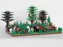
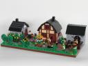
For me the highlight here is the robbery scene. Nice variation in the level of the ground, and the accents with lime green work well. I really like that cart with the rounded roof a lot. Also note stickshift levers stuck here and there as arrows that were shot at the cart.
Others, in no particular order:
PJCountach's skippable afternoon
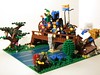
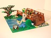
In the first image the jester is holding a pinwheel - that's a great little design that I'd never seen before. The use of trans elements to show movement for the skipping 'stones' in the second image is also a great idea.
Qi tah's Level Up
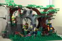
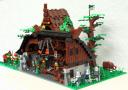
Interesting ruin deep in the forest as a setting for the robbery scene. In the second scene I wanted to point out two nice build features - On the taller structure in the back, the roof is done very nicely with a mix of tiles and cheese slopes. Also, in the middle of the building in front, there's a fig holding some sort of compound bow made of skelly arms and other pieces that's kind of interesting.
Nanuck's Ted Thug


Great rockscaping in the robbery scene. I do think that a couple of outlaws might have scaled the steep sides of the pass to shoot arrows down on the ambushed party. What made this whole MOC, though, was the punchline "That's why he's not known as Ted the thinker." I really got a chuckle out of that.
Peter's forestman tax
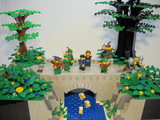
Really nice bridge design in the robbery scene. I do think it would have been better to have the riverbank be in all dark gray to give contrast with the light gray bridge, though. Cute ducks down below. In the wizard's workshop, I really enjoyed looking at all of the details, particularly the variety of little vials on the shelf.
Piglet's village donation
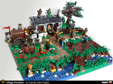
Nice idea here to use the stands from the Collectible figs in the construction of the roof. Also, the giant chest makes a good wagon.
My top three:
1. Derfel Cadarn -Rich Man's Mill & Drink And Be Merry -
In the robbery scene, that water wheel is outstanding - best solution I've ever seen for that. I also really like that the water is dark green rather than the standard blue. Also cool how a few of those three-leaf cylinder pieces are built directly into the stone walls. One subtle detail is in the rock wall in front of the door of the mill - he's topped it here with alternating 1x2 tiles and then 1x1 tiles raised one plate and rotated 45 degrees - that works very well. In the second scene I really like the detail achieved with tooth plates to look like pennants. The stained glass is also really nice.
2. Karrde - Aid the Poor -
In the robbery scene I really like the non-square footprint. The rockscaping is really well done to give a lot of different shapes. Great height, and very cool that there is different action involving all three levels of the scene. One suggestion would be to take another photo from the water level looking up to take advantage of the elevation of the MOC - photographing from above tends to flatten out the scene more. In the second scene, another non-square base, also it's nice that the border between the green areas and the tan areas seems natural. The irregular fence in the back is good. Best detail, though is the texture achieved in the roofs by slightly angling the plates with respect to each other.
3. axel76 -Robbery of the tax money -
For me the highlight here is the robbery scene. Nice variation in the level of the ground, and the accents with lime green work well. I really like that cart with the rounded roof a lot. Also note stickshift levers stuck here and there as arrows that were shot at the cart.
Others, in no particular order:
PJCountach's skippable afternoon
In the first image the jester is holding a pinwheel - that's a great little design that I'd never seen before. The use of trans elements to show movement for the skipping 'stones' in the second image is also a great idea.
Qi tah's Level Up
Interesting ruin deep in the forest as a setting for the robbery scene. In the second scene I wanted to point out two nice build features - On the taller structure in the back, the roof is done very nicely with a mix of tiles and cheese slopes. Also, in the middle of the building in front, there's a fig holding some sort of compound bow made of skelly arms and other pieces that's kind of interesting.
Nanuck's Ted Thug
Great rockscaping in the robbery scene. I do think that a couple of outlaws might have scaled the steep sides of the pass to shoot arrows down on the ambushed party. What made this whole MOC, though, was the punchline "That's why he's not known as Ted the thinker." I really got a chuckle out of that.
Peter's forestman tax
Really nice bridge design in the robbery scene. I do think it would have been better to have the riverbank be in all dark gray to give contrast with the light gray bridge, though. Cute ducks down below. In the wizard's workshop, I really enjoyed looking at all of the details, particularly the variety of little vials on the shelf.
Piglet's village donation
Nice idea here to use the stands from the Collectible figs in the construction of the roof. Also, the giant chest makes a good wagon.
[url=http://comicbricks.blogspot.com/]ComicBricks[/url] [url=http://godbricks.blogspot.com/]GodBricks[/url] [url=http://microbricks.blogspot.com/]MicroBricks[/url] [url=http://minilandbricks.blogspot.com/]MinilandBricks[/url] [url=http://scibricks.blogspot.com/]SciBricks[/url] [url=http://vignettebricks.blogspot.com/]VignetteBricks[/url] [url=http://www.classic-castle.com/bricktales/]Brick Tales[/url]
-
theboywarrior

- Steward
- Posts: 588
- Joined: Wed Jan 19, 2011 12:02 am
- Location: Trenzalore. Help.
Re: Bruce's contest thoughts - CCCVIII
" ...What made this whole MOC, though, was the punchline "That's why he's not known as Ted the thinker." I really got a chuckle out of that."
I got more than a chuckle, I was in agony!
All of these are super builds, congrats to all of you who won and who made it past the naughty list, unlike myself...
I got more than a chuckle, I was in agony!
All of these are super builds, congrats to all of you who won and who made it past the naughty list, unlike myself...
Some folk we never forget
Some kind we never forgive
Haven’t seen the back of us yet
We’ll fight as long as we live
[img]http://www.brickshelf.com/gallery/lord-of-o ... tizen2.bmp[/img]
Some kind we never forgive
Haven’t seen the back of us yet
We’ll fight as long as we live
[img]http://www.brickshelf.com/gallery/lord-of-o ... tizen2.bmp[/img]