
I'm sure it hasn't been two weeks yet, but it seems that rule isn't in place any more? If it is, my apologies. I'd appreciate critiques on this model (my second Ill Advised Journey entry):
http://www.flickr.com/photos/gid617/set ... 292047897/
Thanks!
CCC X MOC critiques thread
Re: CCC X MOC critiques thread
[url=http://www.flickr.com/photos/gid617/]Flickr[/url]
-
friskywhiskers
- Landlord
- Posts: 926
- Joined: Sat Dec 26, 2009 11:46 pm
- Location: Brooklyn, NY
Re: CCC X MOC critiques thread
Thanks for the critique Bruce! I didn't even think to put in the Trade/tolls Category b/c I assumed that required some sort of gate or port. Oh well!
[img]http://www.roawia.byethost7.com/titlemaker/ ... ald&size=1[/img][img]http://www.brickshelf.com/gallery/friskywhi ... banner.jpg[/img]
[url=http://www.flickr.com/photos/sir_edwyn/]Flickr[/url]
[url=http://www.flickr.com/photos/sir_edwyn/]Flickr[/url]
-
Bruce N H

- Precentor of the Scriptorium
- Posts: 6311
- Joined: Mon Sep 15, 2003 9:11 pm
- Location: Middle Zealand
- Contact:
Re: CCC X MOC critiques thread
Frisky,
Maybe it would have been a stretch in Trade and Tolls, I was just thinking this based on the category description of "regulation of medieval trade", thinking that's what the commerce guild would be involved in.
Gid617,
Into the swamp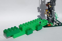
Well, I do like how you embraced the Duplo challenge, and the Duplo animal is kind of fun. But, well, it's made of 11 basic bricks. While it's pretty good for something made of that, it ultimately looks like something in the directions for a set for younger builders rather than a real AFOL/TFOL MOC. The detailing on the ground is nice, but I wish you'd actually made this cover a whole baseplate, and the rock formation and wooden scaffolding are well done, but way too spindly to look realistic.
Bruce
[url=http://comicbricks.blogspot.com/]ComicBricks[/url] [url=http://godbricks.blogspot.com/]GodBricks[/url] [url=http://microbricks.blogspot.com/]MicroBricks[/url] [url=http://minilandbricks.blogspot.com/]MinilandBricks[/url] [url=http://scibricks.blogspot.com/]SciBricks[/url] [url=http://vignettebricks.blogspot.com/]VignetteBricks[/url] [url=http://www.classic-castle.com/bricktales/]Brick Tales[/url]
Re: CCC X MOC critiques thread
well its been a week since you last crituqued my build, but the 2 week rule seams to have dissapeared, could I have feedback on this one please?
http://www.flickr.com/photos/67866231@N ... 994202618/
sorry for all those extra images in teh folder, they wern't there till I got a free pro account which expires this month, then they'll go
thanks for the feedback one the other two!
one more to go...
http://www.flickr.com/photos/67866231@N ... 994202618/
sorry for all those extra images in teh folder, they wern't there till I got a free pro account which expires this month, then they'll go
thanks for the feedback one the other two!
one more to go...
My FLickr [url]http://www.flickr.com/photos/67866231@N02/[/url]

Re: CCC X MOC critiques thread

[img]http://www.brickshelf.com/gallery/lord-of-o ... tizen3.jpg[/img] [img]http://farm9.staticflickr.com/8244/84879601 ... 04d4_t.jpg[/img] [url=http://www.flickr.com/photos/bentoft/][img]http://www.worldwatch.org/system/files/images/e2/Flickr.jpg[/img][/url]
-
soccerkid6

- Admin

- Posts: 2169
- Joined: Fri Jun 03, 2011 6:41 pm
- Location: Nordheim Keep
- Contact:
Re: CCC X MOC critiques thread
Would love to hear some feedback on my Set Rebuild entry: http://www.legocreator57.tk/CCCX-Set.php
Thanks again for doing this
Thanks again for doing this
John 14:6, Jesus answered, "I am the way the truth and the life. No one comes to the Father except through me."
Brickbuilt: http://www.brickbuilt.org/
Flickr: https://www.flickr.com/photos/isaacsnyder/
Brickbuilt: http://www.brickbuilt.org/
Flickr: https://www.flickr.com/photos/isaacsnyder/
Re: CCC X MOC critiques thread
Yes, I realized that the size of that one would probably kill it (the initial idea was 48x48 but, well, I ran out pretty fast). Thanks for the critique though, maybe one day I'll try to redo that build a bit bigger...
I'd appreciate some critique on my first Medieval Life entry as well:
http://www.flickr.com/photos/gid617/set ... 050809602/
I'd appreciate some critique on my first Medieval Life entry as well:
http://www.flickr.com/photos/gid617/set ... 050809602/
[url=http://www.flickr.com/photos/gid617/]Flickr[/url]
-
Bruce N H
- Precentor of the Scriptorium
- Posts: 6311
- Joined: Mon Sep 15, 2003 9:11 pm
- Location: Middle Zealand
- Contact:
Re: CCC X MOC critiques thread
Legonardo
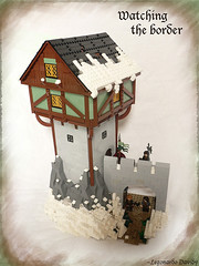
Watching the border
First, realize that this is an honorable mention, so it scored really highly. I really like the color scheme, and the mixing in a few brick-bricks into the wall to give some subtle texture. The rocks and snow-scaping are very well done. I did think the curved supports at the corners of the wooden structure atop the tower looked wrong - those should be concave curves rather than convex if they're going to give any actual support. I thought the wooden part extended a little too much beyond the stone part - it seems a little rickety to me. I was curious to see the other side of the wall. One other suggestion would have been to add another element - perhaps a traveler leading a horse and the guard stepping out to ask them who they were.
Bentoft,
Toberg library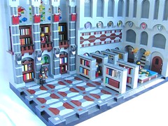
Again, this is another honorable mention winner, so scored very well. There was a lot to love in this MOC - all of the different mosaic patterns, the details on the shelves, the little table where the generals were planning their battles. I did think all of the patterning got to be a little much. Perhaps the portion on the right-hand side of the back wall should have just had simple arches with the dark gray background, like on the right-hand wall, instead of the mosaic pattern. I did think the proportions of the room seemed a little off. You've got this huge room, and all of the shelves and the generals' map/table are shoved over onto one side, with this big empty open dance floor. I know, you wanted to show off your mosaic floor, but it ends up looking odd. I think it would have been better if you'd spread the bookshelves and the generals more evenly through the room. Oh, that little stairway going off in the arch on the right-hand side is really great.
Soccerkid6,
6062 rebuild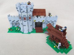
Again, this was another outstanding entry. I loved the way you referenced the panel walls from the original, but actually gave the wall some realistic thickness. The trick of having it fold up into a keep was particularly nice - I could imagine that being a great feature of a real set. It's a little odd that the base extends out one stud for an eight-wide section. It's obvious why you ended up having to add that, but it seems that you should have then gone back and just extended the whole thing forward by one stud so it was all even. In this case we had a direct comparison, as Eklund did the same set, and I just gave the slight edge to his since I liked his more-rounded tower and the way he made the windows into arrow slits with beveled edges, but I really liked both versions.
Gid617,
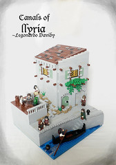
Life in the City of the Canals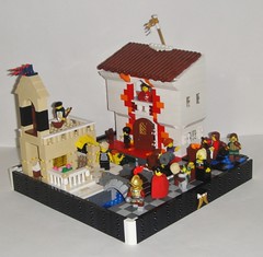
I have to say, looking at the complete set of MOCs you entered this year, you ran a little hot and cold. Some I liked much more, like the priest, the printing press, the Akbri Bridge, and the inn, but this one left me a little cold. I wasn't a huge fan of some of the different color schemes, like the little section of street that's blue and black tiles, or the wild splashes of red around the door of the white building. And then you had some nice detail, like the shutters on the white building, where you did them in white against a white wall and you could hardly see them - here some color would have been nice. I liked the roof on the white building a lot, but it looks a little crooked. My favorite portions were the bridge, and the little close-up shot of the guy carrying a barrel - there you really achieved some realism in the posing and head/hair-choice.
Watching the border
First, realize that this is an honorable mention, so it scored really highly. I really like the color scheme, and the mixing in a few brick-bricks into the wall to give some subtle texture. The rocks and snow-scaping are very well done. I did think the curved supports at the corners of the wooden structure atop the tower looked wrong - those should be concave curves rather than convex if they're going to give any actual support. I thought the wooden part extended a little too much beyond the stone part - it seems a little rickety to me. I was curious to see the other side of the wall. One other suggestion would have been to add another element - perhaps a traveler leading a horse and the guard stepping out to ask them who they were.
Bentoft,
Toberg library
Again, this is another honorable mention winner, so scored very well. There was a lot to love in this MOC - all of the different mosaic patterns, the details on the shelves, the little table where the generals were planning their battles. I did think all of the patterning got to be a little much. Perhaps the portion on the right-hand side of the back wall should have just had simple arches with the dark gray background, like on the right-hand wall, instead of the mosaic pattern. I did think the proportions of the room seemed a little off. You've got this huge room, and all of the shelves and the generals' map/table are shoved over onto one side, with this big empty open dance floor. I know, you wanted to show off your mosaic floor, but it ends up looking odd. I think it would have been better if you'd spread the bookshelves and the generals more evenly through the room. Oh, that little stairway going off in the arch on the right-hand side is really great.
Soccerkid6,
6062 rebuild
Again, this was another outstanding entry. I loved the way you referenced the panel walls from the original, but actually gave the wall some realistic thickness. The trick of having it fold up into a keep was particularly nice - I could imagine that being a great feature of a real set. It's a little odd that the base extends out one stud for an eight-wide section. It's obvious why you ended up having to add that, but it seems that you should have then gone back and just extended the whole thing forward by one stud so it was all even. In this case we had a direct comparison, as Eklund did the same set, and I just gave the slight edge to his since I liked his more-rounded tower and the way he made the windows into arrow slits with beveled edges, but I really liked both versions.
Gid617,
Life in the City of the Canals
I have to say, looking at the complete set of MOCs you entered this year, you ran a little hot and cold. Some I liked much more, like the priest, the printing press, the Akbri Bridge, and the inn, but this one left me a little cold. I wasn't a huge fan of some of the different color schemes, like the little section of street that's blue and black tiles, or the wild splashes of red around the door of the white building. And then you had some nice detail, like the shutters on the white building, where you did them in white against a white wall and you could hardly see them - here some color would have been nice. I liked the roof on the white building a lot, but it looks a little crooked. My favorite portions were the bridge, and the little close-up shot of the guy carrying a barrel - there you really achieved some realism in the posing and head/hair-choice.
[url=http://comicbricks.blogspot.com/]ComicBricks[/url] [url=http://godbricks.blogspot.com/]GodBricks[/url] [url=http://microbricks.blogspot.com/]MicroBricks[/url] [url=http://minilandbricks.blogspot.com/]MinilandBricks[/url] [url=http://scibricks.blogspot.com/]SciBricks[/url] [url=http://vignettebricks.blogspot.com/]VignetteBricks[/url] [url=http://www.classic-castle.com/bricktales/]Brick Tales[/url]
-
mencot

- Twifealdlic Builder
- Posts: 1180
- Joined: Thu Nov 17, 2011 8:28 am
- Location: Den of unforgotten heros
- Contact:
Re: CCC X MOC critiques thread
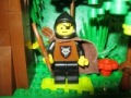
I would like to have some feedback on my CCCX custom figs:
Thanks
Thanks
Sir Mencot Paladin and rogue
[img]http://www.brickshelf.com/gallery/lord-of-orks/map/rankings/citizen3.jpg[/img][img]http://farm9.staticflickr.com/8244/8487960182_6a051704d4_t.jpg[/img][img]http://farm9.staticflickr.com/8120/8636932919_7220cc2cc9_m.jpg[/img]
[url=http://www.flickr.com/photos/mencot]Flickr[/url]
[img]http://www.brickshelf.com/gallery/lord-of-orks/map/rankings/citizen3.jpg[/img][img]http://farm9.staticflickr.com/8244/8487960182_6a051704d4_t.jpg[/img][img]http://farm9.staticflickr.com/8120/8636932919_7220cc2cc9_m.jpg[/img]
[url=http://www.flickr.com/photos/mencot]Flickr[/url]
-
Bruce N H
- Precentor of the Scriptorium
- Posts: 6311
- Joined: Mon Sep 15, 2003 9:11 pm
- Location: Middle Zealand
- Contact:
Re: CCC X MOC critiques thread
Mencot,
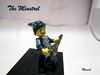
Wandering minstrel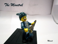
I should start by noting that I'm not a customizer, so while I may critique the end result, I certainly couldn't do it myself. This looks pretty good from the thumbnail, but when you look at it close-up it's kind of messy - you can see the different brush strokes, etc. The idea of doing a custom lute is great, but the result is lumpy, and ends up looking a little like a club instead. I do really like the shape of the hat. That's a nicely done custom accessory.
[url=http://comicbricks.blogspot.com/]ComicBricks[/url] [url=http://godbricks.blogspot.com/]GodBricks[/url] [url=http://microbricks.blogspot.com/]MicroBricks[/url] [url=http://minilandbricks.blogspot.com/]MinilandBricks[/url] [url=http://scibricks.blogspot.com/]SciBricks[/url] [url=http://vignettebricks.blogspot.com/]VignetteBricks[/url] [url=http://www.classic-castle.com/bricktales/]Brick Tales[/url]
Re: CCC X MOC critiques thread
Bruce, yes, that was one of my first entries and also one of my worst! Actually the blue and black section of the street was supposed to be a blanket, but obviously I didn't do a good job portraying that! I probably tried to shove too much into the build and as a result it looked a bit too busy (even to me  ). Thanks for the critique, though!
I'd love to hear your thought's on my Medieval Priest, which was my first customization attempt... http://www.flickr.com/photos/gid617/set ... 315162486/
I'd love to hear your thought's on my Medieval Priest, which was my first customization attempt... http://www.flickr.com/photos/gid617/set ... 315162486/
[url=http://www.flickr.com/photos/gid617/]Flickr[/url]
-
mencot
- Twifealdlic Builder
- Posts: 1180
- Joined: Thu Nov 17, 2011 8:28 am
- Location: Den of unforgotten heros
- Contact:
Re: CCC X MOC critiques thread
Thanks Bruce, yea customizing isn´t really easy to do, I really like it though but have to find better ways how to make tiny details on the figs because my hands aren´t so steady any more as when I was younger.
There are a few more entries I would love to hear some comments about, I see that the 2 week wait is gone now but I won´t load you with entries.
One more entry and then I will wait again.
What about this moc, what was good and what could been done better:
Thanks again
There are a few more entries I would love to hear some comments about, I see that the 2 week wait is gone now but I won´t load you with entries.
One more entry and then I will wait again.
What about this moc, what was good and what could been done better:
Thanks again
Sir Mencot Paladin and rogue
[img]http://www.brickshelf.com/gallery/lord-of-orks/map/rankings/citizen3.jpg[/img][img]http://farm9.staticflickr.com/8244/8487960182_6a051704d4_t.jpg[/img][img]http://farm9.staticflickr.com/8120/8636932919_7220cc2cc9_m.jpg[/img]
[url=http://www.flickr.com/photos/mencot]Flickr[/url]
[img]http://www.brickshelf.com/gallery/lord-of-orks/map/rankings/citizen3.jpg[/img][img]http://farm9.staticflickr.com/8244/8487960182_6a051704d4_t.jpg[/img][img]http://farm9.staticflickr.com/8120/8636932919_7220cc2cc9_m.jpg[/img]
[url=http://www.flickr.com/photos/mencot]Flickr[/url]
-
Bruce N H
- Precentor of the Scriptorium
- Posts: 6311
- Joined: Mon Sep 15, 2003 9:11 pm
- Location: Middle Zealand
- Contact:
Re: CCC X MOC critiques thread
Gid617,
Priest
I liked this quite a bit. I thought the glitter worked out well. Yes, it certainly could have been cleaner, but really tough to do using this sort of technique. The glitter was messiest on the hat - I might have suggested using a different hat, or else just going with hair. One mistake is that the printing is on the wrong side of the Bible.
Mencot,
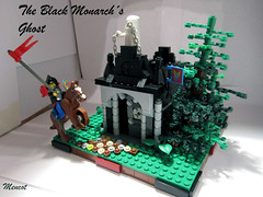
Black Monarch's Ghost
This entry did a pretty good job of referencing the source material (though you didn't include the bird). I'm not a fan of the black/light gray color scheme, but that's true to the Black Monarch's Castle. I did think the crypt was too busy - it felt that in this case less detailing would have accomplished more for you. The tree falls into the trap that many LEGO trees fall into - when you are looking at it head-on it's just a bunch of parallel lines pointing out of a trunk.
Bruce
Priest
I liked this quite a bit. I thought the glitter worked out well. Yes, it certainly could have been cleaner, but really tough to do using this sort of technique. The glitter was messiest on the hat - I might have suggested using a different hat, or else just going with hair. One mistake is that the printing is on the wrong side of the Bible.
Mencot,
Black Monarch's Ghost
This entry did a pretty good job of referencing the source material (though you didn't include the bird). I'm not a fan of the black/light gray color scheme, but that's true to the Black Monarch's Castle. I did think the crypt was too busy - it felt that in this case less detailing would have accomplished more for you. The tree falls into the trap that many LEGO trees fall into - when you are looking at it head-on it's just a bunch of parallel lines pointing out of a trunk.
Bruce
[url=http://comicbricks.blogspot.com/]ComicBricks[/url] [url=http://godbricks.blogspot.com/]GodBricks[/url] [url=http://microbricks.blogspot.com/]MicroBricks[/url] [url=http://minilandbricks.blogspot.com/]MinilandBricks[/url] [url=http://scibricks.blogspot.com/]SciBricks[/url] [url=http://vignettebricks.blogspot.com/]VignetteBricks[/url] [url=http://www.classic-castle.com/bricktales/]Brick Tales[/url]
Re: CCC X MOC critiques thread
hey could I have feedback on this?
thanks
http://www.flickr.com/photos/73083455@N ... 079742979/
David
thanks
http://www.flickr.com/photos/73083455@N ... 079742979/
David
My FLickr [url]http://www.flickr.com/photos/67866231@N02/[/url]
-
soccerkid6
- Admin
- Posts: 2169
- Joined: Fri Jun 03, 2011 6:41 pm
- Location: Nordheim Keep
- Contact:
Re: CCC X MOC critiques thread
Thanks again for all the very helpful criticism.
Some feedback on my medieval life entry: http://www.legocreator57.tk/Varlyrio.php would be appreciated
Some feedback on my medieval life entry: http://www.legocreator57.tk/Varlyrio.php would be appreciated
John 14:6, Jesus answered, "I am the way the truth and the life. No one comes to the Father except through me."
Brickbuilt: http://www.brickbuilt.org/
Flickr: https://www.flickr.com/photos/isaacsnyder/
Brickbuilt: http://www.brickbuilt.org/
Flickr: https://www.flickr.com/photos/isaacsnyder/