Hey,
It looks like we're down to the same people asking for additional critiques. Unless there are any new people asking for feedback, I'm going to address these and then call it a day on this feedback thread.
Legonardo,
Canals of llyria 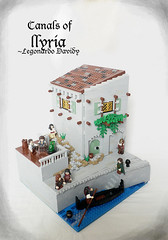
This was an honorable mention winner, so again there's not really anything 'wrong' with it. I really loved the angles and the curve of the sea wall. The texturing in the walls and the little details like the curved bit of the hinge plates and those clip plates are great. I also love the brick-built gondola. I have no clue why there's a bearded guy in the water, but I'll assume that's some sort of inside joke. It's also unclear what the hair on top of a post at the top of the steps is. My only build suggestion is that I would have made the road portion a different color - either dark gray or dark tan, just to break up the mass of light gray. I generally love the color scheme, so I wouldn't do too much with color variations, though. Another suggestion is presentation - essentially your three images are all the same - the second and third are just closer-up views of the top and bottom half of the first, from the same camera angle. I'd suggest looking at this from a couple of different angles, maybe one from the perspective of the fig on the gondola, looking up at the town above.
Soccerkid,
Life in Illyria (popular place) 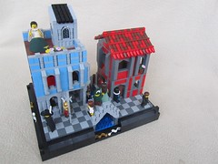
Another very strong entry. I liked the red/dark red roof in particular, also the details with the alternating light gray 1x1 cylinders and 1x1 round plates, and the gallery along the canal. I normally am not a huge fan of checkerboard walkways, but here I think it makes a nice color scheme transition from the blue building with light gray accents to the red building with dark gray accents. The building interiors are too clean. The buildings don't look lived-in. On presentation, as with Legonardo, I think you could have chosen at least one low angle. Looking at your personal site with more photos, I really like the one looking down the canal between the buildings where you can see the couple on the bridge at the back. The proposal scene is a nice touch of life, btw - is this some sort of personal life reference?
Gid617,
Hall of ancient history 
I'm sorry, but I didn't like this entry very much. You had some nice ideas, but it comes across as a squat unlovely building. I think I said previously that I thought you ran hot and cold in the contest, and this one was cold. I think your overall collection in this contest would have looked better if you'd either gotten rid of or drastically changed a few of the entries (this one, the swamp escape, and the camp at red ruby).* Now, I did really like the low broad stairs with the red carpet, the railing, and the mosaic floor. If I were rebuilding this I think I'd rip away three walls of the building altogether, make the wall across the middle much taller, and add some wide-open doors - basically make this the cutaway of the front entrance to a palace. Then take photos from each side - from the 'outside' you'd see the steps running up to the door, from the 'inside' you'd see the entry hall, with that mosaic floor, and some detail like a potted plant or a statue on one side of the door. You could transplant that stained-glass window from the side wall to a window above the front door (remember I'd make this wall much taller).
*Sorry to be harsh, but OTOH I've noted above that I really liked several of your entries - the printing press, the priest, the bridge, the library - and others I liked with some reservations, as in my critique above in this thread of the feast and the city of canals, and also the escape entry. There are a couple (the custom fig and the boat) that weren't bad, but felt a little like filler to me.
And, unless there are other people that haven't previously asked for critiques, I bid adieu to CCCX. Thank you, all, for your wonderful entries.
Best. LEGO contest. Ever.
Bruce