Hey all,
Sorry for the delay - every time I go back to finish up this post, a few more people have added requests. Perhaps I should have just posted what I had rather than try to comment on everything, but too late for that now - here you go, I think I'm caught up.
Brickninja, okay, it's been a week.
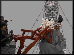
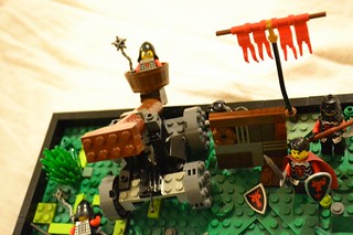
Human catapult

I really like the idea here and several of the elements. The catapult itself is good, though maybe a little overly blocky on the front end - maybe if you capped off the brown 2x4 brick on the front of that arm with two 2x2 45 degree brown slopes. I'd also think a little more about color bocking on the catapult - maybe mostly brown with a few accents of another color. Similarly on the ground, I don't think those lime green pieces work. The mantlet is a great detail. On presentation I think you might have been better off going with one overview shot, one from the perspective of the defenders looking down on the attackers, and one from the perspective of the attackers looking up at the attackers. One suggestion that might help the human element would be to show the result of the human catapult, having another fig splatted up against the wall. Maybe then have a few more figs lined up to be the next ones to climb in the catapult, and use the face that looks scared with drops of sweat to show that maybe they don't think this is such a great plan.
Nanuck
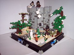
Stone Meadow Castle
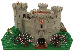
This was a great castle, it just fell in with an extremely strong category of competition this year. I really liked the mottling of the walls, the way you incorporated a few different tower shapes/styles, that great tree, and some of the nice little life details. If I had to complain about something, it did feel a little to me like the proportions were off. I think this would be improved if there was a large keep inside - as it was, there are these massive fortifications all protecting a small wooden building in the middle. The biggest building here is the gatehouse, which seems out of balance.
Eklund
Hrastornj Castle
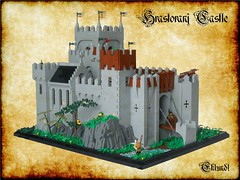
As with Nanuck this is a wonderful entry in a category full of wonderful entries. I really love the color blocking of this. I think this is a wonderful example of how the Big Gray Wall is not a bad thing at all, the way you offset it with the dark gray rocks, the greenery, and the brown wooden accents and the black roof on the chapel. I particularly like the subtle insets in those arched sections along the right side of the castle. My only real complaint is that I'd like to see the surrounding landscape extended a little on the front, just so that drawbridge doesn't go across and then drop off. If you extended the ground out front, and then showed a road winding up to the main entrance, that would be great - probably then I would add some more fig life, like maybe a carriage coming towards the gate, and some guard coming out to greet them, or something like that.
One thing I'd really love to see people do, and this not just you, or Nanuck, but anyone who has gone to the effort, time, and bricks to build one of these massive castles, is to take the castle and dress it up to show lots of different situations - change up the seasons by replacing the greenery with snow or fall colors, have a festival or fair with lots of visitors, vendors, entertainers, etc, put the castle under siege from a surrounding army, maybe some sort of ceremonial procession coming to the castle, etc.
Kumplekante
Ebbegard
Really the same comment as with the previous two castle entries, and yours scored even better than those two, since yours was an honorable mention. If I may offer two critiques, I have a general view that MOCs should have a contrast between simple and complex, both in details and in color scheme. If you've got a very detailed color scheme for the castle, I would make the surrounding landscape pretty monochromatic. If OTOH the castle is all one color, I would make the more color variation in the landscaping. Here you've got a lot of different color accents and mottling in the castle, and also your landscape uses different blues, greens, etc. I would agree that this is more realistic, but it sometimes hides the details of the MOC, especially when looking at a small number of photos of a large MOC. My other critique is on presentation and photo choice -- your birds-eye view photo of the courtyard isn't doing you any good here. Overhead camera angles tend to hide details rather than highlight them, IMO, in that the fig action gets reduced to just the tops of heads, and all of the vertical elements get flattened out.
Legonardo
Dark of Mirkwood
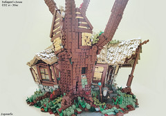
This was a pretty amazing build, as recognized by being an honorable mention in the very difficult misc category. The way you achieved all of those crazy angles was pretty stunning. If you're going to force me to nitpick I suppose I could say the tree trunk could be a little more rounded, but I'm really forcing myself to find something there. I guess the one thing I would do to add a little more to this would be to have Radagast doing somehing more than just standing in front of his home. You could have him hanging out with some animals (say that Friends hedgehog), or hopping on his bunny sled, or maybe to take an already epic MOC and make it a little epicer, have a giant spider attacking the home.
RoyalBrickCustoms
Roaring Lions
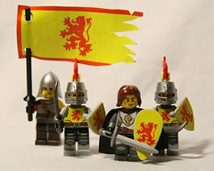
The faction design you've created is really nice and the decals are well applied. One suggestion is that the flag looks too clean. If the one edge is all torn up, this is a flag that's been around a long time and the whole thing should be worn out. Maybe you could get that effect by repeatedly crumpling up that flag, then flattening it out again, etc, and also fray up the other three edges a bit. My other critique is that the build part is a bit of a throw-away. The category wasn't simply to create the custom figs, but to 'build a scene' with them. All you have in the one scene is a little bit of a tan plate with a couple of plant pieces (and that pic is slightly out of focus, btw).
Luke the Swift - this thread is all about CCC feedback. How about starting a separate thread in Castle MOCs for your build?
Lil_Curt
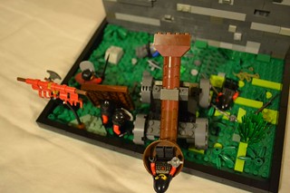
Blacksmith attack
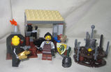
This build could hardly count as an alternate model. About all you did was take off the water wheel from the official design. Perhaps this set wasn't the ideal choice for doing an 'alternative model' category submission, because there's not a lot you could do with it.
Soccerkid
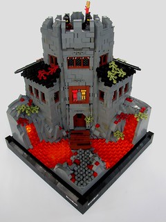
Wolfpack fortress

This MOC falls into one of my critiques for several of the 'secret hideout' entries - it's not really very secret. I really like the glowing lava, the rough walls, the black roof, and the way you made the front entry on an angle. One critique is that you can see light peeking through around the tops of the arched windows on the front. Also, that brown frame around the flags above the door looks a little odd. I really like that there's an interior - one critique is that the floor is too thin and unsupported - maybe some support beams or arches holding that up.
Takkata
Lothlorien

I really liked your entry a lot and scored it very well. I love that sweeping spiral staircase, the way you did the flets as plates splayed out around the tree trunk and the elegant curve of the bridges. One critique is that I think for these (presumably the guard post where Frodo and company spend their first night on the edge of Lorien) the leaf cover should be a lot thicker. Doesn't a whole company of orcs march through right underneath? If any of them looked up they'd immediately see these.
Josdu
Entrance to the Underworld

I don't mean to be harsh, but I just don't get what's going on in this MOC. I do like the red dragon head, though you should round off the nose a lot more. The tower thing on stilts in the back seems very structurally unsound, though I do like the spiral staircase you added on the back. I think the ground would be helped a lot by sticking with a main color scheme of black or gray, and then just adding in a few accents of other colors.
Mrcp6d
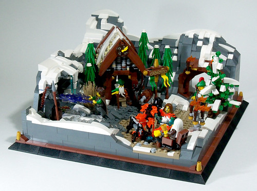
First Snow
There are some really nice parts to this - I love the rock and snow-scaping, the arch cave entrance on the right, the trees around the hut, etc. My main thing here is that it's too busy, which makes it hard for the eye to focus on details. I would edit a lot out of this - definitely the tree on the right-hand side, that rack of torches, maybe make the roof of the hut brown rather than tan so there's not as much color variation there, and I'd probably get rid of the fire-pit in the front and those two figs, and move the guy casting blue spells on the left down to the middle. Oh, I'd get rid of the gold cones in the corner of the frame. I know that the fad for the past year or so has been to always make a little frame around the base of MOCs, but when the MOC itself is a little on the busy side, adding superfluous details around the frame just add to the cluttered look.
Rifirofi
Bird strike
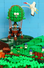
I really like this and it was one of my top scores in this category. I love the microscale for perspective, the shape of the baloon and gondola, the bird, etc. I didn't actually get at first that the baloon was a frog, and so I was confused by the little cones on the side and the face. One thing that really jumps out at me and I would get rid of it is the rust-brown wedge on the lower left. In fact I might make the hills on the left all in normal green, and just have brown accents for dift along the lower ground. I also would probably simplify the color scheme of the gondola - maybe replace the dark and light gray bits with black. The micro houses are lovely - my only nitpick is that you shouldn't see straight through the one that's a 1x1 technic brick to the green behind it.
Purple Wolf
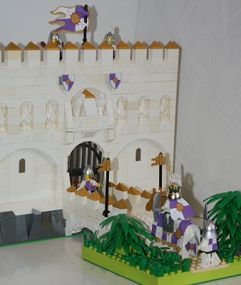
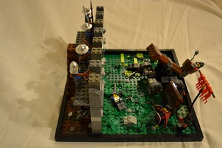
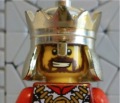
Sunknights
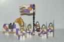
I've already remarked on your other MOC on some of the wall details that I liked, that you also have in this scene. I generally like the livery you've created, though in a couple of places you can see the stickers peeled up a bit (e.g. the spearman marching behind the king's horse). Maybe waterslide decals would have served you better. Also, I thought the figs were too white. Maybe for the king this is okay, but I don't see soldier's marching around in a lot of shiny white pants. I think the build would have been helped if the ground at the front were the same width as the wall part in back and if you put in some blue for the moat. Having the fortress with a bridge over nothingness to a small little bit of ground made this feel a little bit like a floating rock MOC.
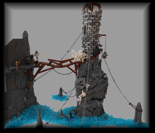
Gom
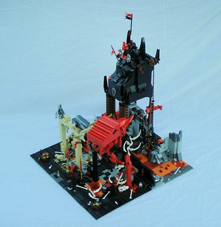
Cedric's misfortune
Same comment as with others about a tower on top of a rock spire not being very secret. I really like the way you did the round tower - that's very effective, and the rickety bridge is fun, also the army of skellies bursting out of the door. Not sure what the black-cloaked fig is doing going away from the action up the spiral stairs. I'm not a big fan of the chains and would probably delete them. The cliff face on the near end of the bridge seems very unfinished, particularly in
this picture.
Ronin
First Snow
I really liked this MOC - it had a lot of fun details in it. The best bit was the guys sweeping the snow off the ramparts - brilliant to have the one that still has snow be all rounded, and where the snow has been cleared you see those jagged details, and the flalling snow is very effective. I would jusggest more snow-scaping on the ground part - maybe cover up all of the tan, and have the snow be more uneven down there. One critique is that if it's winter, those leaves should probably have fallen, and so maybe the non-evergreens should be leafless (or at least the fall color leaves). Also, I would give the snowman a blank face (or just turn the head around), as the face you have there is pretty creepy, glaring at the two boys.
Mark
Brynolf aff Kwrala

I think this guy was probably the weakest of your entries. In several places, particularly the weapon, the cuts aren't very clean, and I also thought the vearious bloodstains were a little messy. Your Roman, Norman and Welsh figs were all significantly better customs, IMO.
Bruce


