
Black Knight Art Mosaic
Black Knight Art Mosaic
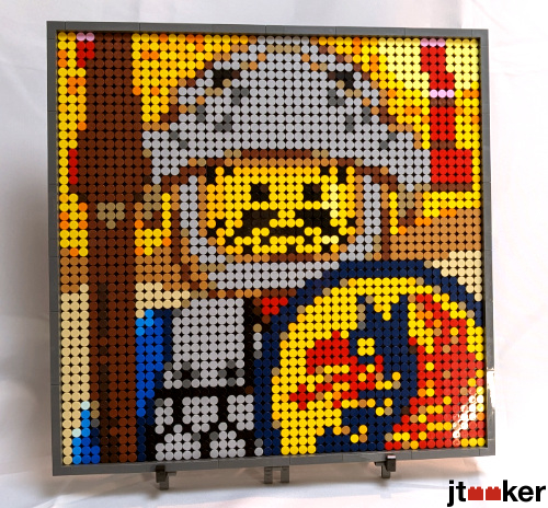
I created this Mosaic from the LEGO Art kit 21226, DOTS and other pieces I was able to find. It is 48x48 studs.
-
AK_Brickster

- Admin

- Posts: 3476
- Joined: Wed Jun 22, 2011 5:02 pm
- Location: Mushing through the Great Driftplains of Garheim
- Contact:
Re: Black Knight Art Mosaic
I like this a lot! It's very readable, even at a relatively small scale of 48x48. The helmet plumes in particular are extremely well done!
If I were to offer feedback, it would be to go with a color other than yellow/orange for the sky/backdrop in the upper half of the mosaic, to bump up the contrast value a bit.
If I were to offer feedback, it would be to go with a color other than yellow/orange for the sky/backdrop in the upper half of the mosaic, to bump up the contrast value a bit.

Re: Black Knight Art Mosaic
Thanks for the input. I don't have a place to display this, but I do have a narrow place, so I was thinking of just doing the shield as 32x48 or 32x64 mosaic. I'll keep the background contrast in mind.

Re: Black Knight Art Mosaic
I hardly pay attention to mosaics to be honest but this is so well done, nice. Agreed about the background contrast thing, but otherwise just perfect! How cool it would be to make several different from same era and display them on the wall or something.
-
Formendacil

- Knight Templar

- Posts: 4162
- Joined: Wed May 05, 2004 7:22 pm
- Location: Ashland, MA
- Contact:
Re: Black Knight Art Mosaic
I'm going to say that I like the yellow background: I don't think the lack of contrast is necessarily bad. As it is, the image both evokes the yellow backgrounds of the 80s/90s boxes and it gives the whole image something of a signature colour. I can see the argument for it being different--but I also like it as is.