Posted: Fri Feb 01, 2008 9:27 pm
Why not? My trojan horse entry (that was supposed to be in the historic event category) from Medieval Legends.

Hob Took
Hob Took
The source for all your LEGO Castle needs!
http://www.classic-castle.com/forum/
The more you practice at giving critique, the better you become at giving it. It benefits everyone.SavaTheAggie wrote:Lol... I'll consider myself on notice.Hippotam wrote:Lord Sava, now you are under close scrutiny of the Poles.
Consider yourself warned
EDIT: It's becoming "good cop/bad cop" game, I love that!
I'm not sure how wise this all is. Not only do I usually have a hard time giving criticism, but if this helps people improve, next years contest will be even harder to grade... ugh.
--Tony
Your Tower of London MOC suffers from its' size. It's a very imposing MOC, but given its' enormous size the pictures that we limit the contest cause its' detail to be lost. The terrain around it is also a bit plain, whether that be a fault of the subject or design. Large MOCs such as these are great to look at, but usually fail to score highly in our contests specifically because their detail is lost from afar.Randman wrote:Lord Sava, please, I beg you, tell me why these two sucked:
Tower of London from Misc
http://www.brickshelf.com/cgi-bin/gallery.cgi?f=292885
Tower of London Chapel from Castle Space
http://www.brickshelf.com/cgi-bin/gallery.cgi?f=292890
Thanks for the feedback!
I'm not going to go searching for your MOCs for you. Please provide a link to the MOC you'd like me to critique.Asterios wrote:ooh ooh do mine too
Your MOC is well built, and there's a lot of great tension that can be felt between the two figs. Unfortunately, there really isn't a lot of playability here, and I know the figs are supposed to be stoically staring each other down, but there really isn't much 'life' to be seen. I would have liked to have seen more detail on the beach (rocks, change in elevation, etc.), and the studs on the wave put next to studless water is very distracting. If you're going to use studless water I would have much rather seen slopes and tiles on the large wave (excepting, perhaps, studs on the white foam to add texture).DARKspawn wrote:So as not to be a hypocrite I offer up the creation that I thought was the weakest in my collection of 6.
Musashi vs Kojiro
Although it was my weakest entry (IMO), I really love this MOC because it gave me a chance to make a tribute to one of my personal heroes, Miyomoto Musashi.
Go, my child, into the salavating maw of Sava's critique ...
Both of these MOCs made it in the top ten for the Medieval Legends category, which means they both scored high, and also makes them hard to critique.Piotr wrote:Hi Tony!
This is me entry, to Medieval Legends categorry:
The Last Adventure
The Dragon of Wawel Hill
Please comment my work!!
It's ok.SavaTheAggie wrote:Exactly.Bruce N H wrote:Hey Tony,SavaTheAggie wrote:
However I will say that without any 'live' minifigs in the dungeon area, it seems pretty, well, dead. Also, the connection between the two rooms isn't very obvious, I'm not sure how they connect. Granted, I *think* you were trying to show what would happen to the Queen's 'friend' if he was caught, but as a judge I'm not allowed to assume anything, I have to take everything at face value. It would have been better, I think, to have somehow shown a connection between the two rooms, either by a more obvious physical connection (hallway, something) or turned it into a vignette, with the figs repeated in each room like a before and after.
--Tony
You misinterpreted this one. The 'dungeon' area is actually the secret passage leading to the queen's room that her paramour is escaping into. At the far left of that image, the brown is the door that is disguised as a wardrobe in the queen's room.
Bruce
SavaTheAggie wrote: Ooh... dang, I feel embarressed. Knowing this I would have really liked a better shot connecting the two, perhaps replacing the close up shot of the man escaping into the wardrobe with one looking out of the passage into the room through the wardrobe, to illustrate the connection between the rooms.
My apologies.
--Tony

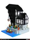
The Port Crane entry was actually one of my favorites for this category. It does have a few flaws. The action of the scene does not relate well to the crane. Second, we have this nice giant crane lifting a single wheel. I would hope to see a heavy crate being lifted from a larger ship or barge. Black is hard to photograph, so perhaps better lighting or using a different color for the crane would have helped. The moc is also very monochromatic. Using more mottling for a cobblestone street and canal/dock wall would help. A plant or vine would also add color.Hippotam wrote:Lord Sava,
Our club fellow Liwnik for some reason can not register on CC forum and he asked me to post on his behalf:
Please, comment on the Port Crane, submitted to Trade & Industry category:
Thank you!
I also really liked this entry. You captured the action of this great story nicely. The cap on a pole and cobblestone courtyard were built well. Your well is nice but needs a slightly larger roof.Athos wrote:My, you've got a lot of commenting to do...
And William Tell:
http://www.brickshelf.com/cgi-bin/gallery.cgi?f=284932
Steve


