Page 1 of 1
Jellybean--Chapter 2: The Prince and the Feathered Hat
Posted: Tue Jun 06, 2006 3:34 am
by eNiGMa
I really pushed myself to get this done before Thursday (I leave for a couple weeks on that day), and I'm glad to finally be done. So, here's Chapter 2 for your enjoyment!
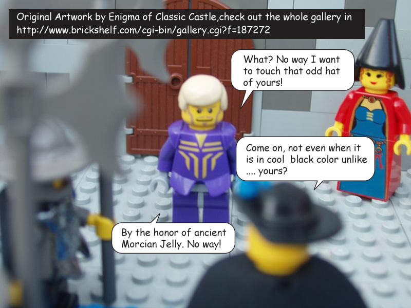
http://www.brickshelf.com/cgi-bin/gallery.cgi?f=187272
Chapters 3 and 4 are already planned out, so I'll get to work on those when I get back. Thanks for reading!
Posted: Tue Jun 06, 2006 3:29 pm
by TheOrk
Another great chapter!
This one really made me laugh, it said what we're all thinking.
The only question I have is, is why do the Morcians have cool armour?

Posted: Tue Jun 06, 2006 3:44 pm
by eNiGMa
TheOrk wrote:The only question I have is, is why do the Morcians have cool armour?
I didn't have any of those chess set crossbowmen available to guard the king.

Posted: Tue Jun 06, 2006 5:54 pm
by smcginnis
I like this chapter, very funny. The Morcians certainly look good that way, I'm glad you don't have the chess set!
~smcginnis
Posted: Tue Jun 06, 2006 7:39 pm
by Sir Kohran
The only question I have is, is why do the Morcians have cool armour?
Why are you asking that? The Morcians have always had cool armour.

Anyhow, I loved this one. I liked the megafig King Mathias shield on the wall - it added a reallyt nice effect. And the conversation about the 'sexy hat' was priceless. The guards with the chrome armour and the helmets looked excellent. Not sure about the guards with the Samurai torsos, but aside from that, great.
- Matt
Posted: Tue Jun 06, 2006 7:47 pm
by eNiGMa
Sir Kohran wrote:Not sure about the guards with the Samurai torsos, but aside from that, great.
I needed something that didn't scream "non-Morcian faction," so I used the Samurai torsos because they were blue and didn't have a faction-specific crest on them.
Thanks for all your comments!
Posted: Thu Jun 08, 2006 1:56 am
by InquisitorW
So random... so awesome. I just don't know what else to say about this. Looking forward to more.
Posted: Fri Jun 09, 2006 9:17 am
by Fry_slayer
Most excellent!
A few points though which i believe can greatly improve the overall flow and structure of the way the story is told
1) Check your focus, some frames has it the main speaking character is blurred while the side cast is focus, definitely a technical issue
2) Instead of having one dialog bubble at a time in a frame have multiple speak bubble instead so there are interactions between characters. This will ofcourse drasticly increase the amount of text in the frame, so i will suggest using squarish dialog bubble instead
I took the liberty of modifying one of ur frame to show what i mean, i really hope u wont mind, else PM me and i will delete it.
 Click to View
3) Some toppings:
Surely u can do better than pure blue background with wardings on top as starter?
I see real great potential of where you are heading, u just need to polish up the bits and detail, i can only point so much as comic was once the center of my life. This really brings back my old days feel when comic was life itself back in the old days.. before video games... before internet.
Later
Posted: Sat Jun 10, 2006 4:13 am
by eNiGMa
Those are excellent tips, Fry_slayer! I especially like what you did with that frame--very cool. I like the look of the squarish dialog bubble.
Thank you!
