DNL wrote:I would like it to know what you think about
these MOCs
Friclifh was right up at the top. The battle is wild and full of great action. It was a great entry. However, in order to whittle down the top entries, I had to get really nitpicky. Here are my nitpicks. The black skeletons on top of the fire are posed oddly. They just don't look quite right. I think they look like that because they are archers and they really can't hold those bows right. But, whatever the reason, they look a bit off. My only other nitpick on this is a timing issue with the Ballista. The action shot of the bolt taking off the skeletons head is awesome, but the ballista is already reloaded. If it had just fired that bolt, there is no way it could have been reloaded that quickly.
Under Attack was also a good entry but not as good as Friclifh. The burning building was a really nice touch and I liked the hastily constructed barricade. What hurt you in this one was the fig posing. The archers hurt you a bit, thought I realize how hard it is to get archers in a decent pose. One of your soldiers at the barricade isn't looking at the enemy as he stabs at them and in the street fight, the soldiers at the rear aren't running in, they're are just standing there with both feet on the ground. You have a number of figs in this who are posed well, but the rest seem like they aren't doing enough.
SlyOwl wrote:Hey
I would like to know what you think about my entries...
Which did you think was best?
What could I do to improve?
Your entries were very impressive. Almost all were top-notch.
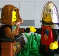
Your best was Tirachinas. It didn't get knocked out of the running until right near the end. I loved the action, the guys swimming in through the drains. Your archer could have been posed better, that is a common problem. I really like the flowers as blood and the arrows in the victims. I wasn't crazy about the use of the tire as a projectile in the wall, but it works. In the end, I had to get really nit-picky and it came down to one glaring mistake you made. It was the dead woman in the building. I couldn't find the rest of her. Her torso is there, her innards are obviously there. The rest is missing.
Triengard had a really nice landscape. That impressed me. What hurt you here was the flow of battle. The timing just seems off. There are crownies running in from the side and actively killing people, but then there is one running out of the hut, who has obviously been there a while, as well as the one throwing the baby in the water. I couldn't figure out the sequence of events at all. One other issue is the dead old man. He is wearing glasses.
Skeleton Village Attack was an interesting idea and I like the forced perspective of the buildings. Again though, it was the flow of battle. You have one Crownie running away and his weapons are nowhere to be seen. He was leading the charge empy-handed, I guess. But the main problem is the dead Crownie on the left. Who killed him? All the skeletons nearby have weapons, but there is a cutlass sticking out of his gut.
Asmodeus was cool. I love the beast and the action on the beast itself is first class. And the skeleton pushing the guy into the pond made me laugh.

However, I couldn't overlook the guys at the base. They are just standing there, both feet on the ground.
So, to sum up, your building skills are fantastic. Way better than mine. Also you did an excellent job with a limited number of figs. Perfect. But you need to work on some of your fig posing and think about the sequence of events that lead up to your scene.
SirNadroj wrote:Hi! This was really a fun contest, and I was glad I was able to whip something up. I had a feeling I'd lose since mine's so darn tiny compared to the other glorious entries, but what do you think of mine?

Your landscaping was incredible. Your gore was a bit over the top, but that is a personal taste issue. I didn't mark you down for that.

The blood on the sword was nicely done. I hadn't seen that before.
Here is what hurt you. The dead guy looks like he flew apart in surprise. It doesn't look like the troll chopped him in half. He isn't in range, in fact it looks like he (the troll) is still running up.
SavaTheAggie wrote:Oh why not. I may be a judge on other contests but that doesn't mean I should be immune from constructive criticism.
Breath of the Dragon was my favorite. The idea of a large group of soldiers attacking these two guys and getting blown away cracked me up. I liked the burned out swath, the bent over trees, the smoothed off rock, etc. The landscaping fit perfectly.
It was only nitpicks that disqualified this one. Obviously, we are seeing this immediately after the blast. No one has really had a chance to respond, but the mage and his companion don't look alert enough. Also the mage's cape is blowing back behind him rather strongly. If the wind was blowing like that, he would have gotten singed a bit.
Cry of the Ancients was well concieved and your lighting was excellent! Again the landscape fit perfectly. But the skeletons did you in (as they often do). The ones fighting are fine, but the skellies on the outskirts seem to just be strolling in.
Seige of Castle Rock had extremely impressive landscaping. But the flow of battle seemed off. I couldn't figure out a plausible sequence of events that would have gotten everyone where they were.
Giorgio Chronas wrote:I'd better be fast asking about my entry before all other 97 guys ask josh to give his critique. Josh you will wish you never offered your comments...
Nah, I don't mind!
I have some time today, after this people are going to have to wait longer....
Your entry was very impressive. Landscaping was good and excellent seige engines. And I could easily figure out the sequence of events.
However, I couldn't ignore your archers. I just couldn't live with the pose you chose for them. While I realize how difficult it is to pose archers, this just did not work for me. They are effectively holding their bows behind their heads.
Hope this helps!
Josh


