CCC X MOC critiques thread
Re: CCC X MOC critiques thread
I would be grateful, if you share your opinion about my entry.
http://www.flickr.com/photos/designabis ... 384947390/
Thanks.
http://www.flickr.com/photos/designabis ... 384947390/
Thanks.
- Bruce N H
- Precentor of the Scriptorium
- Posts: 6314
- Joined: Mon Sep 15, 2003 9:11 pm
- Location: Middle Zealand
- Contact:
Re: CCC X MOC critiques thread
Gid 617,
Desert journey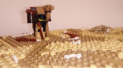
That's good as far as it goes, but there's not much to engage with there. Something to heighten the urgency would be nice - a vulture picking at those bones would be a great addition. I did like the tan/dark tan variation, but I think it would have been more interesting if there were more elevation changes (e.g. see Rocko's Dune MOC). Also, there is no difference between your three photos. At least turn things around so we see this guy from different angles (bird's eye view might be cool as it could be a vulture overhead). One last issue was that there was nothing that said 'castle' to me. That scene could be from a thousand years ago or last week. Perhaps using a different fig would help here.
Matthew,
Fire and Water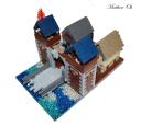
This is fine as far as it goes, but could have been so much more. I understand that the photos make it hard to see some details, like the fronts of the houses, but perhaps camera angles would have fixed that. The houses themselves are simple rectangular floorplan - these could have been changed a bit perhaps. My main problem with this MOC is what it was missing. This is, presumably, Laketown (from the name, and the fact that it was also your MELO entry). Laketown was built up on piers, which would make this much more interesting. See, for instance, some of Blake's entries last year). Even if this isn't supposed to be Laketown, and I'm not going to hold you to that, since you didn't even say so in your entry description, the water outside the walls is on the same level as the street, which means this town is going to be in a lot of danger of drowning, even if there's not a dragon about. And that, of course, brings me to the other glaring omission. Assuming this is Laketown, and we're in the chapter of the Hobbit 'Fire and Water' (your entry title), there should be a dragon somewhere about, and the soldiers should be rushing to fight him off. That inclusion would have elevated this MOC from pretty good to epic. Even if we go with saying this isn't from the Hobbit at all and the allusions are accidental, well, then, you've got an unexplained fire on the one side, and even if it isn't due to some dragon intervention, you'd expect the other figs to be rushing to put out the fire.
DeetCr,
Reach the stars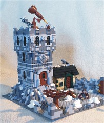
This suffers from the problem I mentioned in an earlier critique of 'too much busy-ness'. You've got a jumble of gray and dark gray in the building, on the ground, in that rock wall on the side, and even in the smoke. It would have been much nicer, IMO, if the ground had been all dark gray and the tower all light gray, or vice versa. I do really like the details around the door of the tower, and also the detail with the wedge plates around the windows on the upper floor. That little tree is very nice, though it seems a bit of an afterthought. On the building's interior, it always looks wrong when people show a cutaway and there's only a plate or two for the floor between levels. There should be some sort of pillars or rafters to hold one level above the other. This could be fixed pretty easily with some brown half-arches, or inverted slopes, as supports for the upper levels. The telescope is cool, but the hinge point looks way too fragile for that huge telescope. Oh, the chimney should extend much higher. As it is, anybody up on that top level to use the telescope would get a face full of smoke every time the wind shifted.
Bruce
Desert journey

That's good as far as it goes, but there's not much to engage with there. Something to heighten the urgency would be nice - a vulture picking at those bones would be a great addition. I did like the tan/dark tan variation, but I think it would have been more interesting if there were more elevation changes (e.g. see Rocko's Dune MOC). Also, there is no difference between your three photos. At least turn things around so we see this guy from different angles (bird's eye view might be cool as it could be a vulture overhead). One last issue was that there was nothing that said 'castle' to me. That scene could be from a thousand years ago or last week. Perhaps using a different fig would help here.
Matthew,
Fire and Water

This is fine as far as it goes, but could have been so much more. I understand that the photos make it hard to see some details, like the fronts of the houses, but perhaps camera angles would have fixed that. The houses themselves are simple rectangular floorplan - these could have been changed a bit perhaps. My main problem with this MOC is what it was missing. This is, presumably, Laketown (from the name, and the fact that it was also your MELO entry). Laketown was built up on piers, which would make this much more interesting. See, for instance, some of Blake's entries last year). Even if this isn't supposed to be Laketown, and I'm not going to hold you to that, since you didn't even say so in your entry description, the water outside the walls is on the same level as the street, which means this town is going to be in a lot of danger of drowning, even if there's not a dragon about. And that, of course, brings me to the other glaring omission. Assuming this is Laketown, and we're in the chapter of the Hobbit 'Fire and Water' (your entry title), there should be a dragon somewhere about, and the soldiers should be rushing to fight him off. That inclusion would have elevated this MOC from pretty good to epic. Even if we go with saying this isn't from the Hobbit at all and the allusions are accidental, well, then, you've got an unexplained fire on the one side, and even if it isn't due to some dragon intervention, you'd expect the other figs to be rushing to put out the fire.
DeetCr,
Reach the stars

This suffers from the problem I mentioned in an earlier critique of 'too much busy-ness'. You've got a jumble of gray and dark gray in the building, on the ground, in that rock wall on the side, and even in the smoke. It would have been much nicer, IMO, if the ground had been all dark gray and the tower all light gray, or vice versa. I do really like the details around the door of the tower, and also the detail with the wedge plates around the windows on the upper floor. That little tree is very nice, though it seems a bit of an afterthought. On the building's interior, it always looks wrong when people show a cutaway and there's only a plate or two for the floor between levels. There should be some sort of pillars or rafters to hold one level above the other. This could be fixed pretty easily with some brown half-arches, or inverted slopes, as supports for the upper levels. The telescope is cool, but the hinge point looks way too fragile for that huge telescope. Oh, the chimney should extend much higher. As it is, anybody up on that top level to use the telescope would get a face full of smoke every time the wind shifted.
Bruce
[url=http://comicbricks.blogspot.com/]ComicBricks[/url] [url=http://godbricks.blogspot.com/]GodBricks[/url] [url=http://microbricks.blogspot.com/]MicroBricks[/url] [url=http://minilandbricks.blogspot.com/]MinilandBricks[/url] [url=http://scibricks.blogspot.com/]SciBricks[/url] [url=http://vignettebricks.blogspot.com/]VignetteBricks[/url] [url=http://www.classic-castle.com/bricktales/]Brick Tales[/url]
Re: CCC X MOC critiques thread
Wow! Thanks for all that critique! Now that you explain it, I see your points.  It is actually Laketown, and the reason why it is not raised is because I ran out of pieces. :/ I might try to make this again, with you critiques and all.
Can you critique this one too?
http://www.mocpages.com/moc.php/348451
P.S. Josh, if you are an admin to Brothers-Bricks, I am just wondering, how do you get blogged?
Can you critique this one too?
http://www.mocpages.com/moc.php/348451
P.S. Josh, if you are an admin to Brothers-Bricks, I am just wondering, how do you get blogged?
[url=http://www.mocpages.com/home.php/75100]Mocpages[/url], [url=http://www.flickr.com/photos/92459453@N08/]Flickr[/url]
Support [url=https://ideas.lego.com/projects/74333]Huckleberry Finn[/url] on Lego Ideas!
Philippians 4:13
Support [url=https://ideas.lego.com/projects/74333]Huckleberry Finn[/url] on Lego Ideas!
Philippians 4:13
- AK_Brickster
- Admin

- Posts: 3476
- Joined: Wed Jun 22, 2011 5:02 pm
- Location: Mushing through the Great Driftplains of Garheim
- Contact:
Re: CCC X MOC critiques thread
Build something really really awesome and cross your fingers that someone notices itmpoh98 wrote:P.S. Josh, if you are an admin to Brothers-Bricks, I am just wondering, how do you get blogged?
- Bruce N H
- Precentor of the Scriptorium
- Posts: 6314
- Joined: Mon Sep 15, 2003 9:11 pm
- Location: Middle Zealand
- Contact:
Re: CCC X MOC critiques thread
Matthew,
In the ground rules I put at the start of this thread I said I would only critique one MOC per person every two weeks. Post again in a couple of weeks.
Bruce
In the ground rules I put at the start of this thread I said I would only critique one MOC per person every two weeks. Post again in a couple of weeks.
Bruce
[url=http://comicbricks.blogspot.com/]ComicBricks[/url] [url=http://godbricks.blogspot.com/]GodBricks[/url] [url=http://microbricks.blogspot.com/]MicroBricks[/url] [url=http://minilandbricks.blogspot.com/]MinilandBricks[/url] [url=http://scibricks.blogspot.com/]SciBricks[/url] [url=http://vignettebricks.blogspot.com/]VignetteBricks[/url] [url=http://www.classic-castle.com/bricktales/]Brick Tales[/url]
Re: CCC X MOC critiques thread
Thanks! Yeah, I see your point - I was kind of going for a completely deserted scene but a few more details, like the vulture you mentioned could have really helped. It also occurred to me later that if I had extended the sand 1 stud off the base plate I wouldn't have had the annoying green there. Thanks again!
[url=http://www.flickr.com/photos/gid617/]Flickr[/url]
- royalbrickcustoms
- Gentleman
- Posts: 701
- Joined: Mon Sep 24, 2012 6:31 pm
- Location: In the City of Fangroth
- Contact:
Re: CCC X MOC critiques thread
Hey Josh and Bruce would you, both please offer feedback as well as critisism and a critique for my CCCX: Forest Life entry (my only entry for the CCCX):
http://m.flickr.com/#/photos/88363283@N03/8165469459/
Thanks,
~RBC
http://m.flickr.com/#/photos/88363283@N03/8165469459/
Thanks,
~RBC
"I can do all things through Him who strengthens me."
~Phil. 4:13
[url=http://www.bricklink.com/store.asp?p=RBCustoms]Royal Brick Customs Shop (Bricklink)[/url]
~Phil. 4:13
[url=http://www.bricklink.com/store.asp?p=RBCustoms]Royal Brick Customs Shop (Bricklink)[/url]
Re: CCC X MOC critiques thread
I would very much like some critique on this build:
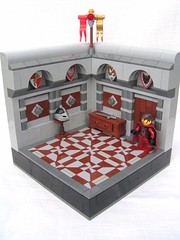
Room at Toberg by bentoft, on Flickr
I have a lot of my own critique on my other build.

Room at Toberg by bentoft, on Flickr
I have a lot of my own critique on my other build.
[img]http://www.brickshelf.com/gallery/lord-of-o ... tizen3.jpg[/img] [img]http://farm9.staticflickr.com/8244/84879601 ... 04d4_t.jpg[/img] [url=http://www.flickr.com/photos/bentoft/][img]http://www.worldwatch.org/system/files/images/e2/Flickr.jpg[/img][/url]
- royalbrickcustoms
- Gentleman
- Posts: 701
- Joined: Mon Sep 24, 2012 6:31 pm
- Location: In the City of Fangroth
- Contact:
Re: CCC X MOC critiques thread
Can you critique LCC MOCS or just CCCX entry MOCS?
~RBC
~RBC
"I can do all things through Him who strengthens me."
~Phil. 4:13
[url=http://www.bricklink.com/store.asp?p=RBCustoms]Royal Brick Customs Shop (Bricklink)[/url]
~Phil. 4:13
[url=http://www.bricklink.com/store.asp?p=RBCustoms]Royal Brick Customs Shop (Bricklink)[/url]
- Bruce N H
- Precentor of the Scriptorium
- Posts: 6314
- Joined: Mon Sep 15, 2003 9:11 pm
- Location: Middle Zealand
- Contact:
Re: CCC X MOC critiques thread
Sorry, but no. I want to confine this thread to the ccc.royalbrickcustoms wrote:Can you critique LCC MOCS or just CCCX entry MOCS?
~RBC
Bruce
[url=http://comicbricks.blogspot.com/]ComicBricks[/url] [url=http://godbricks.blogspot.com/]GodBricks[/url] [url=http://microbricks.blogspot.com/]MicroBricks[/url] [url=http://minilandbricks.blogspot.com/]MinilandBricks[/url] [url=http://scibricks.blogspot.com/]SciBricks[/url] [url=http://vignettebricks.blogspot.com/]VignetteBricks[/url] [url=http://www.classic-castle.com/bricktales/]Brick Tales[/url]
Re: CCC X MOC critiques thread
Thank you for your critique. I hope i will remember your advise, when i will build for next CCC.
- Bruce N H
- Precentor of the Scriptorium
- Posts: 6314
- Joined: Mon Sep 15, 2003 9:11 pm
- Location: Middle Zealand
- Contact:
Re: CCC X MOC critiques thread
Bentoft,
Room at Toberg
I really loved the floor mosaic you came up with. Perhaps my only complaint with it is color scheme. To me brown comes across as wood, and gray as stone, so that would be odd. Either brown/tan as an inlaid wood floor, or some other scheme as stone would be better, IMO. The little diamond details are also really nice. I did think that maybe if you had a simpler wall it would have highlighted the floor even more - the problem I've mentioned in other critiques of having too many complex things, where it's nice to have a contrast of simple vs complex. The furniture is great.
RoyalBrickCustoms,
Mavram's Palace
I liked the color scheme on the two trees, but they needed branches. As it is they're poles that go up and then have leaves at the top. The rocks on either side of the road confused me. Are they natural rock formations, or are they walls someone built? If they are walls, they should be more regular and smoother on the road side. If they're just natural rock formations, I would have put them back from the road, and not just have those flat faces on the back side. The gate itself was nice, but I would have also liked to see the other side.
Bruce
Room at Toberg

I really loved the floor mosaic you came up with. Perhaps my only complaint with it is color scheme. To me brown comes across as wood, and gray as stone, so that would be odd. Either brown/tan as an inlaid wood floor, or some other scheme as stone would be better, IMO. The little diamond details are also really nice. I did think that maybe if you had a simpler wall it would have highlighted the floor even more - the problem I've mentioned in other critiques of having too many complex things, where it's nice to have a contrast of simple vs complex. The furniture is great.
RoyalBrickCustoms,
Mavram's Palace
I liked the color scheme on the two trees, but they needed branches. As it is they're poles that go up and then have leaves at the top. The rocks on either side of the road confused me. Are they natural rock formations, or are they walls someone built? If they are walls, they should be more regular and smoother on the road side. If they're just natural rock formations, I would have put them back from the road, and not just have those flat faces on the back side. The gate itself was nice, but I would have also liked to see the other side.
Bruce
[url=http://comicbricks.blogspot.com/]ComicBricks[/url] [url=http://godbricks.blogspot.com/]GodBricks[/url] [url=http://microbricks.blogspot.com/]MicroBricks[/url] [url=http://minilandbricks.blogspot.com/]MinilandBricks[/url] [url=http://scibricks.blogspot.com/]SciBricks[/url] [url=http://vignettebricks.blogspot.com/]VignetteBricks[/url] [url=http://www.classic-castle.com/bricktales/]Brick Tales[/url]
Re: CCC X MOC critiques thread
As a new builder I really miss feedbacks on my MOC's so I would be very happy with a critique about my vignette: http://www.flickr.com/photos/77967082@N ... 315618309/. Thanks in advance!
- Bruce N H
- Precentor of the Scriptorium
- Posts: 6314
- Joined: Mon Sep 15, 2003 9:11 pm
- Location: Middle Zealand
- Contact:
Re: CCC X MOC critiques thread
Burlogh,
Blacksmith Shop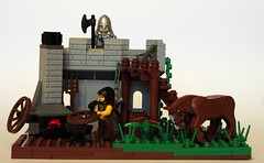
I really liked this MOC a lot. I particularly like the way you filled in some of the failings of the original (hard to say 'failings' in the context of that wonderful set), such as giving the guard up above more space and a parapet along the inside, and adding detail to the wall. I also really enjoyed the fact that you added a light brick to the fire and turning it at an angle. Giving the ground some definition, with the layering of soil and grass, was also nice. Perhaps my only negative mark on this was that it stayed almost too true to the source material, while some of the other entries went a greater step beyond the original. One idea, perhaps, would have been to include some allusion to the alternate build that is included in the original set's instructions (the small tower and the cart). BTW, I agree with your implication on Flickr that the original set should have been named 'wheelwright' rather than 'blacksmith'.
Okay, I guess there hasn't been a flood of requests, so I'll go back and address the couple of additional ones that I asked to wait.
Matthew,
Siege Tower redux
I thought there was too much on the siege tower - you made these overlapping tiles to give texture, but also had a whole variety of colors. I thought that would have looked better if it were all in one color. It goes back to my comment on other MOCs above in this thread of contrasting complex with simple - here a simple color scheme would have gone well with the complex texture, whereas making both complex it looks messy. Also on the tower, the fold-down bridge starts out way too high. The attacking soldier would have far too much difficulty keeping his balance on that steep downward slope and would not be able to swing his sword. Another issue is the action - everyone is kind of standing around. This would have been strengthened if the defenders were rushing to the point where the attackers were leaping down from the tower, and maybe that other attacker should be coming up the ladder rather than just sitting on his horse. The curved detail on the wall is interesting, but maybe out of place on an outer defensive wall.
KumpelKante,
Frost Fair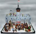
I really loved the idea of this entry. I'd never known about these frost fairs, that's a fun little slice of history. One issue I had was that if you did not read the description, it was initially unclear that the bridge was a bridge over a frozen river, rather than just some structure built up over a field. Perhaps if you'd included a little of the banks on either side of the river. Some nice details on the bridge itself. The action down below is a little confused - it is unclear what all is happening on first look. Another suggestion would be to have one of your photos from the perspective of an onlooker from the bridge above.
Blacksmith Shop

I really liked this MOC a lot. I particularly like the way you filled in some of the failings of the original (hard to say 'failings' in the context of that wonderful set), such as giving the guard up above more space and a parapet along the inside, and adding detail to the wall. I also really enjoyed the fact that you added a light brick to the fire and turning it at an angle. Giving the ground some definition, with the layering of soil and grass, was also nice. Perhaps my only negative mark on this was that it stayed almost too true to the source material, while some of the other entries went a greater step beyond the original. One idea, perhaps, would have been to include some allusion to the alternate build that is included in the original set's instructions (the small tower and the cart). BTW, I agree with your implication on Flickr that the original set should have been named 'wheelwright' rather than 'blacksmith'.
Okay, I guess there hasn't been a flood of requests, so I'll go back and address the couple of additional ones that I asked to wait.
Matthew,
Siege Tower redux

I thought there was too much on the siege tower - you made these overlapping tiles to give texture, but also had a whole variety of colors. I thought that would have looked better if it were all in one color. It goes back to my comment on other MOCs above in this thread of contrasting complex with simple - here a simple color scheme would have gone well with the complex texture, whereas making both complex it looks messy. Also on the tower, the fold-down bridge starts out way too high. The attacking soldier would have far too much difficulty keeping his balance on that steep downward slope and would not be able to swing his sword. Another issue is the action - everyone is kind of standing around. This would have been strengthened if the defenders were rushing to the point where the attackers were leaping down from the tower, and maybe that other attacker should be coming up the ladder rather than just sitting on his horse. The curved detail on the wall is interesting, but maybe out of place on an outer defensive wall.
KumpelKante,
Frost Fair

I really loved the idea of this entry. I'd never known about these frost fairs, that's a fun little slice of history. One issue I had was that if you did not read the description, it was initially unclear that the bridge was a bridge over a frozen river, rather than just some structure built up over a field. Perhaps if you'd included a little of the banks on either side of the river. Some nice details on the bridge itself. The action down below is a little confused - it is unclear what all is happening on first look. Another suggestion would be to have one of your photos from the perspective of an onlooker from the bridge above.
[url=http://comicbricks.blogspot.com/]ComicBricks[/url] [url=http://godbricks.blogspot.com/]GodBricks[/url] [url=http://microbricks.blogspot.com/]MicroBricks[/url] [url=http://minilandbricks.blogspot.com/]MinilandBricks[/url] [url=http://scibricks.blogspot.com/]SciBricks[/url] [url=http://vignettebricks.blogspot.com/]VignetteBricks[/url] [url=http://www.classic-castle.com/bricktales/]Brick Tales[/url]
- soccerkid6
- Admin

- Posts: 2176
- Joined: Fri Jun 03, 2011 6:41 pm
- Location: Nordheim Keep
- Contact:
Re: CCC X MOC critiques thread
Going by the above post I'd like to ask for feedback on my winter scene entry: http://www.legocreator57.tk/Mitgardian-Lighthouse.php
The feedback you gave for my last entry was extremely helpful, a lot of stuff I hadn't even thought about and it all made perfect sense
The feedback you gave for my last entry was extremely helpful, a lot of stuff I hadn't even thought about and it all made perfect sense
John 14:6, Jesus answered, "I am the way the truth and the life. No one comes to the Father except through me."
Brickbuilt: http://www.brickbuilt.org/
Flickr: https://www.flickr.com/photos/isaacsnyder/
Brickbuilt: http://www.brickbuilt.org/
Flickr: https://www.flickr.com/photos/isaacsnyder/
