my space skulls medium entry
Gallery: http://www.brickshelf.com/cgi-bin/gallery.cgi?f=316894
Preview: http://www.brickshelf.com/gallery/xbloo ... shot11.png
Comments and constructive critisism welcome!
CS competition entry 2
-
xbloodyfangs

- Laborer
- Posts: 142
- Joined: Sat Jul 01, 2006 6:15 pm
- Location: Chicago,IL
CS competition entry 2
My brickshelf http://www.brickshelf.com/cgi-bin/gallery.c ... loodyfangs
-
xbloodyfangs
- Laborer
- Posts: 142
- Joined: Sat Jul 01, 2006 6:15 pm
- Location: Chicago,IL
no one?
sorry for double posting but I would appreciate some comments?
sorry for double posting but I would appreciate some comments?
My brickshelf http://www.brickshelf.com/cgi-bin/gallery.c ... loodyfangs
-
FullNelson

- Apprentice
- Posts: 183
- Joined: Wed Aug 08, 2007 2:20 pm
- Location: My head is floating in a far off land alone. My body is unfortunately stuck on Earth.

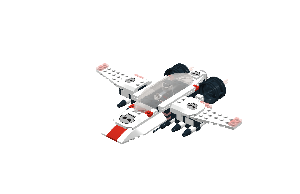
Ooh, I like the frontal veiw! I like the red striping.
One suggestion would be to move each wing outward by one stud if possible so that the piece with the SpaceSkulls insignia does not hang over the edge of the wing, to me that kind of takes away from the "streamlined" look that is often very attractive in in ship design.
Other than that I think this is a good ship and a good design, but alas it would take a real built model to really judge it properly. IMO
Nice work though. Enjoy the contest!
~LORD DOOM~
"My toys can beat up your toys."
[img]http://www.brickshelf.com/gallery/LORDD00M/ ... n/ldad.jpg[/img]
http://www.flickr.com/photos/12819392@N05/
http://www.flickr.com/photos/10149887@N08/
"My toys can beat up your toys."
[img]http://www.brickshelf.com/gallery/LORDD00M/ ... n/ldad.jpg[/img]
http://www.flickr.com/photos/12819392@N05/
http://www.flickr.com/photos/10149887@N08/
-
xbloodyfangs
- Laborer
- Posts: 142
- Joined: Sat Jul 01, 2006 6:15 pm
- Location: Chicago,IL
Thanks for the comments!
I would like to make it in real life too, but it's a LDD contest so yea...
But I haven't submitted it yet, so I'll take your suggestions!
Thanks again (:
I would like to make it in real life too, but it's a LDD contest so yea...
But I haven't submitted it yet, so I'll take your suggestions!
Thanks again (:
My brickshelf http://www.brickshelf.com/cgi-bin/gallery.c ... loodyfangs
This MOC looks very good. I really like the design and colorscheme.
One nitpick: Maybe the front view looks a bit too square. Maybe you can bring the red stripe one stud forward....so the nose of the plane becomes slightly more pointy?
Anyway very nice creation!
One nitpick: Maybe the front view looks a bit too square. Maybe you can bring the red stripe one stud forward....so the nose of the plane becomes slightly more pointy?
Anyway very nice creation!
You want a piece of me?!?!
My Brickshelf gallery:[url=http://www.brickshelf.com/cgi-bin/gallery.cgi?m=MrTS]here[/url]
My Brickshelf gallery:[url=http://www.brickshelf.com/cgi-bin/gallery.cgi?m=MrTS]here[/url]