Page 1 of 1
CS competition entry 2
Posted: Sat May 03, 2008 11:10 pm
by xbloodyfangs
Posted: Sun May 04, 2008 10:04 pm
by xbloodyfangs
no one?
sorry for double posting but I would appreciate some comments?
Posted: Sun May 04, 2008 10:11 pm
by FullNelson
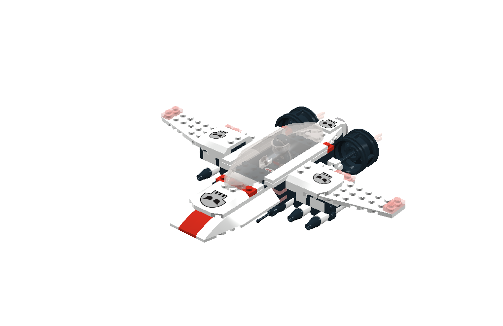
I love the airplane. I like how you made the engines and the missles especially the ones right under the ship. The color scheme is really good. Have you tried building one with black instead of white.
Posted: Sun May 04, 2008 10:16 pm
by LORD DOOM
Ooh, I like the frontal veiw! I like the red striping.
One suggestion would be to move each wing outward by one stud if possible so that the piece with the SpaceSkulls insignia does not hang over the edge of the wing, to me that kind of takes away from the "streamlined" look that is often very attractive in in ship design.
Other than that I think this is a good ship and a good design, but alas it would take a real built model to really judge it properly. IMO
Nice work though. Enjoy the contest!
Posted: Sun May 04, 2008 10:22 pm
by xbloodyfangs
Thanks for the comments!
I would like to make it in real life too, but it's a LDD contest so yea...
But I haven't submitted it yet, so I'll take your suggestions!
Thanks again (:
Posted: Mon May 05, 2008 6:25 am
by MrTS
This MOC looks very good. I really like the design and colorscheme.
One nitpick: Maybe the front view looks a bit too square. Maybe you can bring the red stripe one stud forward....so the nose of the plane becomes slightly more pointy?
Anyway very nice creation!